


10 New Dos and Don’ts in Decorating
10 New Dos and Don’ts
It’s that time for another episode of Dos and Don’ts. We always get great feed back when we do these blog posts. Do you want to play? Basically, we post images of vignettes that we see that have something wrong in the picture and then you see if you can figure out what is wrong.
Ready? Let’s do it!!
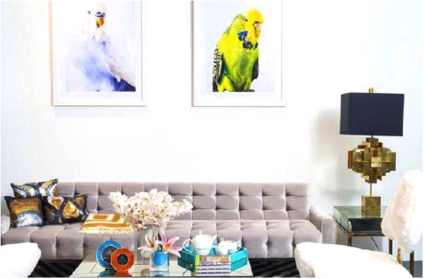
The glaring misstep here, for me, is the height of the paintings. They are “floating” in relation to the sofa below. Ideally, art is placed about 8” above the sofa so it will all read as a unit together. I’ m also not super fond of the cushions, they seem a bit calculated to me. I’d rather see a larger lighter cushion with a couple of more colourful smaller ones -maybe teal? I’m also not a fan of the folded blanket on the sofa. I prefer a more casual throw over the end of the sofa. It feels to me like it was just folded for the picture.
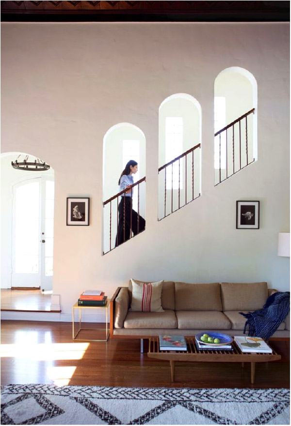
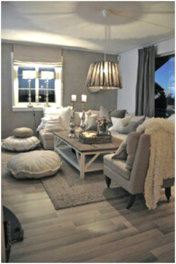
This image has me a little perplexed. I think it is a beautiful image to be sure but there are a couple of things that throw me off. I feel like the carpet is kind of floating away from the furniture. I’d rather it be pulled in towards the furniture, under the coffee table and right up to the sofa legs. That creates more of an intimate space for one relaxing in the space.
Now, I will admit we really don’t know what is going on in the other parts of the room but just going from this image that is my feeling. Also, I think the art piece above the sofa is too high and too small. It looks like they were tying to line up the art piece on the other wall with the one above the sofa. A larger, lower piece of art for over the sofa would look more in scale with the high ceilings of the room.
The two smaller art pieces could then be installed one over the other on the left wall. It would fill the space more and because the two are the same size and are both black and white, it would read as a very interesting art installation.
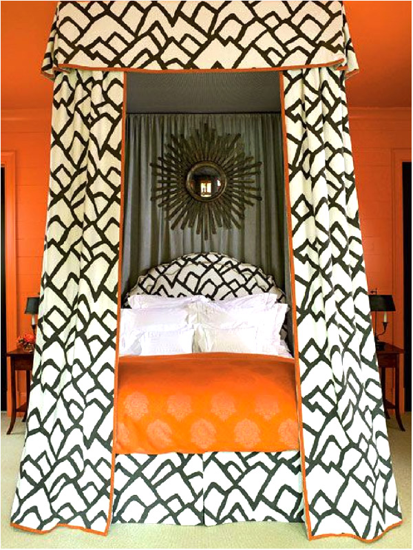
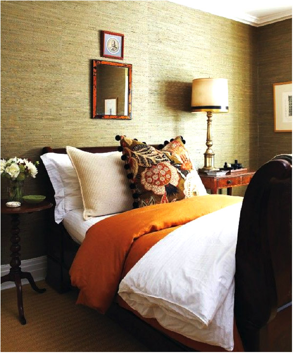
Hmmm…what do you think of this? I’m thinking it’s a little over the top! I feel like this needs some serious editing! Too much of one fabric and too much orange. I would have trouble sleeping in this pumped up bedroom!
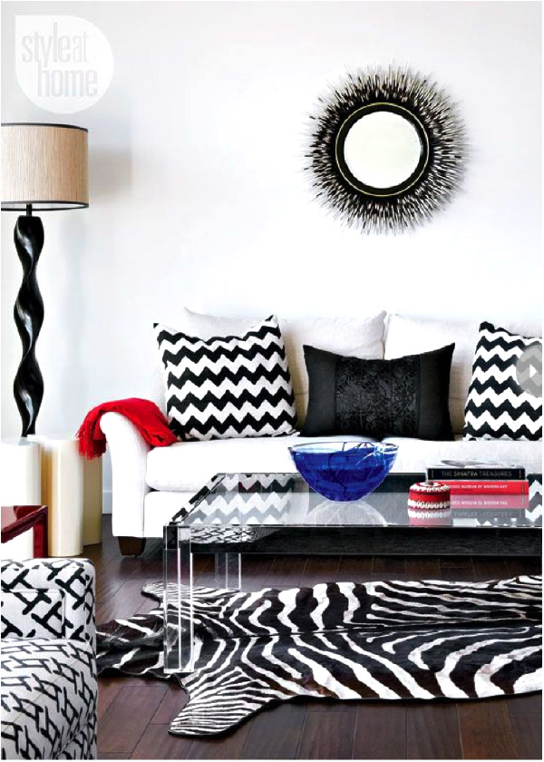
This is a good example of pattern gone wrong. All these patterns, although are the same colours, they really don’t work well together. The reason is theya re all the same SIZE of pattern. The rule when working with pattern is to have one large, one medium, and one small scale pattern. These patterns are all fighting each other for attention. If you vary the scale size then they will not compete and it will read much more cohesively. I will also point out that the mirror above the sofa does not appear to be big enough and is a bit too high.
The problem with this room, for me, is that the roman blind is too small for the window. It should either sit INSIDE the trim or outside all the trim. This one just looks like they took the wrong measurements or took it use form another room.
See our blog on BLINDS here.
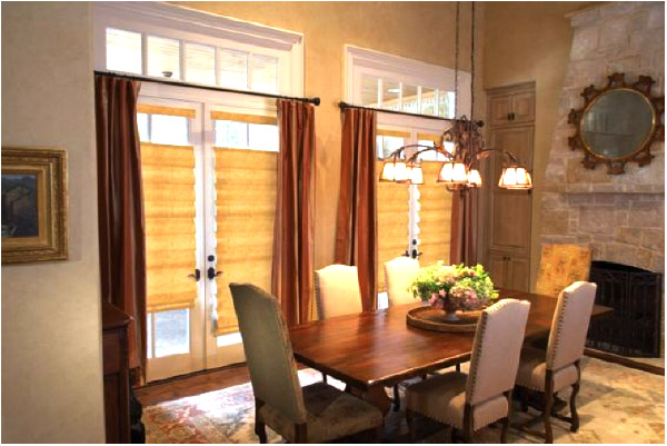
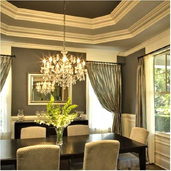
I am not at all clear why they hung these curtains here. The rod should be above the top trim. Actually about 6-8” above works well. Read our blog on curtains here. This just cuts the windows and makes the room feel smaller and more closed in.
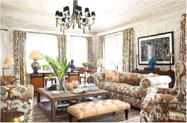
Here is another example of using too much of the same fabric. This is a good fabric to use ONCE. Then you can pull colours from this fabric for all the other pieces. This room is reading very busy at the moment even though the layout looks appealing.
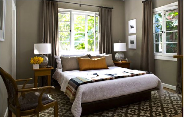
Ok, let’s see if you get this one…lamps? bedding? carpet? Hmmm…this is a tricky one. Look at the curtain rod height. They are different! Both should be hung at the same height. The windows are the same height so I am not sure why they hung the one on the right higher than the one above the bed.
I think these curtains should have been hung in line with the crown moulding. Right now they are bringing the eye down and cutting off the paint colour.
There is a lot I do like about this room but the pictures above the bed just don’t work for me-they are too small. Smaller artwork can be used if you group them but in this case a nice horizontal painting would look good. Also, the table and lamp, although they look great together don’t really work that well for reading in bed. The lamp is very high and the light would shine in your eyes if you were trying to read. Either the table could be lower or the lamp shorter.
How did you make out on this quiz? Let us know what you think!