


The Palette Project #11: Autumn Colours
This is another edition of the palette project– we’re exploring inspiring places in Canada and the colours that make them beautiful.
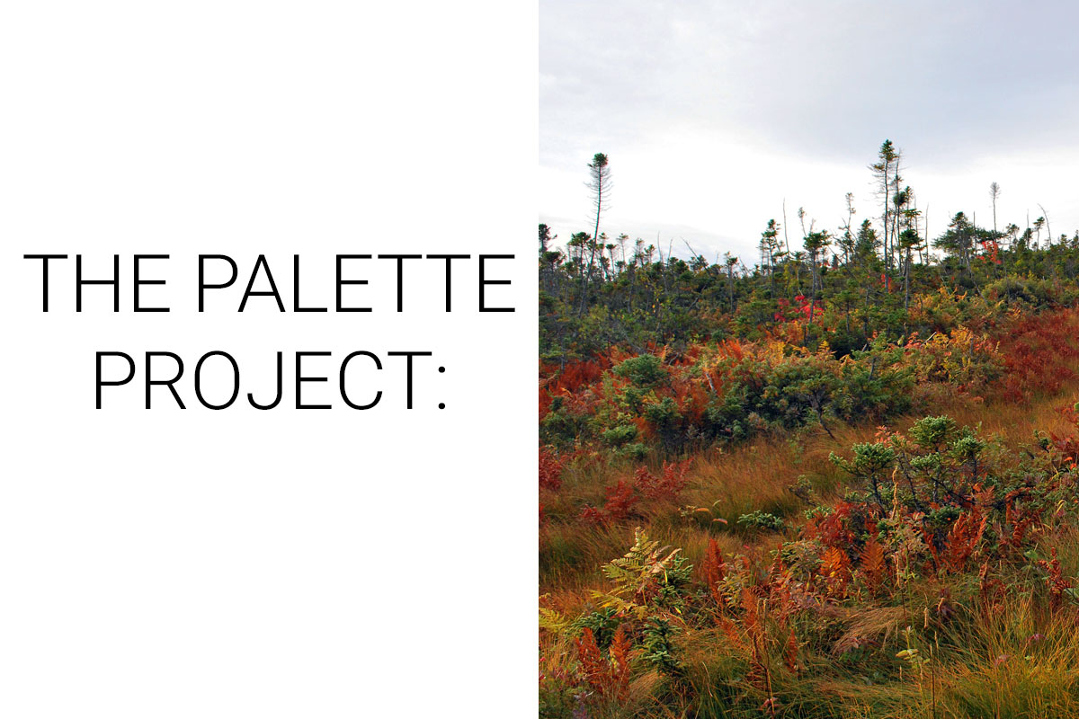
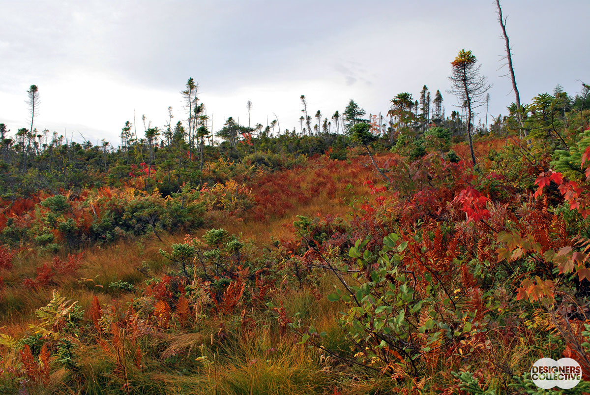
We would be remiss if we didn’t take a look at a gorgeous autumn landscape this weekend… It’s Thanksgiving in Canada and that means embracing the season and celebrating the harvest. Autumn is in full swing and everywhere you look around the city trees and transforming into golden displays of rich reds, umber, and yellow– it’s gorgeous to say the least. All across the country, it’s a magical transformation that marks the end of summer (and what a great summer it has been!). Gros Morne National Park, Newfoundland is a tapestry of ancient landscapes spread between a variety of mountain ranges, rolling meadows, and seaside communities. Our inspiration comes from the sub-alpine areas covered with grasses, pines, maples, and ferns. With such a variety of flora, in the autumn months you get a fantastic array of colours from the richest reds to bright greens. Against a cool grey sky, these tones come alive.
The Inspiration:
The Palettes:
So this week we cheated a little bit… We couldn’t settle on just one palette so we have 3 options for you. Consider our indecisiveness an opportunity to share how you can draw an array of colour options from a single inspiration photo!
#1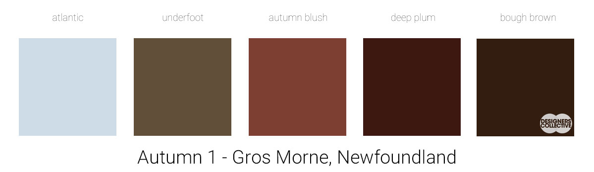
Our first palette was a pleasant surprise… From an inspiration with such warm tones we loved that we found these gorgeous cool tones hidden in the landscape. The deep pinks, purples, and browns share a cool undertone with the blue and grey to pull this palette together. The blue, perhaps obviously, comes from the sky, and the other four colours were pulled from areas of overlapping foliage and shadow. The result is a modern palette with rich tones that can be used as accents on great textiles (we’re thinking velvet or a richly patterned cotton) that will add a level of sophistication to the space.
#2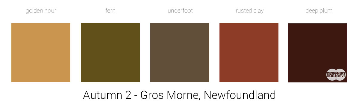
In our second palette we sampled a little bit of everything. We decided to repeat two colours from our first palette (underfoot and deep plum) and mix in three new colours that are more typical when you think of those ‘fall colours’. We selected a green and gold that are not overly saturated as well as a lovely and warm rosy-brown we call rusted clay. When you have a palette like this that has a few stronger colours in it (that will only appear stronger and more saturated on a larger surface like a wall…) it can be fun to play with proportions and how you use colour in the space. Bold walls with neutral furnishings? Sure. Monochrome grey walls and furniture with brighter, more saturated accents? Okay! You can let your preference guide you…
#3 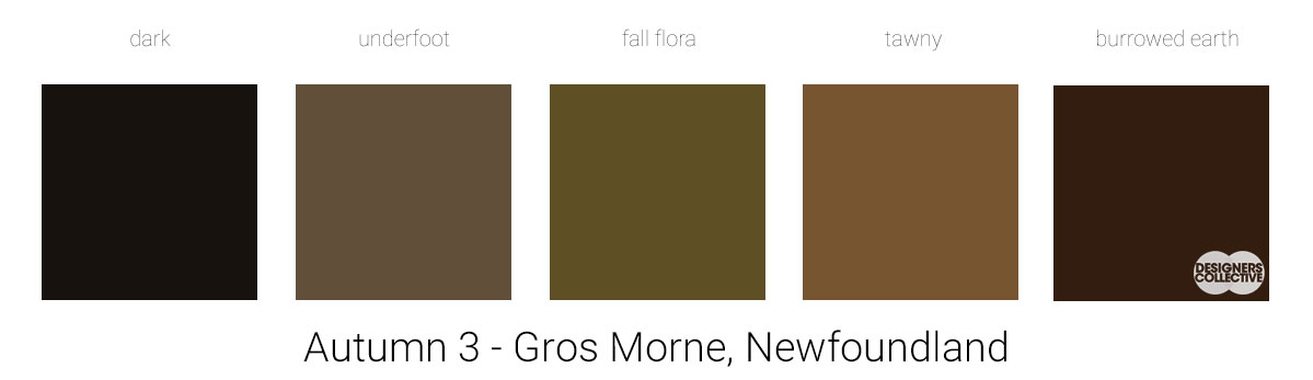
On the opposite end of the scale, we have a family of neutrals. We promise we didn’t intend to ignore all the beautiful golds and greens… neutral palettes can be fun too! We love how these colours can work in almost any proportion anywhere in a space. Really, these colours speak to a lot to natural elements: concrete, leather, stone, wood, even shadows! By using interesting finishes or rich textiles you can increase the visual interest of these tones– without the saturation of other colours your eye will focus more on the materials and how they ‘act’ in the space (ie. how they react with light, interplay of textures, etc…) . This palette can easily be punched up with metallics, interesting stone finishes, or a vibrant colour or two. There is a lot of neutrality to balance out any flashier additions you might want to add!
Next Sunday we’ll have new inspiration and new colours to share with you! Each of these palettes is created by Designers Collective. We encourage you to use them for inspiration! If you are interested in purchasing a palette, with paint colour identifications, get in touch with us at our studio! Email studio@designerscollective.ca or visit us at 2885 W 33rd Ave, Vancouver, BC.