


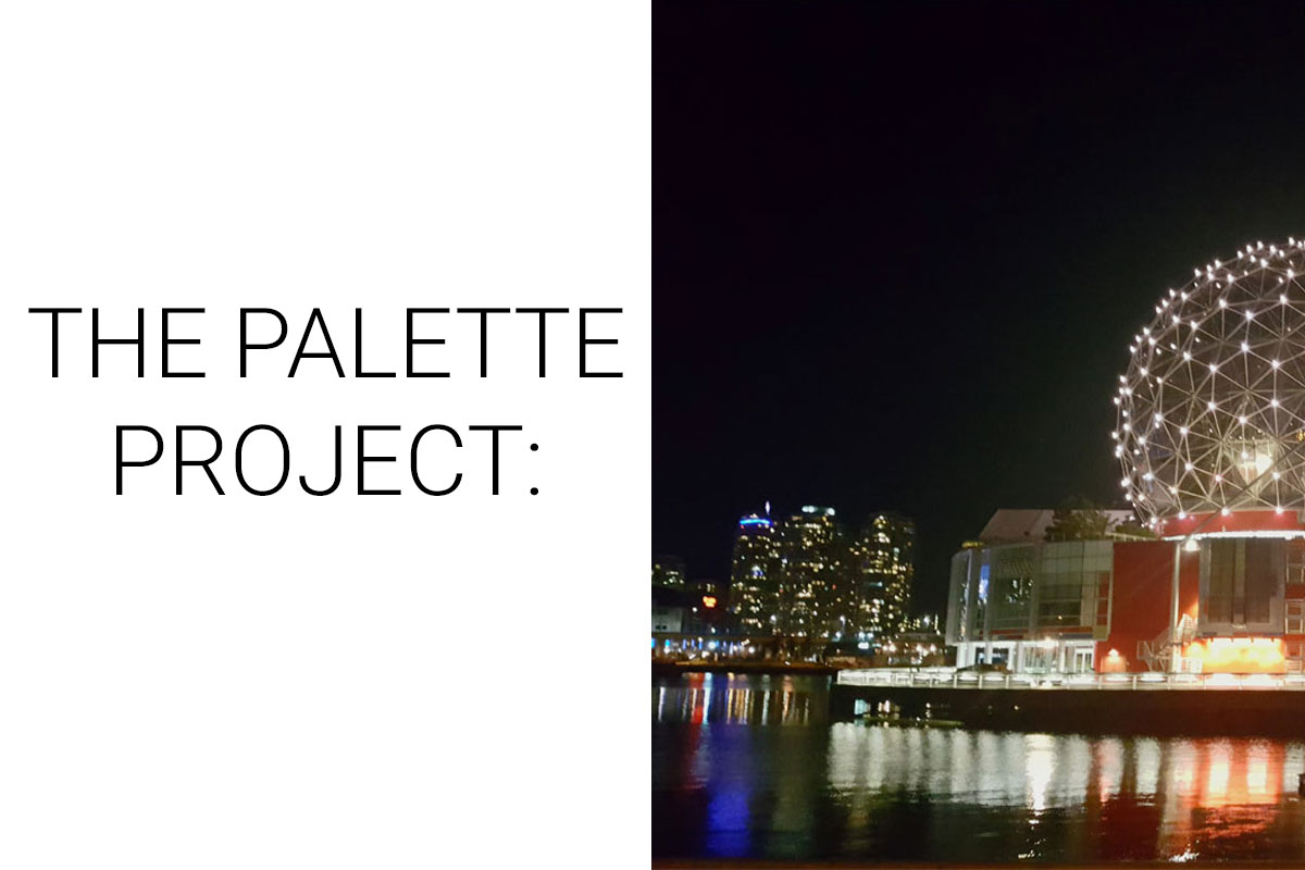
The Palette Project #12: Science World
This is another edition of the palette project– we’re exploring inspiring places in Canada and the colours that make them beautiful.
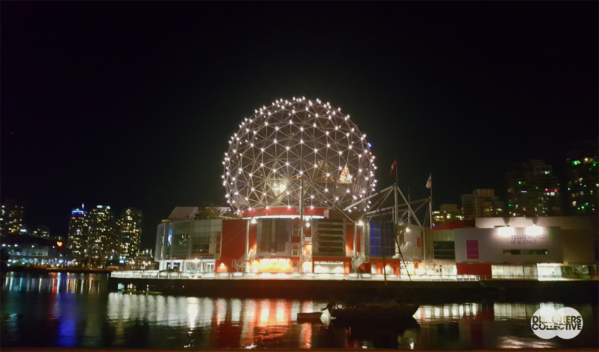
Expo ’86. For the city of Vancouver, back then a moderate city with big aspirations, hosting Expo was the event that marked it’s transformation into a modern and quickly developing metropolis. Science World is an iconic piece of architecture that is part of the Expo ’86 legacy. Sitting on False Creek, the geodesic dome is lit up at night creating an instagram-worthy scene for locals and tourists alike. Inside this unique piece of architecture is something that may be familiar to many Vancouver-area locals… especially if you’ve taken a school trip or two here! All sorts of fun ways to learn about scientific phenomena– from weather to electricity and everything in-between as well as the largest IMAX screen in the world. Inside and out, it’s scientifically fantastic.
The Inspiration:
The Palette:
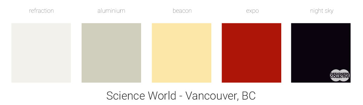
Working with a night-scene it can be easy to stick with dark, dramatic colours. But what is the fun in that? Initially we started to pull a lot of blues, greys, and near-blacks, but who hasn’t seen that before? Why not try something a little bit different, and perhaps more challenging? After playing around we ended up with lighter swatches that have a warm undertone to pull them together. To balance out our night sky and equally inky water we decided to pull a couple different greys as homage to the structure of Science World, a creamy-yellow as a nod to the lights, and a warm red in reference to the exterior of the building. With the red and yellow it was tricky to decide on how light/dark and how saturated we wanted to go, in the end we went just a little bit bold to counter the neutrals in the palette (but there is definitely some flex there!).
Next Sunday we’ll have new inspiration and new colours to share with you! Each of these palettes is created by Designers Collective. We encourage you to use them for inspiration! If you are interested in purchasing a palette, with paint colour identifications, get in touch with us at our studio! Email studio@designerscollective.ca or visit us at 2885 W 33rd Ave, Vancouver, BC.