


The Palette Project #21: Sunshine Meadows
This is another edition of the palette project– we’re exploring inspiring places in Canada and the colours that make them beautiful.
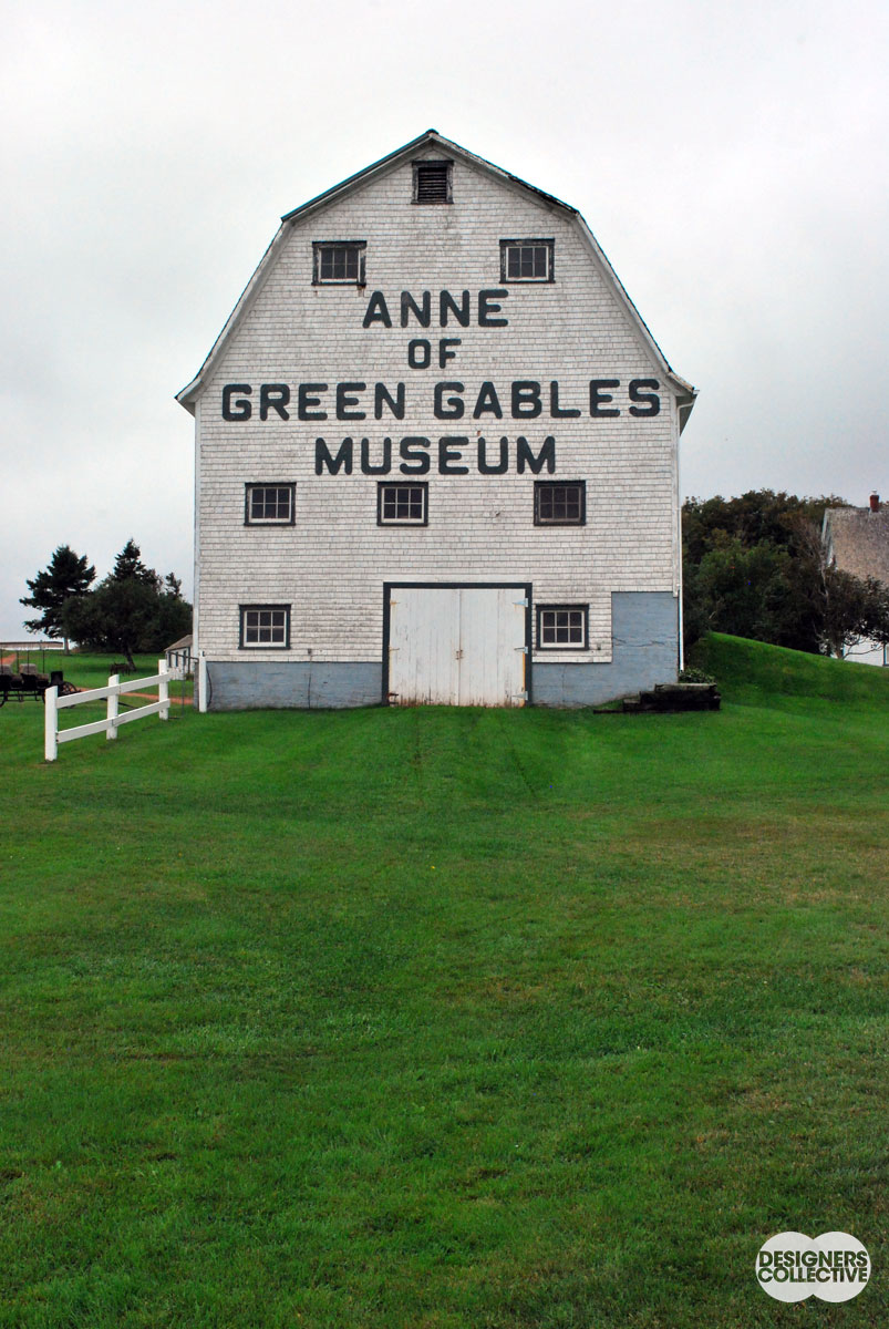
Landscape knows no boarders. This week we turn to the mountainous region between the BC-AB divide and a beautiful alpine meadow. There are no garden roses and decorative grasses up here, everything is naturally wild. Instead of looking to the larger-than-life views, we crouch down and focus our gaze on something smaller. Our inspiration this week is found in the curious appearance of the Western Anenome (or Wind Flower). Sprouting up in tight bunches, its small stalks and hairy plumes of seeds tower over the stocky alpine scrub. A well-timed wind blew past as we captured this shot (no fans up here!). Au naturel.
The Inspiration:
The Palette:
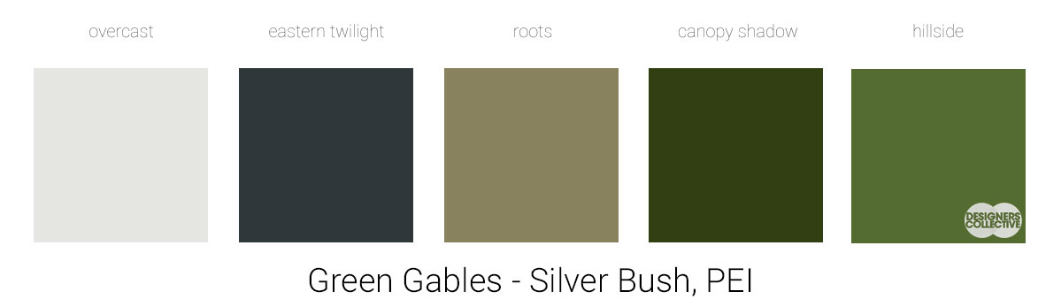
This palette was a challenging balancing act. We decided to start with our green hue, alpine moss, and our yellow hue, sunshine, and fill in the gaps with a variety of neutrals. White, but not too white, grey, but not too grey… It was great to revisit these neutrals as an exercise in undertones. Our neutrals differ slightly, but all undertones fall into a warm beige category. This warmth connects with our yellow and green . It’s amazing how many greys, whites, and creams are in our inspiration photo– talk about a tough job finding one that fits! In the end we wanted to focus on the warmth of the photo and made sure all our colours fit the bill.
We’ll have more palettes for you to enjoy in 2018! We look forward to sharing more colours with you after our Holiday Hiatus… Each of these palettes is created by Designers Collective. We encourage you to use them for inspiration! If you are interested in purchasing a palette, with paint colour identifications, get in touch with us at our studio! Email studio@designerscollective.ca or visit us at 2885 W 33rd Ave, Vancouver, BC.