


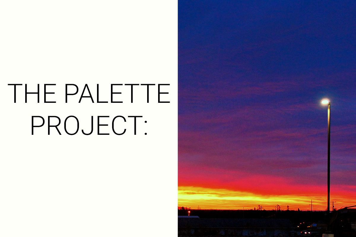
The Palette Project #23: Parking Lot at Sunrise
This is another edition of the palette project– we’re exploring inspiring places in Canada and the colours that make them beautiful.
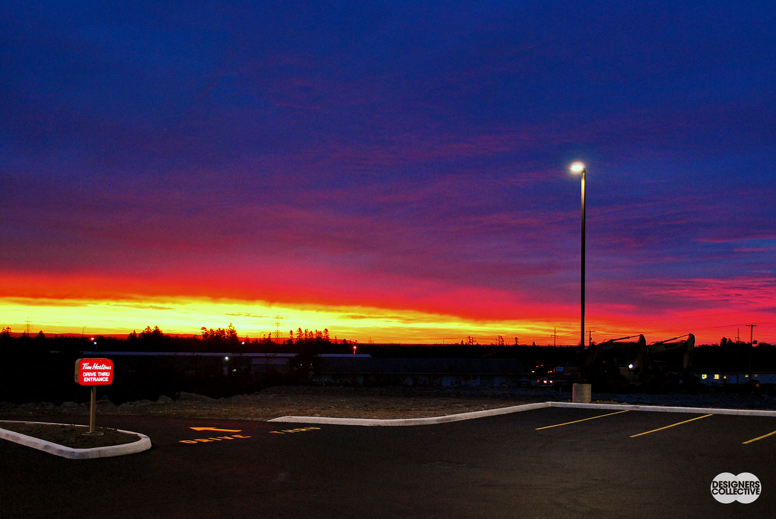
This week, we’re looking at something a little different: a parking lot. No, it’s not on a heritage building list or is otherwise notable for its location, in fact it is a Tim Hortons just outside of Saint John, NB (pretty Canadian right?). What we were drawn to from this inspiration photo was not the place, but the time of day. Taken during sunrise, the sky was that perfect combination of clear/cloudy that sustained fantastic colours of the emerging sunshine– so vibrant they almost seem surreal! It just goes to show that right-place-right-time can make a world of difference.
The Inspiration:
The Palette:
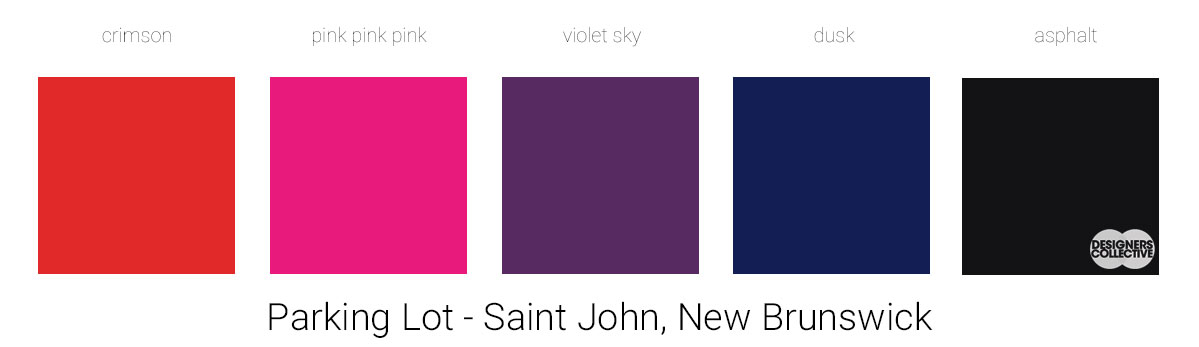
I don’t think we’ve had something this vibrant since our Montreal Street Art post (see it here)… We wanted to include the full spectrum of sunrise in this palette. It made sense to work our way from the brightest tones out, in fact crimson started out as a goldey-yellow tone. Once we had the pink, violet, blue, and dark grey, however, the yellow didn’t seem quite as cohesive as we wanted. So, we replaced our yellow with a more orange-red tone that complements the rest of the palette much better. In our experience, it is easier to tweak palettes and plans once everything else is in place! From crimson through dusk we work our way through the East Coast sky, embracing rich jewel tones that are right on trend from 2018 (and we just had to include asphalt as our neutral to pay homage to the parking lot).
Next Sunday we’ll have new inspiration and new colours to share with you! Each of these palettes is created by Designers Collective. We encourage you to use them for inspiration! If you are interested in purchasing a palette, with paint colour identifications, get in touch with us at our studio! Email studio@designerscollective.ca or visit us at 2885 W 33rd Ave, Vancouver, BC.