


What’s Wrong With This Room? An Analysis
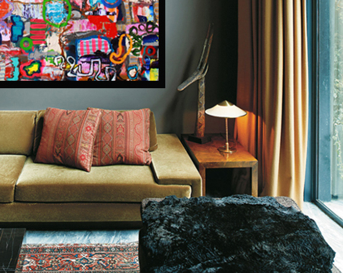
Welcome to another episode of ‘What’s Wrong with This Room?’. When we look through magazines or online we see images that draw us in, and some that don’t seem quite right. Have a good look at this room from an apartment in the West Village, New York that we found in the New York Times magazine. How does it make you feel?
A sumptuous apartment in Manhattan.
Do you think there something wrong with this picture? Your thoughts?
First let me say that I love this room! The high ceiling heights, the art work choice, the colours, furniture, accessories are all perfect. Yet something is just not working?
The Room is Throwing Off My Balance.
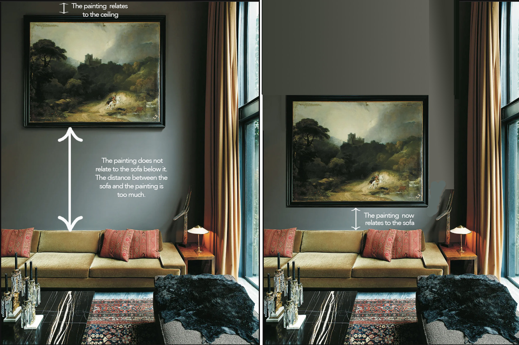
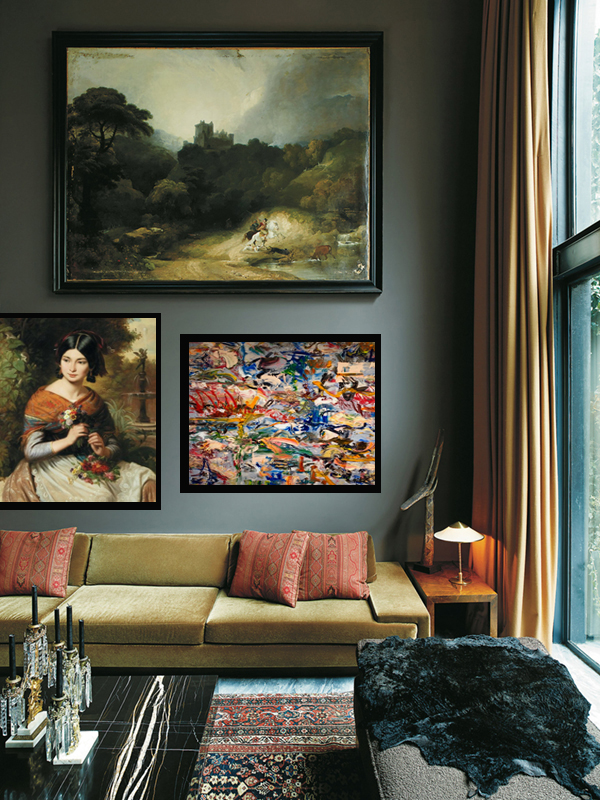
The painting is too high! The size of the painting is great, as is the asymmetrical placement over the sofa. But the art relates more to the ceiling than to the room. If fact, you would have to look up to see the painting. This may draw attention to the high ceiling heights (which is nice) but the painting feels as if it is floating above the room. So what would I do differently? (or…what is the solution?)
What Would I Do To Create Balance?
I would lower the painting to approximately 6-12 inches above the sofa. Now the art relates to the sofa and not the ceiling. It is tempting to treat art like it’s in a gallery where people are standing but in our living spaces we are sitting, so the gallery model does not apply. I always tell my clients to hang their artwork 6″ lower than they think they should.
Some thoughts on placing artwork
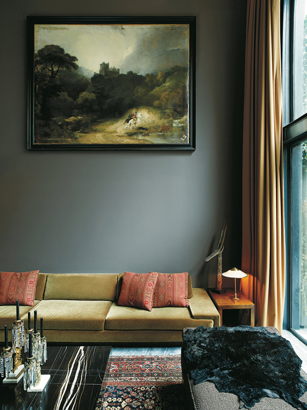
So why do you think the designer hung the painting so high? My thought was that it is likely to relate to an upper floor space. So I did a bit of investigation to see if I could find more pictures of this room and voila!
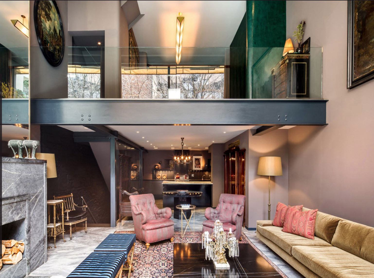
Another view of the West Village Apartment
As I suspected, the painting is at a perfect height to be viewed from the upper floor. Considering the rest of the room, the painting placement makes senses and feels in proportion, given how much is going on in the room. But for now, let’s ignore the rest of the room for purposes of this analysis, and look at how to deal with the big gap between the bottom of the painting and the top of the sofa?
Two ways to take advantage of the high ceiling heights.
1. Clustering Artwork
Clustering Artwork
Add a few more pieces of art below to decrease the gap. These will be seen from eye level so the images can be finer. The big impact painting will stay on top as we don’t need to view this art work close up.
When hanging more than one piece of art, treat the grouping as one, and space the pieces only a few inches (1.5″-3″ depending on the size of the piece) apart, so they look cohesive and connected. Asymmetrical Balance is a great solution when you have a grouping of artworks that are diverse but share at least one similar element, such as subject matter or colour scheme. You can asymmetrically arrange the pieces yet still achieve a visually ‘organic’ balance. Another option is to try staggering them by hanging one lower than the other, so that top and bottom don’t match. This approach relies on the relative ‘visual weight’ of each piece to balance the composition. See image below for a good example of asymmetrical balance.
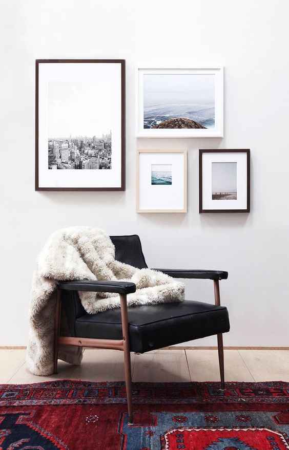
Asymmetrical Balance with photographs.
2. Make An Impact
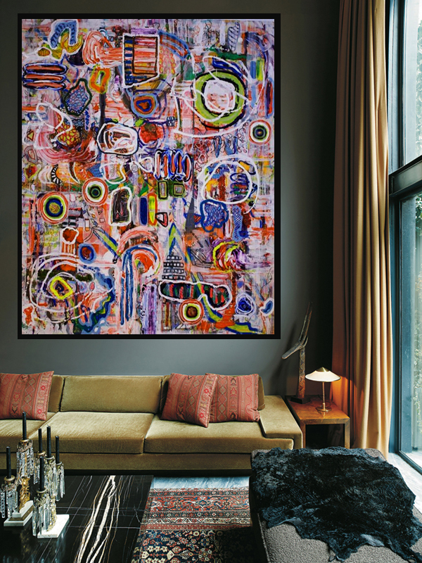
Large, high impact painting by Vancouver Artist, Carla Tak
Take advantage of more generous wall space by hanging a large painting. Large art pieces give you an immediate impact. They are both exciting and imposing and allow one to engage with the art even questioning how the piece was made, installed or how it got through the door.
Recap
In summary, Artwork will lead your eye upwards or downwards; it has huge impact on the viewer but the positioning has to make some sense in the room. Ultimately you have to look critically at what you want to achieve and work somewhat intuitively. Rule of Thumb; If you are not sure what to do lower your artwork by 6″. You’ll be surprised how often this improves the look of your space.
Do Guides on Placing Art
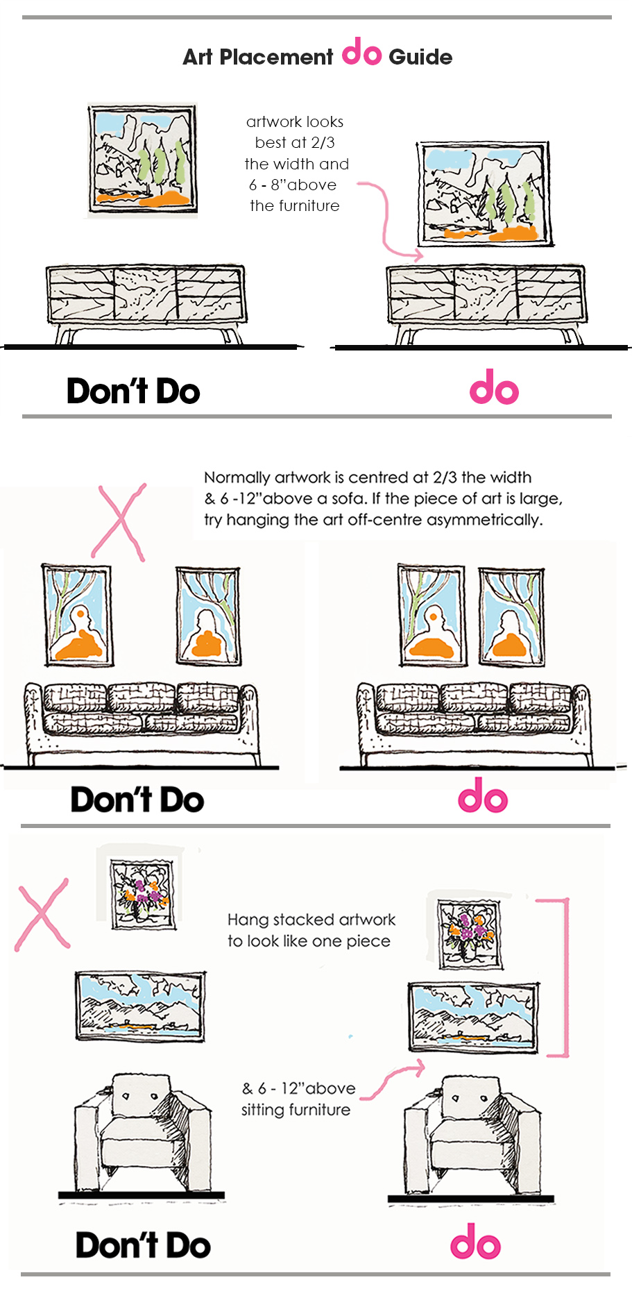
Do Guides for Art Placement. Let us know if you need some help!