


5 trends that defined our LA Design Tour
It’s been a little while since we landed back in Vancouver from our design sojourn in La La Land, but our brains are still buzzing with inspiration. We had such a great time with our design tour participants too! Each time we go to LA we make sure to explore new spaces and uncover what’s emerging in west coast design. It probably is no surprise that LA is a goldmine for innovative interior and exterior design; we made sure to add lots of opportunities to our travel itinerary to explore what’s up-and-coming in the design world (with a side of modern art and art deco to boot!)
So, what did we see? The west coast aesthetic is something we’re familiar with here in Vancouver. The emphasis on natural materials, design that complements the landscape, and celebration of the great outdoors (be it taking advantage of stunning views or outdoor living spaces) are common links with LA. Perhaps it’s the glamour of Hollywood or the USA!-USA!-USA! mindset, but LA dives in to new trends and bold designs with confidence whereas here in Vancouver we can sometimes be a bit more tentative to embrace the ‘new’.
While touring gorgeous homes in Santa Monica, Culver City, and Venice as part of the Dwell Home Tours we were determined to hone in on a few key trends. We were able to narrow our list down to 5 trends that we are most excited about, especially as they can easily be transplanted here! Overall, design in LA is full of personality—little touches and attention to detail pack a punch and speak to the unique taste of the homeowner. Oh, and a huge thank-you (if you’re out there!) to the homeowners who opened their doors to us design lovers!
1. Return of Handcraft: Handmade touches and unrefined materials
This trend is something that extends beyond design—the return of locally-sourced and handmade pieces has been happening for a couple years now (everything from candles to snack foods it seems!). We are not complaining… there is a raw beauty to handmade pieces and materials like leathers offer a great tactile experience when used as drawer pulls and handles. There is a wonderful balance between rustic and manufactured that we are really drawn to. Raw materials become refined and relatable. The result? Spaces feel warm and made to be lived in. See some of our favourite examples below:
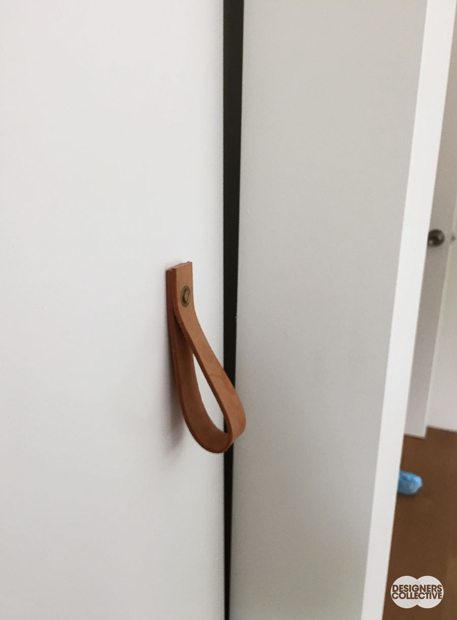
Leather is handy: Straps, loops, and leather-covered hardware replace traditional handles and knobs. This is a great example of a simple concept executed well. The softness of the leather also adds a bit of a warm country feel to the space…
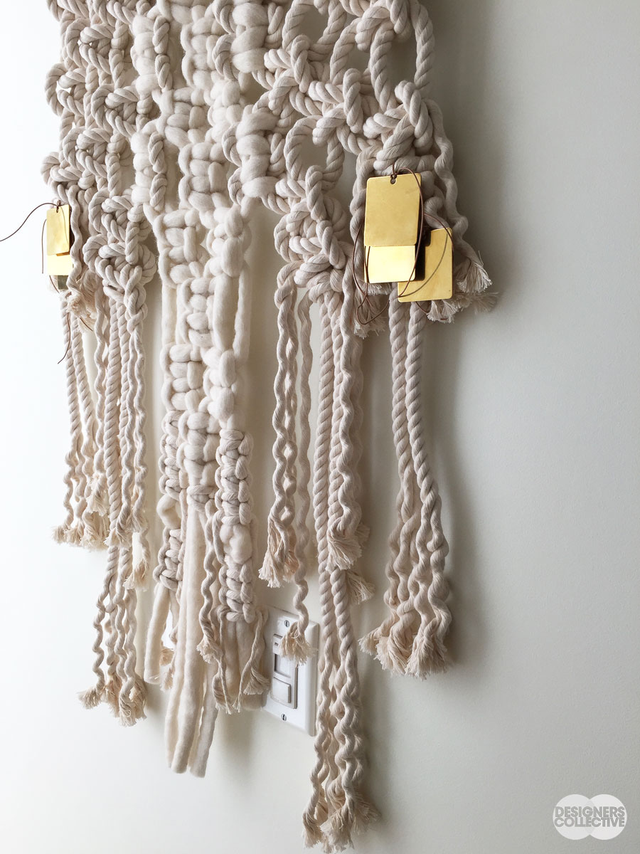
Macra-what? This is not the first time Macramé hits a home run. This iteration becomes a delicate wall-hanging that softly obscures the wall plate near the bottom of the photo. Textile-art-handicraft all rolled into a beautiful monochrome display. A great way to add texture, and a bit of gold, to the space…
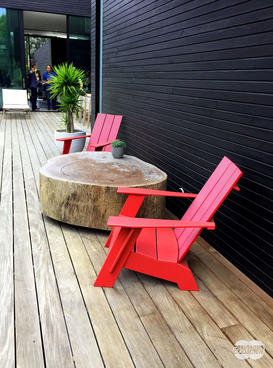
All-natural: A large section of tree is a perfect ready-made table. This adds great texture and a touch of rugged-ness to this modern space. We can’t help but feel a bit of a Canadian vibe with the red muskoka-esque chairs!
2. Indoor-Outdoor Living: The distinction between in and out fades away
We are no strangers to the indoor-outdoor lifestyle. Beautiful summers in Vancouver just begged to be taken advantage of, everyone migrates from living rooms to patios once the weather warms up. The homes we toured REALLY know how to take advantage of good weather (that LA sunshine right?). Disappearing walls and windows galore blur the line between in and out, and it looks so good! Back gardens and patio spaces are folded into the design of the interior and the result is one extra-large and ultra-adaptable living space. We especially love the bold architecture that frames these transitional spaces. Check out these examples:
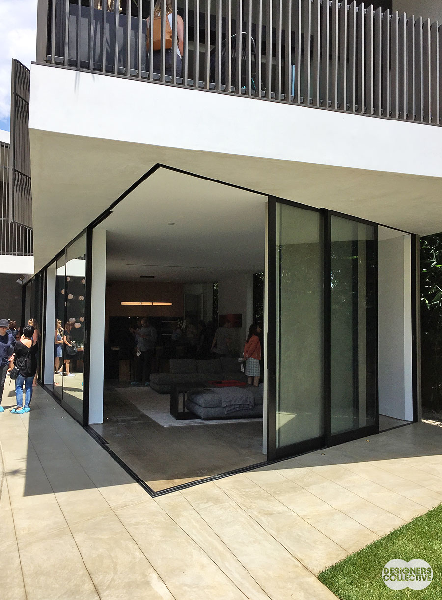
No walls here: There are a couple things we love about this; first, the great offset angle of the sliding doors, and second the seamless-ness of the indoor-outdoor transition. As an added bonus the overhang of the second floor creates a shaded area on the patio below…
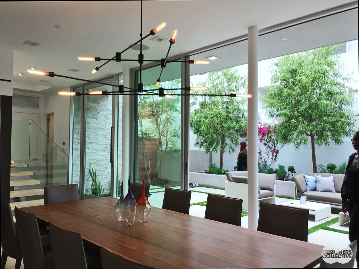
Dinner Al Fresco: Nothing says west-coast summer like having a great dinner get-together with drinks on the patio. Just slide back the floor-to-ceiling glass to double the size of your dining room and reap the benefits of a warm summer breeze and easy kitchen-access…
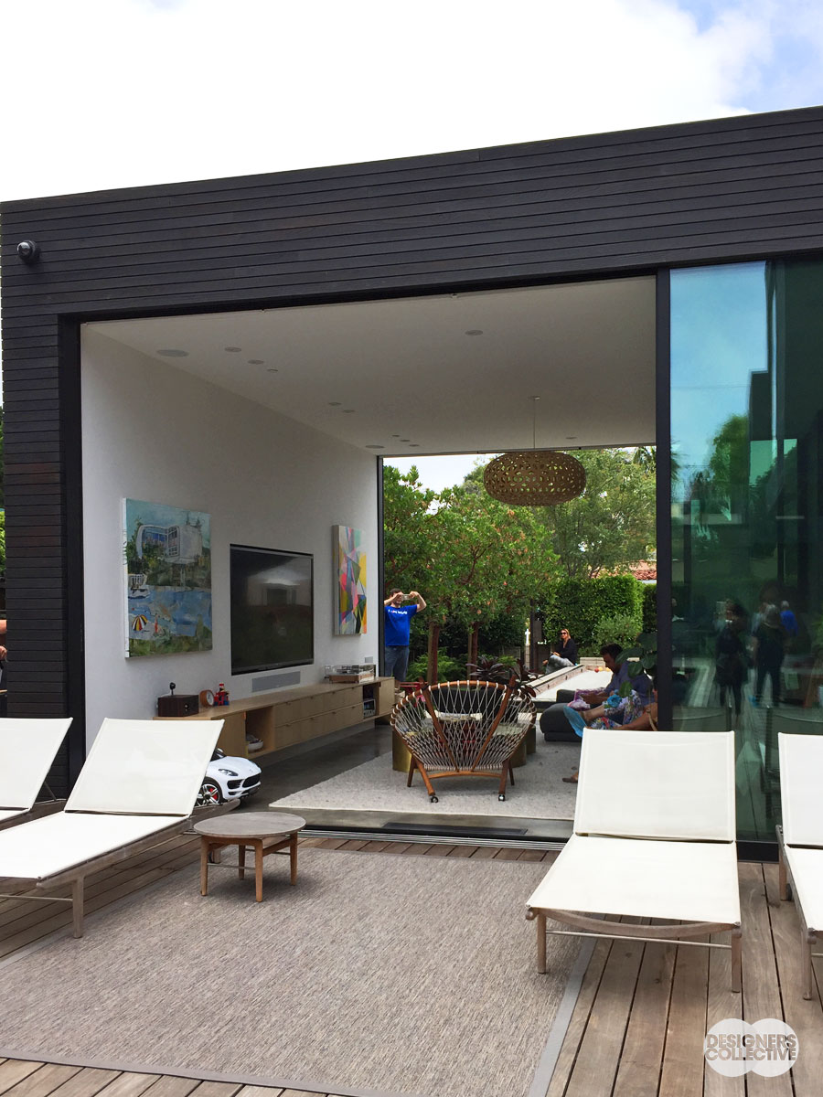
Passing through: Walls of windows disappear to create the ultimate indoor-outdoor living space. The whole family can do what they love and still be in the same space. With our lovely summer breezes in Vancouver, this is something we’d love to try– maybe with a couple umbrellas near by, just in case…
3. Emphasis on Architecture: Structural elements come to the fore
A few homes really flaunted their structure. Everything from architectural supports to interior construction was on display. Structures were celebrated with visually interesting materials (no hiding behind drywall or stucco!) and precise craftsmanship was on display. Instead of baseboards and trim many homes had reveals that distinguished the transition from wall to floor, highlighting different materials in a very clean and modern way. Woods, concretes, and metals were finished to emphasis their natural qualities instead of being painted over or otherwise concealed. The result is a fresh space with little mystery to how is was put together, except for the contact info for the contractor! See what we mean below:
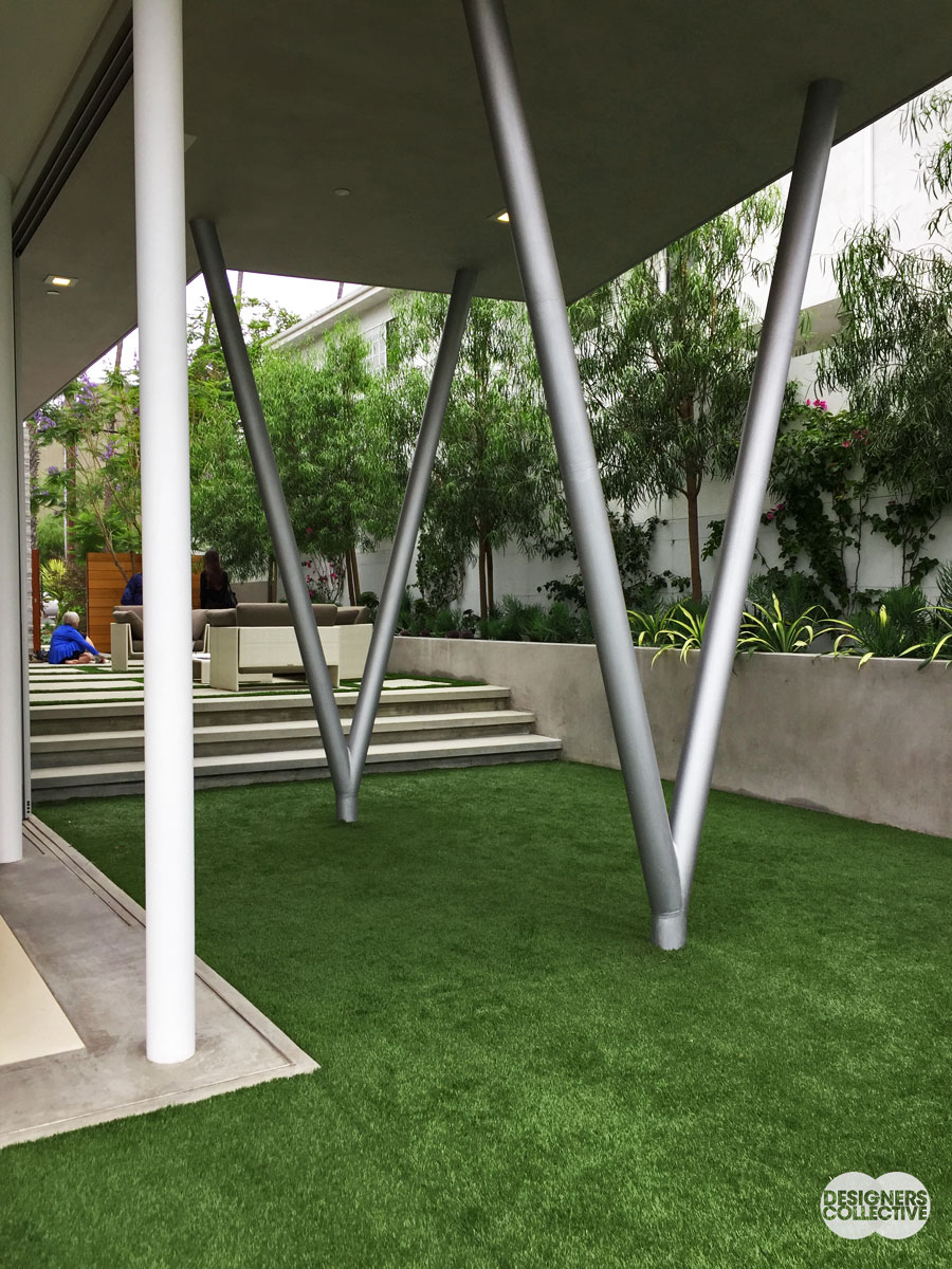
No hiding: these architectural supports blur the boundaries between necessary structure and sculpture. The contrast between the industrial look of the structure with the verdant garden and turf make a compelling composition. The right shapes and material can make all the difference…
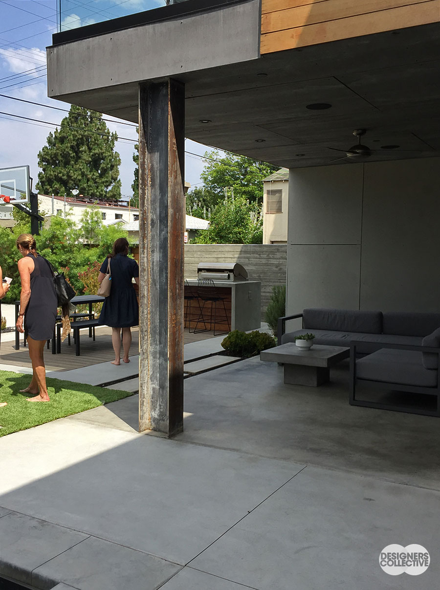
Neo-Industrial: We did notice a nod to industrial materials and finishes during our home tours; we love how this H-beam complements the angular structure of the balcony, the modern patio furniture, and the outdoor kitchen area.
No cover-ups: The reveal replaces the baseboard. A bit of shadow created between the wall and floor is a clean delineation between the two surfaces. Quasi-industrial and a little bit art gallery, the reveal is a subtle way to make a modern statement…
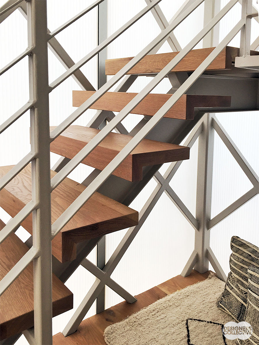
Up we go: A staircase is an opportunity to celebrate the architecture of a home– here we have strong modern lines paired with a mix of materials in a neutral palette. The bold geometry of the structure is echoed in the glass wall behind, which also provides ample natural lighting. Form and function are perfectly balanced…
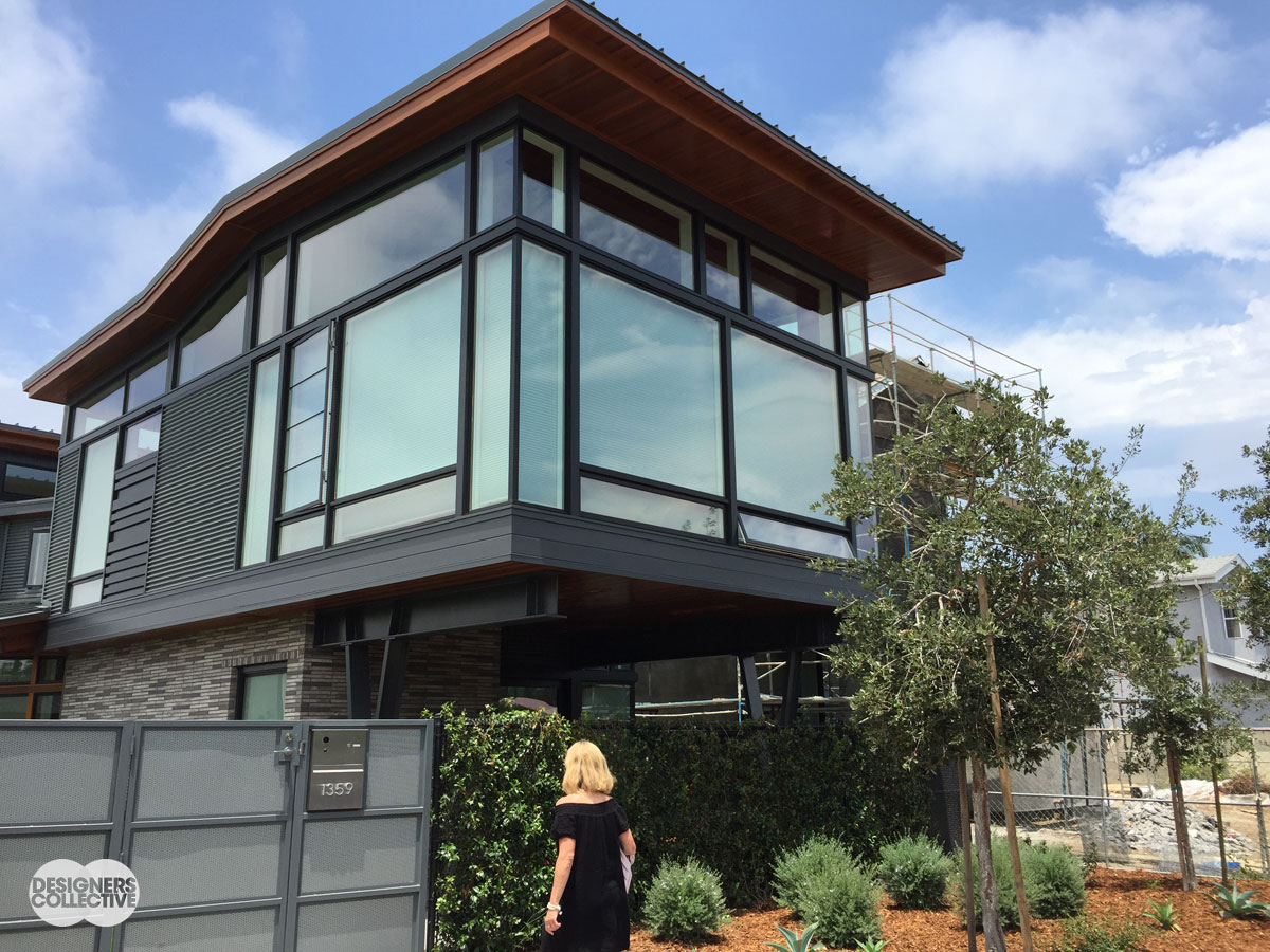
Cantilever revisited: The second story of this home extends out in a classic cantilever, creating a covered patio area beneath. In addition to being a bold architectural choice, it’s also a great way to add some square-footage without sacrificing outdoor space…
4. Wallpaper: Same decorative concept, whole new look
If you haven’t jumped on board the modern wallpaper train—buy your ticket already! We saw a lot of great examples of wallpaper that felt fresh, design appropriate, and very modern on our tour. There’s nothing wrong with a great coat of paint, but the right wallpaper can look absolutely dynamite and add a ton of personality to the space. We saw paper used as a feature wall and a whole room; use it a little or use it a lot, but don’t for one second think wallpaper is old-fashioned and dingy! Here’s why:
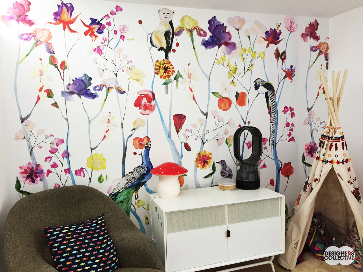
Storybook look: This child’s bedroom gets a playful punch of colour (…make that colours) with a papered feature wall. We love the hand-painted feel of this design and it’s dash of whimsy that’s echoed in the mushroom lamp and embellished play tent…
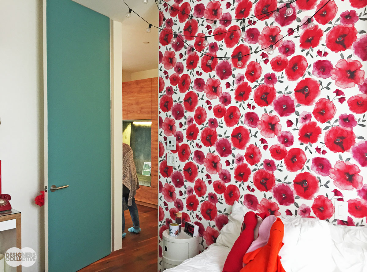
Good morning: In a way this is the ultimate headboard– they opted for a field of poppies as a bold feature wall. How sweet is the addition of string lights? A new way to bring a little outdoors in…
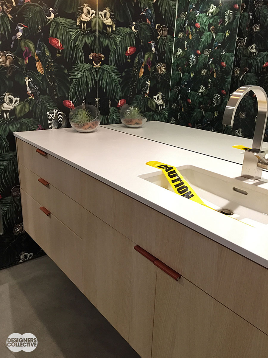
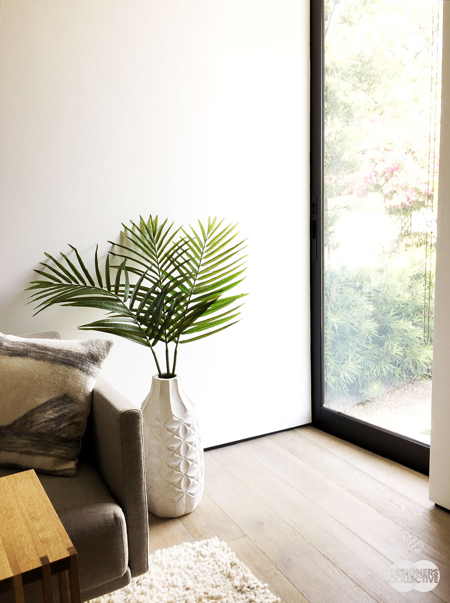
Wild: This exotic darker paper is contrasted with reflective finishes and cabinetry. We love how the wall-to-wall mirror extends the wallpaper’s pattern creating an optical illusion of extra space. (PS. Notice the leather hardware on the vanity?)
5. New Eclectic: Personality in stylish doses
When touring these homes we really got a sense of the type of person that lived there—that’s a sign of great design. It’s your space after all! Why not use it to showcase who you are ? We saw a lot of fantastic examples of art, architecture, furniture, and other touches that spoke to the aesthetic of the homeowner and showcased both style and personality. A few touches were more unexpected than others (heavy ornate gold mirror in a fresh, modern bathroom anybody?); however, these eclectic combinations look great and add a bit of fun to a modern space. We saw a few pieces that deviated from the design ‘theme’, but looked great in the space as they added some visual interest and a ton of personality. The main take-away is: eclectic works and pieces will ‘fit’ because they’re yours not because they’re on theme.
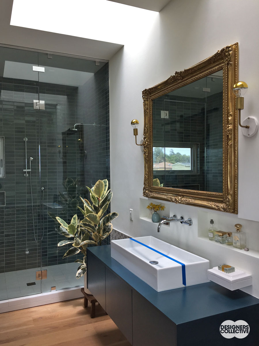
Splash of grandeur: A bathroom with a neutral palette and simple lines is contrasted by the gilt-framed mirror. The gold tones from the frame are picked up in the sconces, perfume bottles above the sink, and even the warm wood flooring– don’t be mistaken, this mirror is the star of the show!
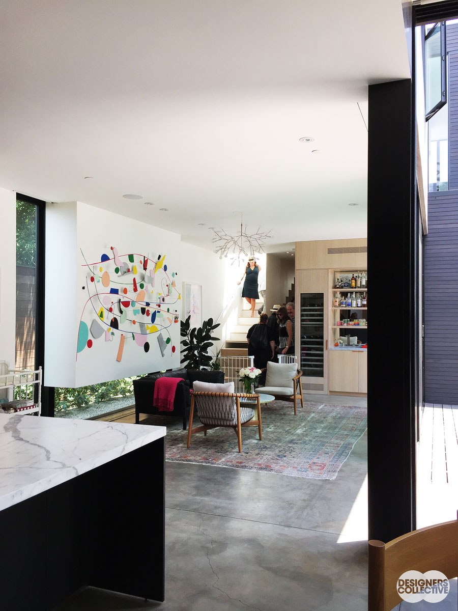
A neutral palette with a few pops of colour tie this space together. A closer look reveals marble is mixed with cement, a persian rug, branching light fixture, and an eclectic mix of furniture. Here the colours and careful editing make the space successful, but it also feels very personal– almost like each piece has a story…
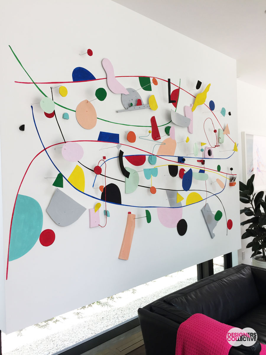
(A colourful close-up)
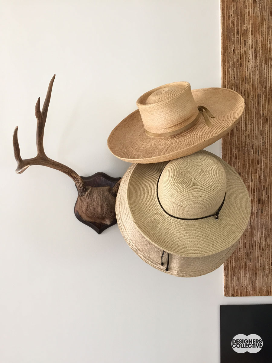
Howdy: The straw hats on the mounted antlers make a really lovely monochrom vignette– we love this dash of wild west in a modern home. This also ties into our other trend of handmade/rustic materials. The focus on texture and colours makes this equal parts decorative and functional…
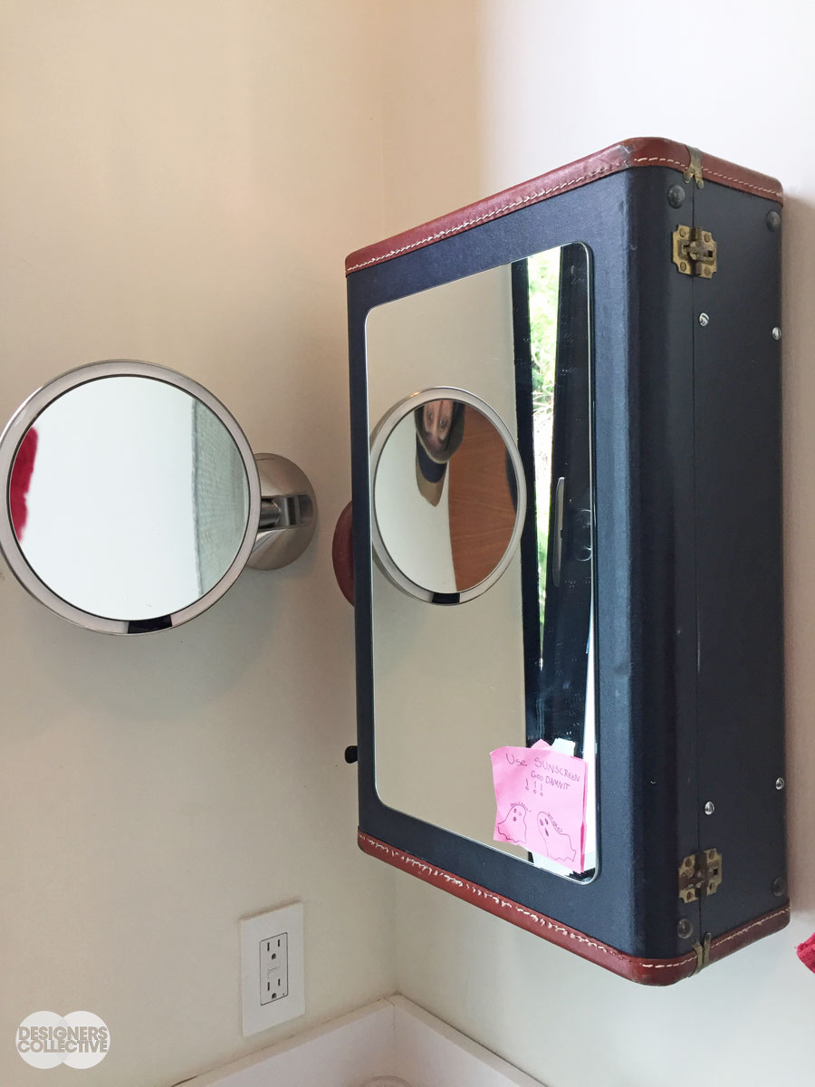
Travelling light: A suitcase as a vanity mirror? Doesn’t seem so out-there when you consider it’s a ready-made medicine cabinet. Full of practicality and personality, this is an unexpected touch that makes the space (that or the post-it with doodled ghosts…)
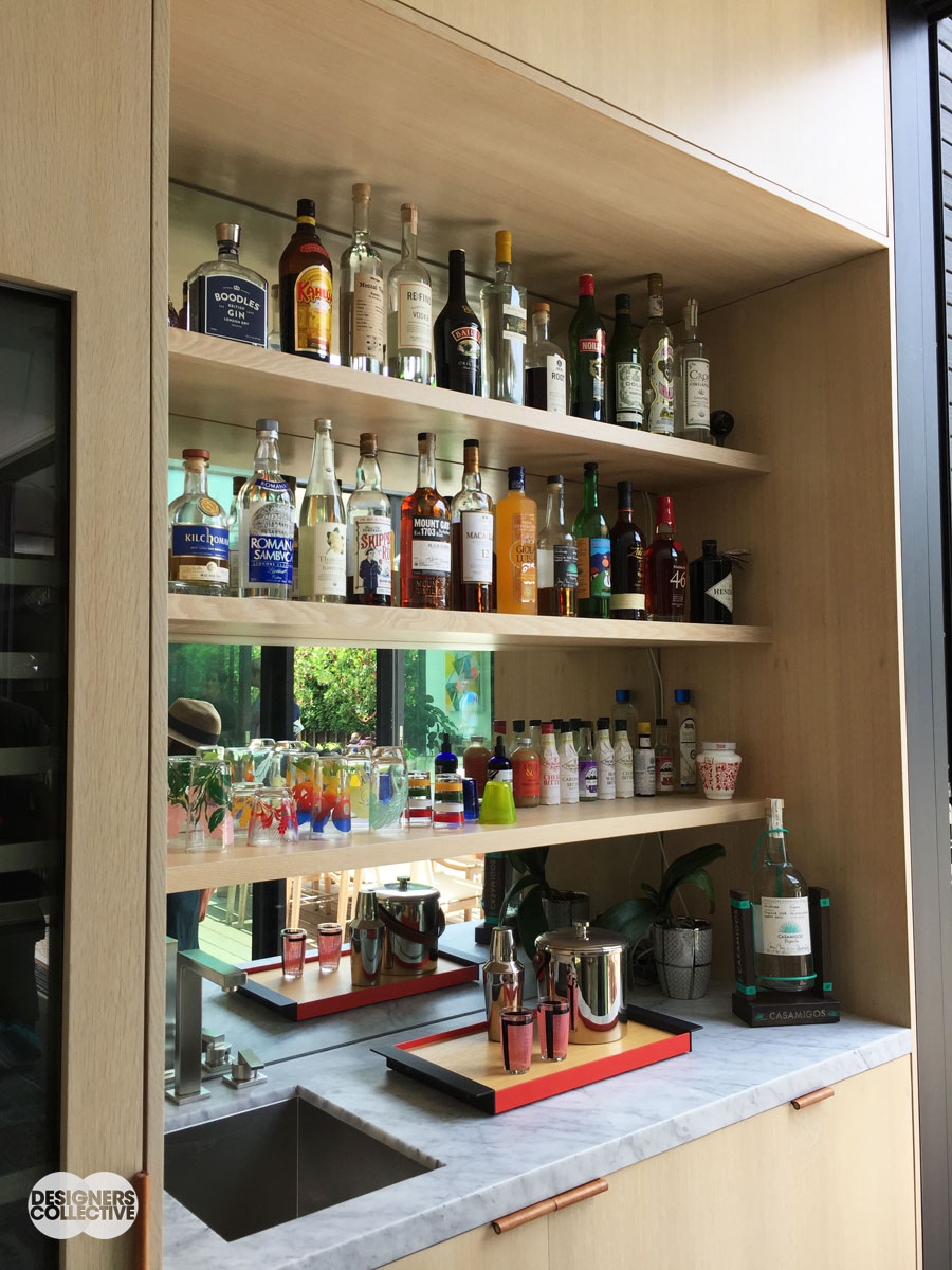
The bar is back: Where else are you going to show off your favourite tumblers? Light wood shelves and cool marble counter complement the mirrored backing, a nod to that classic bar look. Also… Bottles come in all sorts of elegant shapes with interesting labels, so why not use them as a design element as well?
To recap: eclectic style, wallpaper, architectural features, indoor-outdoor living, and handmade touches were front and center during our home tours. If you’re starting a new project, these trends have some staying power so don’t be afraid to incorporate your favourites into your design. If you want some design guidance– give Designers Collective a shout!
There’s more to come from our LA design tour! We had a great time experiencing all that LA had to offer: from the incredible modern art at the Broad to the Dodgers game and of course the home tours, we all came away refreshed, rejuvenated, and full of ideas!
PS. We’re hosting our next design tour in Baja, California, MX. We’ll be exploring the world of photography, image-making, social media, and modern Mexican design– see more details here.
Pingback: The Latest from LA -
May 24, 2018 at 9:03 am