Bringing the Gallery Home
Art galleries.
This particular place may bring to mind a large public institution with cavernous rooms, or something cool and modern on the same street as high-end boutiques, or even an artist-run space filled to the rafters with unique works….
But what about an art gallery at home? Sometimes there is apprehension toward investing in original art. Some questions we’ve come across include: Is there a specific way to display art? Where should I put it? What about my family photos? What kind of art should I buy? Are there “rules” for at-home galleries?
Yes and no. Art (whether you have paintings, sculptures, family photos, or knick knacks…) is a great opportunity to add personality and dimension to a space and there are a million ways to include art in a room. If everyone had large, blank walls with one showstopper piece centered on a piece of furniture (which can look great!) design magazines and inspiration boards would be pretty bland– where’s the fun in that?
The golden rule, if you need a mantra to come back to, is: if you like the way it looks, do it.
Art comes in all dimensions and materials and can be displayed alone, in groups, in nooks, on walls, in bathrooms, within shelving, on tables, in hallways, next to family photos… you could go on. The golden rule, if you need a mantra to come back to, is: If you like the way it looks, do it. Here are two very different examples of presenting art:

This spectacular historic oil painting “Allegory of Sight” by Jan Brueghel the Elder and Rubens hangs in the Museo del Prado. Not everyone will want to hang works above doorways or on ceilings, not to mention scattered on the floor, but there is something ultra-sumptuous about it…

In contrast, there is the minimal-and-high-impact end of the display scale. This work by Eddie Peake is seen at the ultra-contemporary White Cube Gallery based in London, England.
Art and design is all about aesthetics and what you find pleasing. You are decorating your home, so you can play by your rules. Fear not, we do have some general guidelines to help you out before you set off with a bevy of hammers, hooks, and nails to hang your collection (and in the end, remember… if you like the way it looks, do it!)
1. Consider unconventional spaces.
If you have art in your home, chances are the living room, dining room, or bedroom are the first places you will hang it. All great spaces for art, but not the only ones. For something fresh, consider the ‘other’ spaces and rooms. What about your bathroom? The hallway? That tiny corner nook could be a perfect spot for a trio of family snaps….
For example, these smaller works were slotted in with switches, the thermostat, and entertainment mount to transform a tricky and utilitarian wall into a mini-gallery.
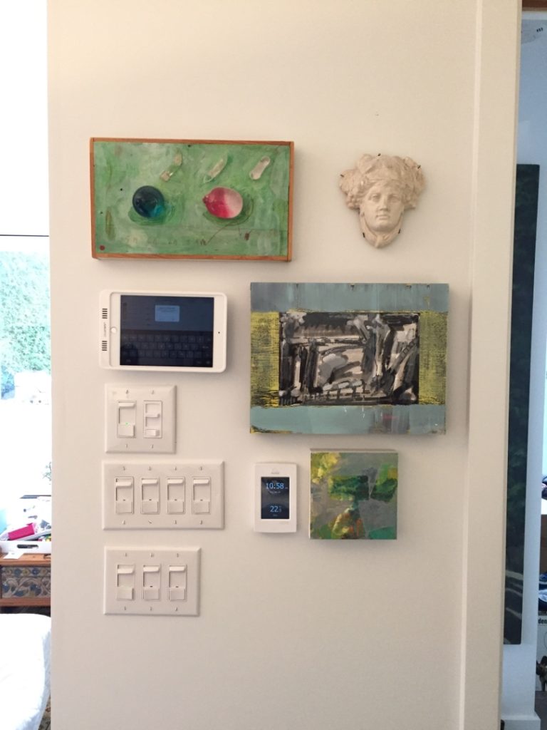
For this project we had fun with the geometry of the switch plates and added some colour with a few smaller art pieces
2. Consider the size of the work
Small works can go almost anywhere and especially work well when you can see them from up close. Spots like bathrooms and hallways, for example, are unconventional but see lots of traffic and provide an opportunity to look closely– versus climbing over couch cushions to see that great snap of your kids. For a bigger impact, group smaller works together. Larger works, on the other hand, perform best in spaces where you have room to step back and admire from a distance –they also command more of the room and will affect the other design elements much more than smaller works). Depending on the size (and materials) make sure that your wall and display hardware (likely hooks) are sturdy enough to support it!
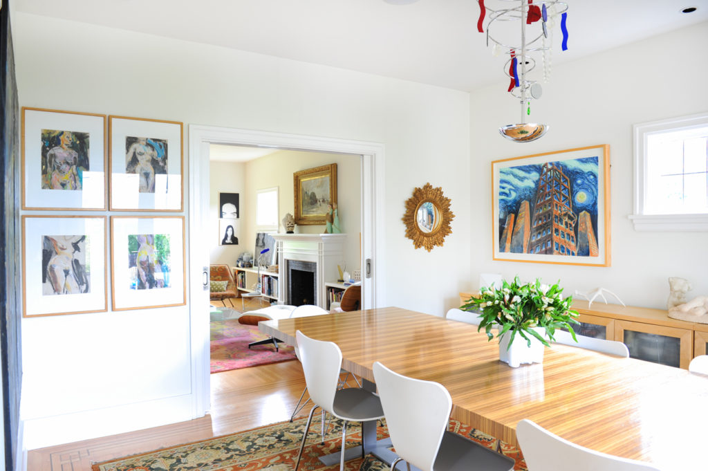
In this project (see the rest of it here) we had a lot of pieces to work with: the small-medium pieces were placed near doorways/transition areas and the larger works are situated above furniture (above the buffet, and the fireplace) where they are framed by architectural elements and can be admired from slightly further away.
3. Consider breathing room
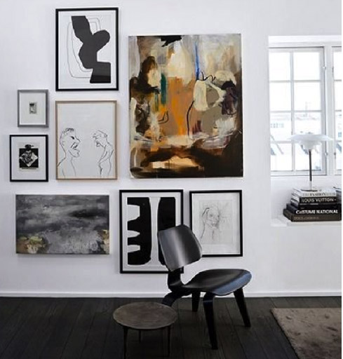
If you are grouping works together or displaying them solo, make sure there is enough breathing room (empty space) between works or other defining elements such as furniture, ceilings, corners, or trim. How much room is right is whatever looks best to you. Consider the display strategies of the Brueghel painting and the White Cube as pictured above– your taste will really determine how much space is ‘enough’ for your gallery area. Other factors, like frames, may effect how much space you give the works. The smaller the work, the less space you will need around it.
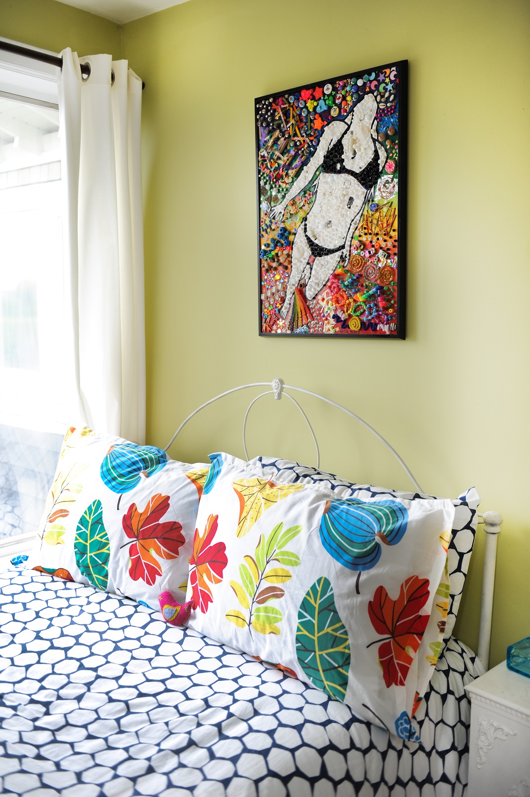
This fun, colourful piece can really hold the wall on its own. It has a lot of space to breathe while colourful bed linens tie the piece into the scheme of the room.
4. Consider testing your layout
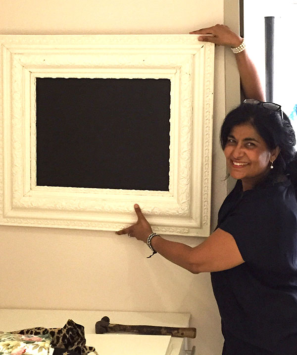
The benefits are twofold: ensuring the layout works, and ensuring you like it. Depending on what (and how many works) you want to display, you won’t know how they look in their surroundings until you test it out. If you have a couple friends to hold works or a piece of furniture to support your desired layout you can adjust breathing room until it is ‘just so’. If possible, check out your layout from different vantage points– you don’t stand still in the same spot all day, so make sure you like it from all angles! Take a photo of each version on your phone or with a good ol’ fashioned camera for an easy way to compare the differences and determine what you like best.
There you have it! No rules, some rules, your rules. Embrace your art and consider every surface in your home as a potential display area. If you like it, do it!
If you have questions about art in your home, let us know! Leave a comment or shoot us an email!


