What is a ‘Colour of the Year’ and Why Should We Care?
What is a Colour of the Year? Who is Pantone and why do we care?
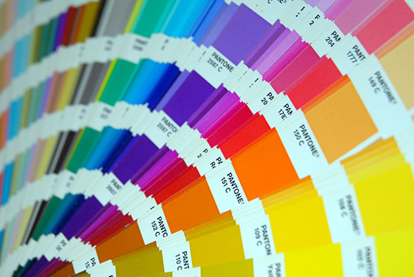
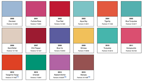
Pantone began as a commercial printing company in the 1950s. Their color-matching system for the print and design industry has become the global standard. They have further cemented their influence by introducing the ‘Colour of the Year’ every year since 2000.
We care because Pantone has a big influence on our life since their choice for Colour of the Year informs designers in graphic design, packaging, branding, fashion and interior design.
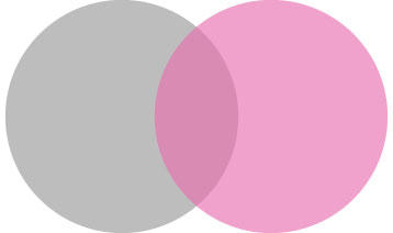
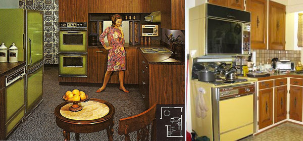
We will often remember important times in our lives by the colors associated with them. We can pinpoint the year certain furniture was produced, or a wall was painted, or an outfit was wornsolely by its colour, Remember those harvest gold and avocado appliances and accessories, from the 70s? Pink and grey was considered a sophisticated color combination in the 80s.
“Twice a year the company hosts, in a European capital, a secret meeting of representatives from various nations’ color standards groups. After two days of presentations and debate, they choose a color for the following year. The results of the meeting are published in Pantone View ($750), which fashion designers, florists, and many other consumer-oriented companies purchase to help guide their designs and planning for future products.” (Wikipedia)
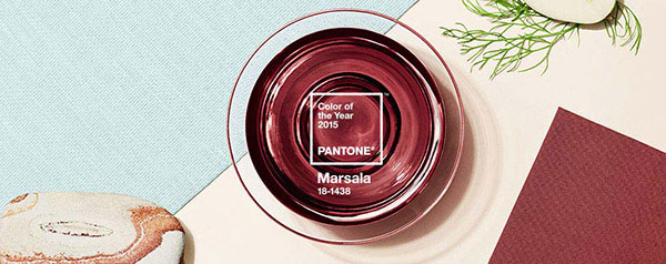
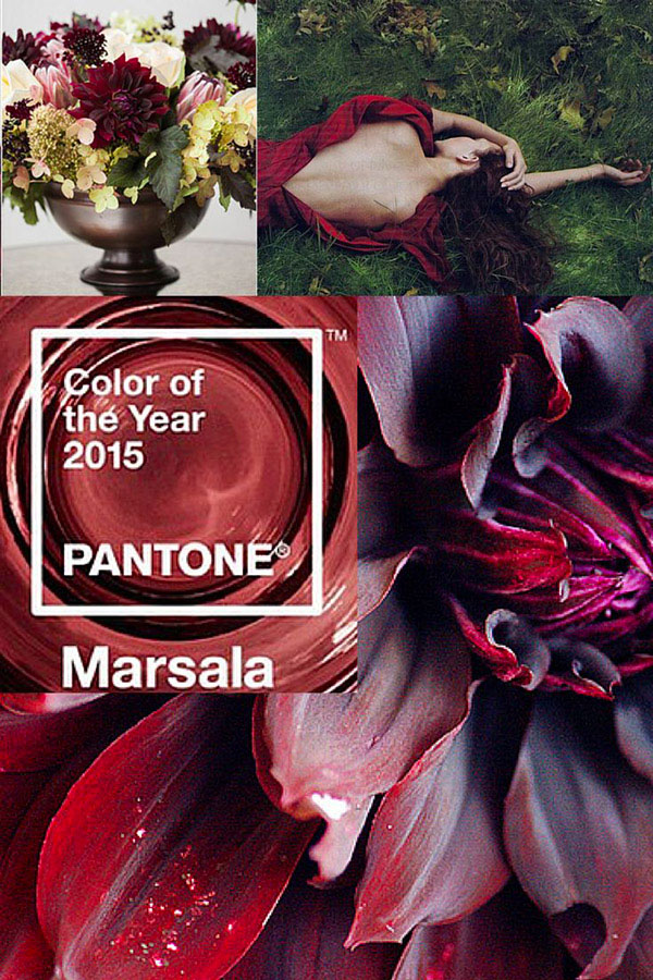
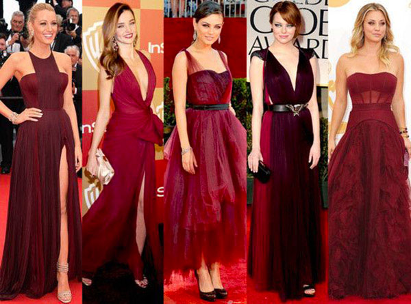
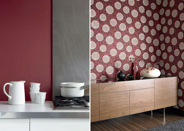
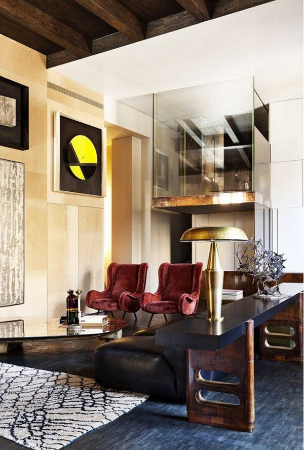
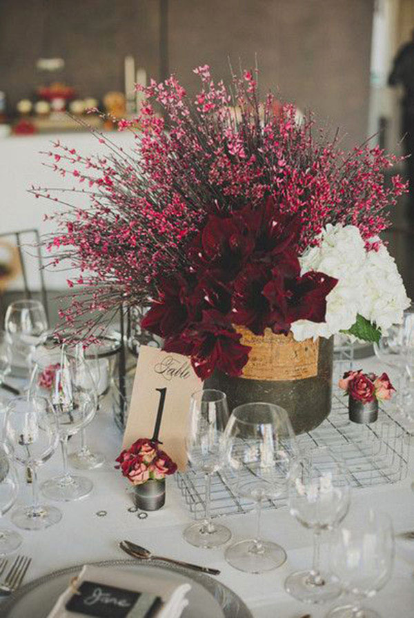
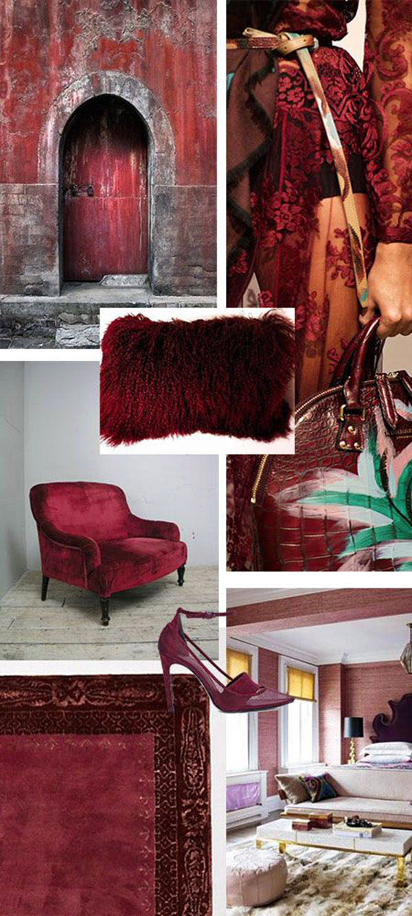
This year’s colour is Marsala. Pantone officials say the colour is already big in fashion and that it goes well with warmer taupes and grays, and umber, golden yellow and turquoise.
So what do colour experts think of Marsala?
The National Post’s experts described the colour, Marsala, as “a ‘tired’ burgundy experts already hate” and
“It’s nice, but it surprises me,” says colour consultant Jean Molesworth Kee, owner of the Painted Room in Alexandria, Va. “We have been veering from red or burgundy wall colour now for years. This has a dusky, earthy quality.” Kee says she could see Marsala used in “an ethnic bohemian place.” She added, “It’s muted and it reminds me of Morocco or of faded old Oriental rugs. It would go nicely with warm, sandy colours and browns.” (National Post)
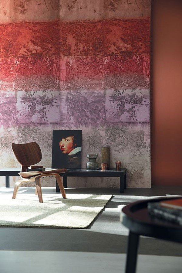
I remember specifying colours similar to Marsala, in the early 90s. The colour has a definite retro, ‘I’ve seen this before’ feel. Initially, I was disappointed with the choice because it felt old fashioned to me, but I must admit I am warming to it. Especially after looking at how its being used by the various design communities.
To me the very fact that there is resistance to this colour suggests that the choice is surprising and that, in itself, is intriguing. After all, if it fit in too comfortably with our existing palette it would hardly be new.
What do you think of Marsala? We’d love to hear from you!
Designers Collective will be offering a Colour Workshop this spring. Check out our workshop offerings.
Many of these images are from Pinterest. Please let us know if you would like us to remove them or if you would like proper credit. Thank you for letting us use them.


WendysHat
January 23, 2015 at 12:07 amI love color of the year because it gives you something to focus on but I find it funny that everyone seems to have their own colors. I’ve seen 3 this year and love them all!
tina
January 28, 2015 at 7:32 pmHello Wendy! Thanks for your comment. I agree there are a few ‘colours of the year’ out there and they are all nice. We are going to look at Benjamin Moore’s Guilford Green (HC-116) next! Revisit us and see what it can do for a home.