Discovering Colour, Inspired by Nature
Last weekend we packed our studio with material samples, inspiring objects, and a gorgeous floral bouquet or two in preparation for our sold out workshop “Discovering Colour: Nature as Your Guide”. For this workshop, Brooke and Tina had the pleasure of collaborating with the multi-talented Heather Ross to take our participants deep into into the world of colour and coach them on how to look critically at colour and how to develop harmonious palettes for their design projects. Armed with delicious snacks and a steady supply of coffee (many thanks to Bigsby the Bakehouse!) our participants floated through an afternoon of multi-dimensional whites, bouquets of green and blush, in addition to a bevy of fabrics and finishes from the Designers’ sample library.
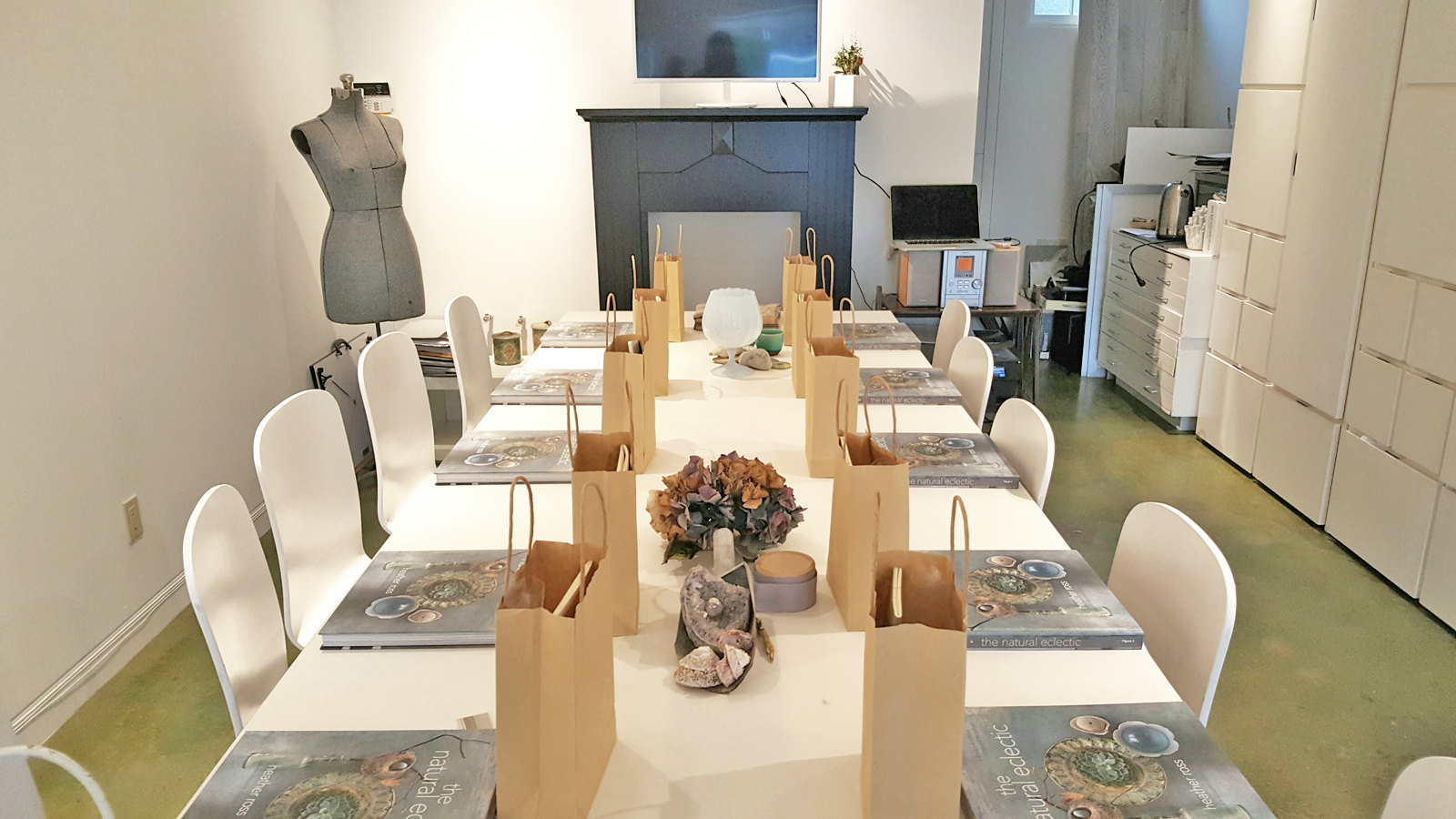
Before our guests arrive: Swag bags and books are set out and a few inspirational pieces from the Natural Eclectic are being arranged
Colour is one of the most complex elements of design– it can transform depending on light, surface quality, and surroundings (not to mention everyone sees and reacts to colour in a different way). Our colour-focused morning began by opening up the floor to our participants, inviting them to share their own colour experiences and what they hoped to gain from the workshop.All of our participants expressed that at least once in their home they had come across a challenging colour situation. Sometimes it was a palette that looked great on paper but translated very poorly in the space, others shared frustration with simply choosing a paint colour or figuring out how to freshen up a space without tearing down all the walls and starting from scratch.
Enter the experts!
Heather Ross led the first portion of the workshop. Known for her absolutely dreamy West Coast-inspired palette (on display in her recently published book ‘
natural eclectic‘) she showcased some of her favourite colour families and walked our participants through her process of working with colour. Using objects sourced from her boutique, gorgeous florals (courtesy of
Quince Fine Florals), and pages from her book she demonstrated how to pull colours and develop palettes from various points of inspiration. She presented our participants with a copy of her book and a healthy supply of curated paint chips that spoke to her favourite colours (namly a beautiful Mullosk Blue) and personal colour story.
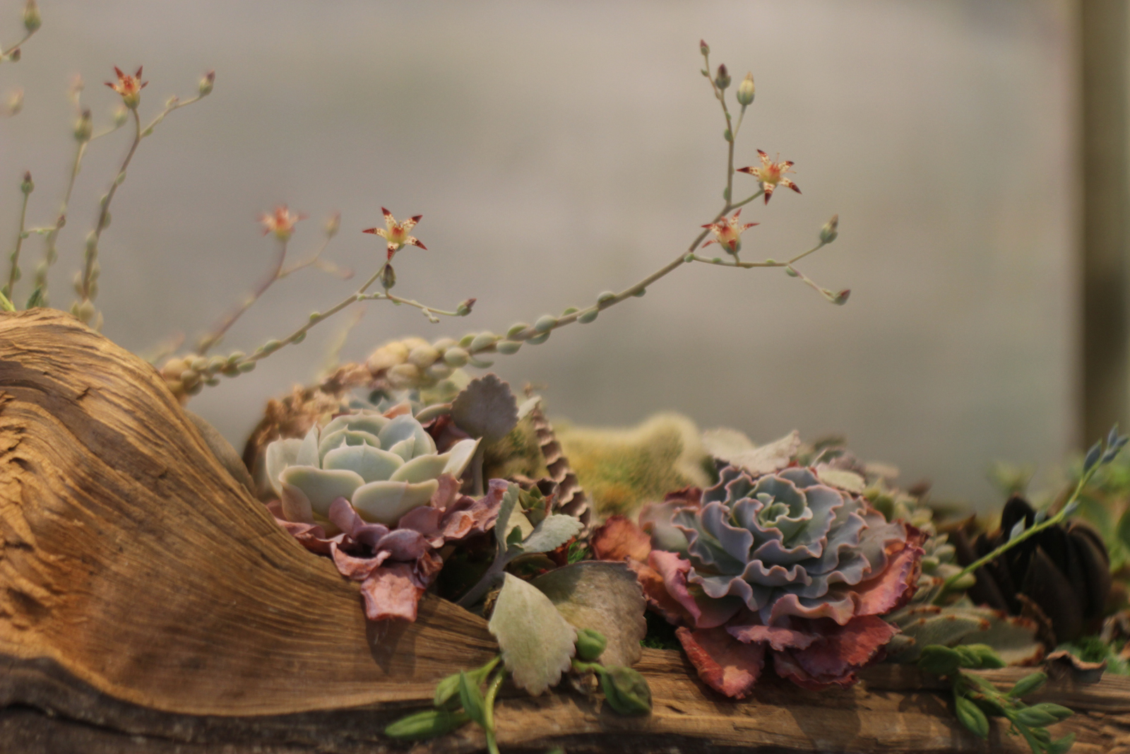
Our driftwood planter filled with succulents provides a beautiful natural palette for our participants to explore
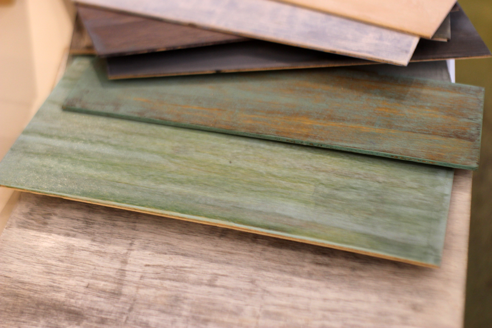
Similar tones from the succulent planter are drawn out in these flooring samples provided by Heather Ross
One of the most practical elements of Heather’s talk was the emphasis on the language of colour. Most of our participants agreed that colour descriptors are almost as numerous as the colours themselves; by honing in on a few key phrases, the entire table was able to communicate and identify the qualities of the colours we were looking at. Using simple words such as muddy, clean, warm, and cool was key to cutting out a lot of confusion that comes with using vague buzzwords (e.g. “Bold” bold what? is it dark or bright? saturated? Many people may consider different qualities to be bold…)
Heather’s advice: Certain colours will resonate with you and you will always gravitate towards particular tones and colour families. Use that as a guide to create your own palette and use that palette as a reference for any new project. If you get stuck, nature knows best and is a great source for inspiration.
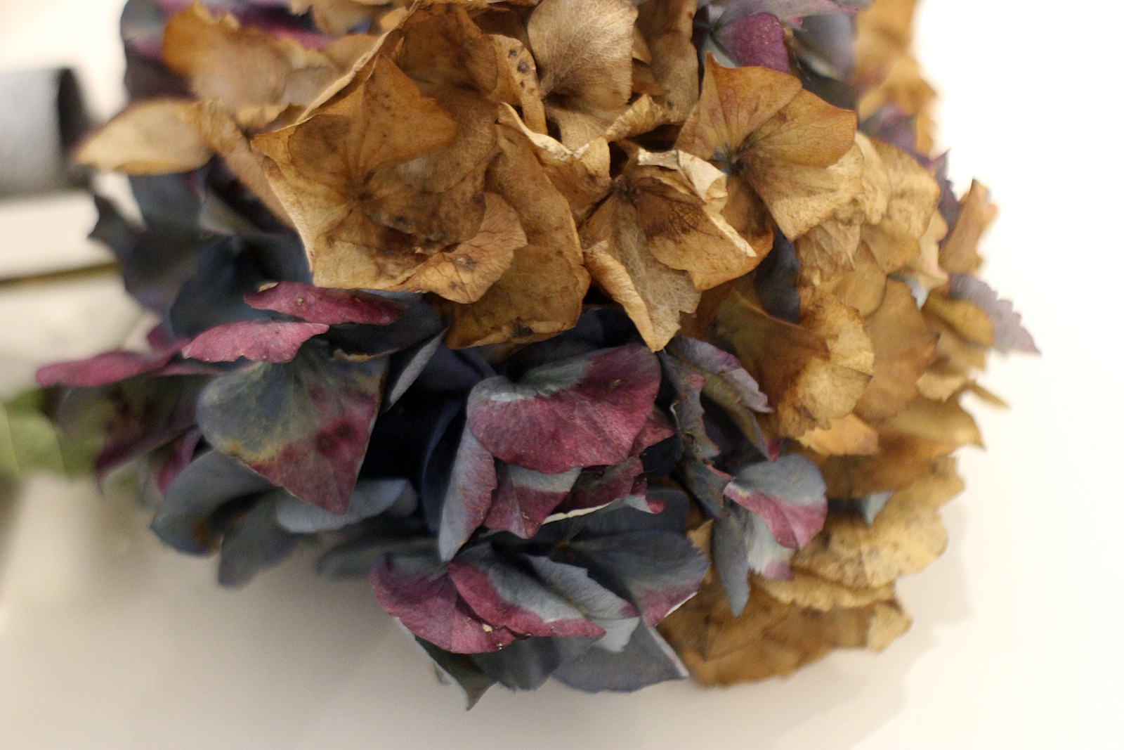
This partially dried hydrangea offers a range of hues— neutral brown and beige are a natural fit with rich blue and purple
Before breaking for lunch, we looked at some high-tech ways to capture colour. Many paint companies have fantastic mobile apps that use your photos to create customized palettes complete with colour codes that refer to paints from their collection. For our workshop we used the Sherwin-Williams ‘ColorSnap’ app (there is also a Benjamin Moore version called ‘Color Capture’) to experiment. It was great to see what kinds of palettes we were able to pull from our surroundings.
The main takeaway is: apps are a great tool to use as a jumping-off point (especially if you have a great inspiration photo), but keep in mind colours will always present themselves differently on a screen–be sure to test, test, test!
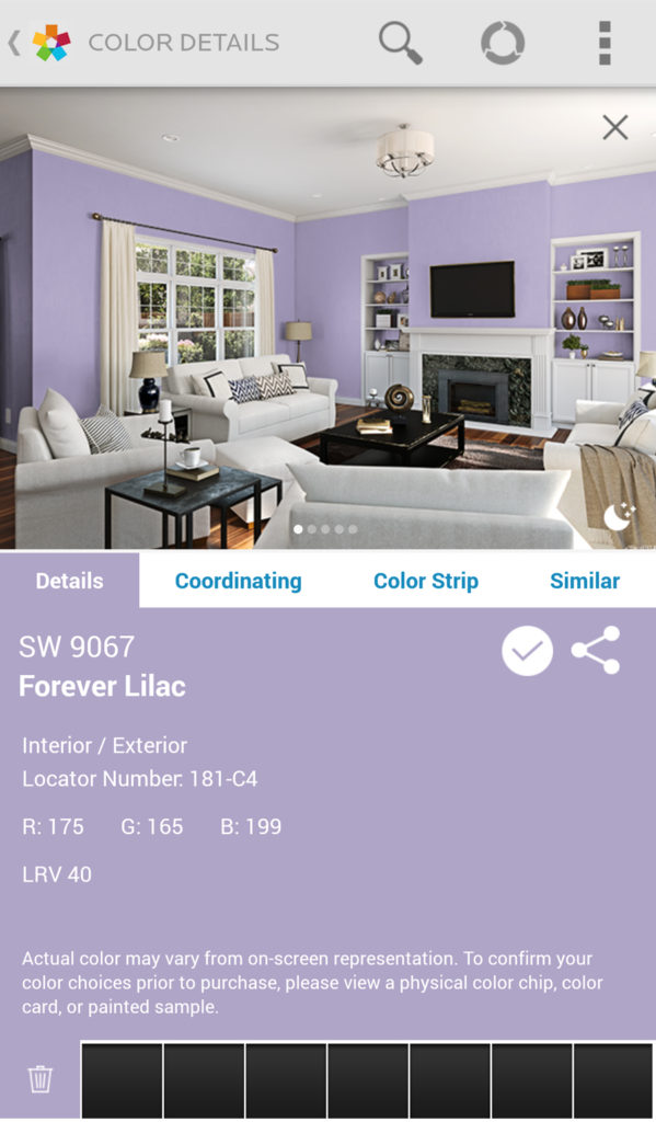
Exploring purple with Sherwin-Williams
After a delicious lunch provided by our favourite local eatery (Bigsby of course!), Brooke and Tina presented their portion of the workshop: how to create a comprehensive design palette with paint, finishes, and accents. When designing for a space, things other than paint come into play and a palette will extend into flooring, textiles, furniture, knick-knacks , art, and more! By looking at photos pulled from design websites and google searches our participants worked out how to identify why certain looks “worked” and why others fell short–focusing in on the elements that made the design successful. Brooke also highlighted how each room will have a focal point or “boss”. The “boss” of the room could be a pattern, bold colour, or architectural feature. The trick to dealing with a boss? Embrace it! If too many “bosses” are in one space they end up fighting each other instead of working together.
Many photo comparisons later, our participants were comfortable evaluating the pros and cons of certain palettes and material combinations. By using limited language to describe the qualities of the colours and finishes (new lingo alert!) as well as honing in on what the “boss” of each design was, our group was ready to move on to a more hands-on experiment. We invited the participants to peruse a table full of items from the Designers Collective sample library (stones, paints, fabrics, papers… and more!). It was now their turn to put their knowledge to the test– developing palettes and playing with different combinations of materials. This was a great exercise to see how pairing different hard finishes with wall colours created different moods and pulled different tones out of the materials.
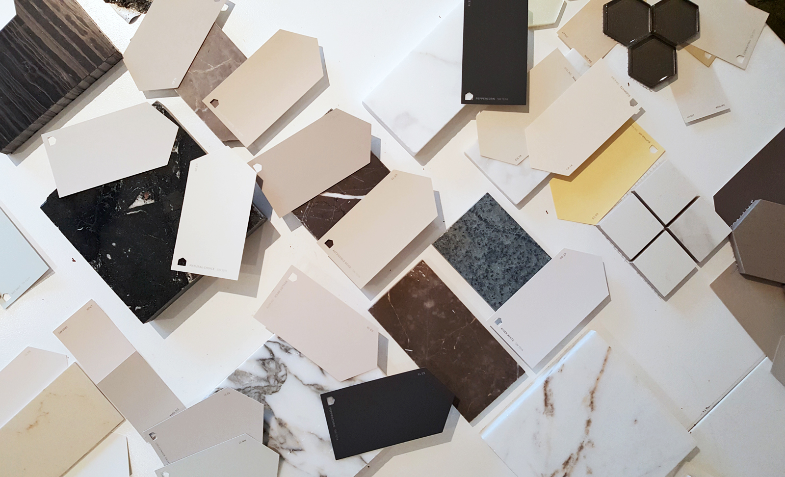
A few materials our group got to experiment with! Mixing and matching on a small scale is a great place to develop ideas and play with colour
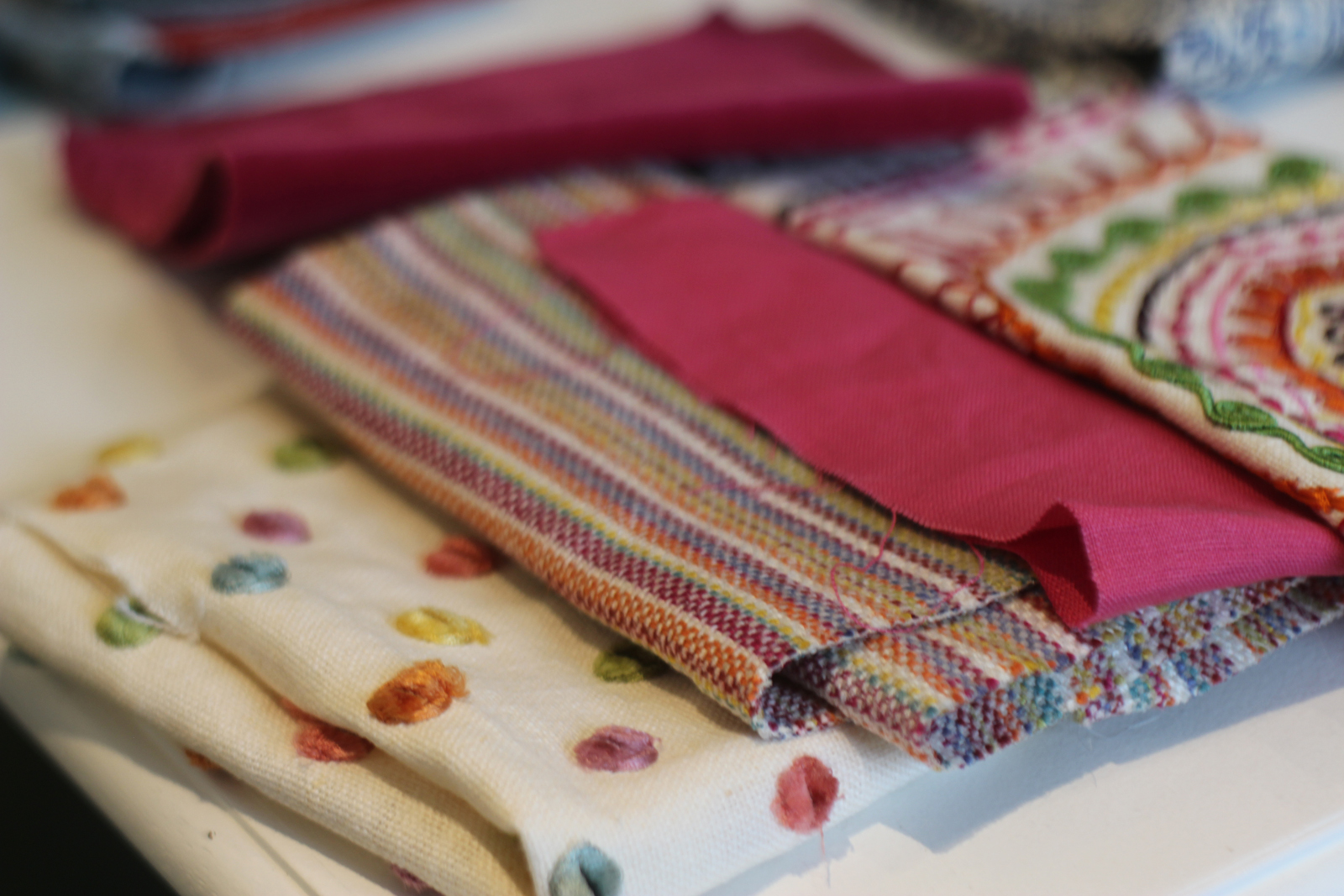
Some of the fabric samples: This is a lot of colour and pattern, but as 3 of 4 samples share the same creamy-linen background (and a similar overall palette) they create a bold and harmonious grouping
Brooke and Tina’s words of advice: It’s easy to get caught up with wanting every ‘cool’ finish and material when starting a new project. At the end of the day, it’s smarter (and less costly!) to be adventurous with items that can easily be replaced– a trendy wall colour or throw pillow is easier to update than changing out a kitchen with 5 types of tile and 4 kinds of marble. (Be mindful of what the “boss” of the space is!)
We had a fabulous time working with our participants and sharing a bit of our know-how with them! If you have photos to share or questions about your space,
we’d love to hear from you!
If you wish you could have attended this event– check out our
events page for upcoming classes and design tours…