


The Palette Project #1: Jack Poole Plaza
Today marks the first day of our Palette Project!
It all started like this: back in April, we collaborated with our friend Heather Ross to host a workshop on colour. We had a great time discussing colour palettes, why some things work and others don’t, and making palettes of our own. One take-away from that workshop was that inspiration is quite literally everywhere—but choosing what colours to use can be tricky… Finding a balance between bright and dark, bold and soft, or neutral and punchy can be a challenge and often takes a bit of trial and error to hone in on your final colours.
Creating palettes with finishes, paint chips, and tiles at our colour workshop. Read about our fun day playing with colour here
After seeing fantastic results (and hearing great feedback!) from this workshop we thought about how we could continue working with colour in a new way. We deal with palettes and colour boards all the time with clients and for our own projects, but sometimes when you do something for work it just doesn’t seem as enjoyable! We brainstormed how we could make colour fun for us and more accessible for you… The result? Two new projects!
The first will be announced on September 1, 2017 (keep your eyes and ears open!), and the second is this: a new, weekly blog series where we’ll talk about colour and share some of our palettes with you.
All projects need inspiration or an anchor point– ours? That’s something very near and dear to us… Canada!
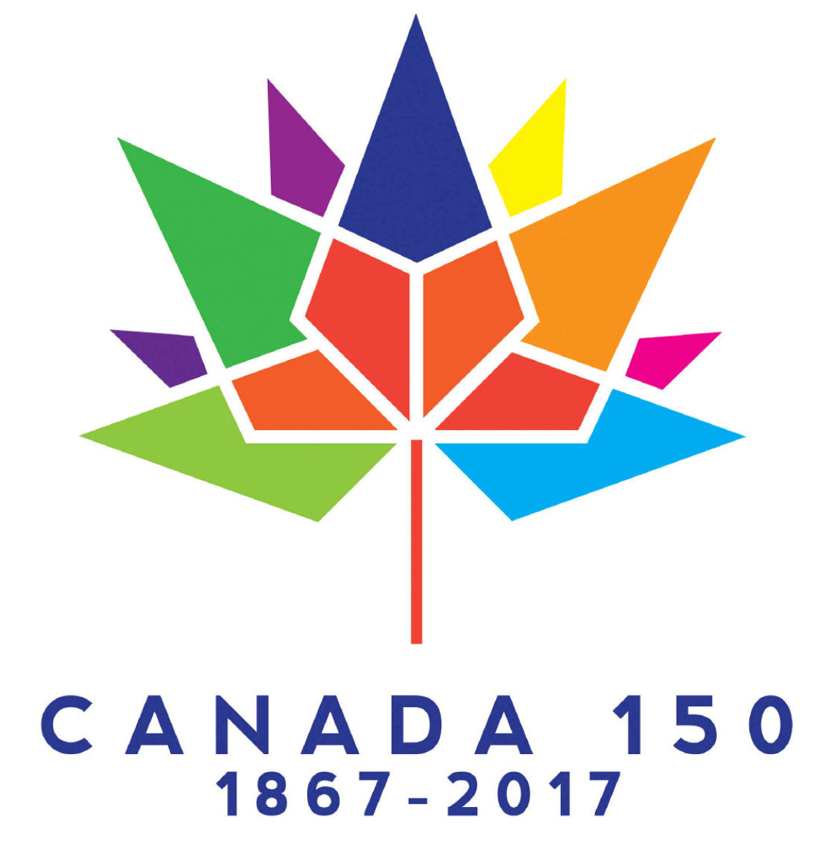
The Canada 150 Logo, designed by Ariana Cuvin
Well you sure cannot escape the Canada 150 celebrations, it’s a big year afterall (sesquicentennial if you’re feeling fancy). So what does this anniversary mean? What is a Canadian?
Overwhelmingly we thought about how the physical landscape of Canada connects us all. This country (though only ‘officially’ 150 years old) has been inhabited for thousands of years. From the First Nation peoples, to the European explorers, and to today’s society that’s made up of innumerable ethnicities, religions, and even languages— the common denominator has always been this beautiful landscape we are so lucky to call home. So why not use Canada as our inspiration? Every Sunday we will be releasing a new palette inspired by a different location in Canada. From sea to shining sea, we will cover as much of our 9.985 million km2 as we can.
So let’s get going!
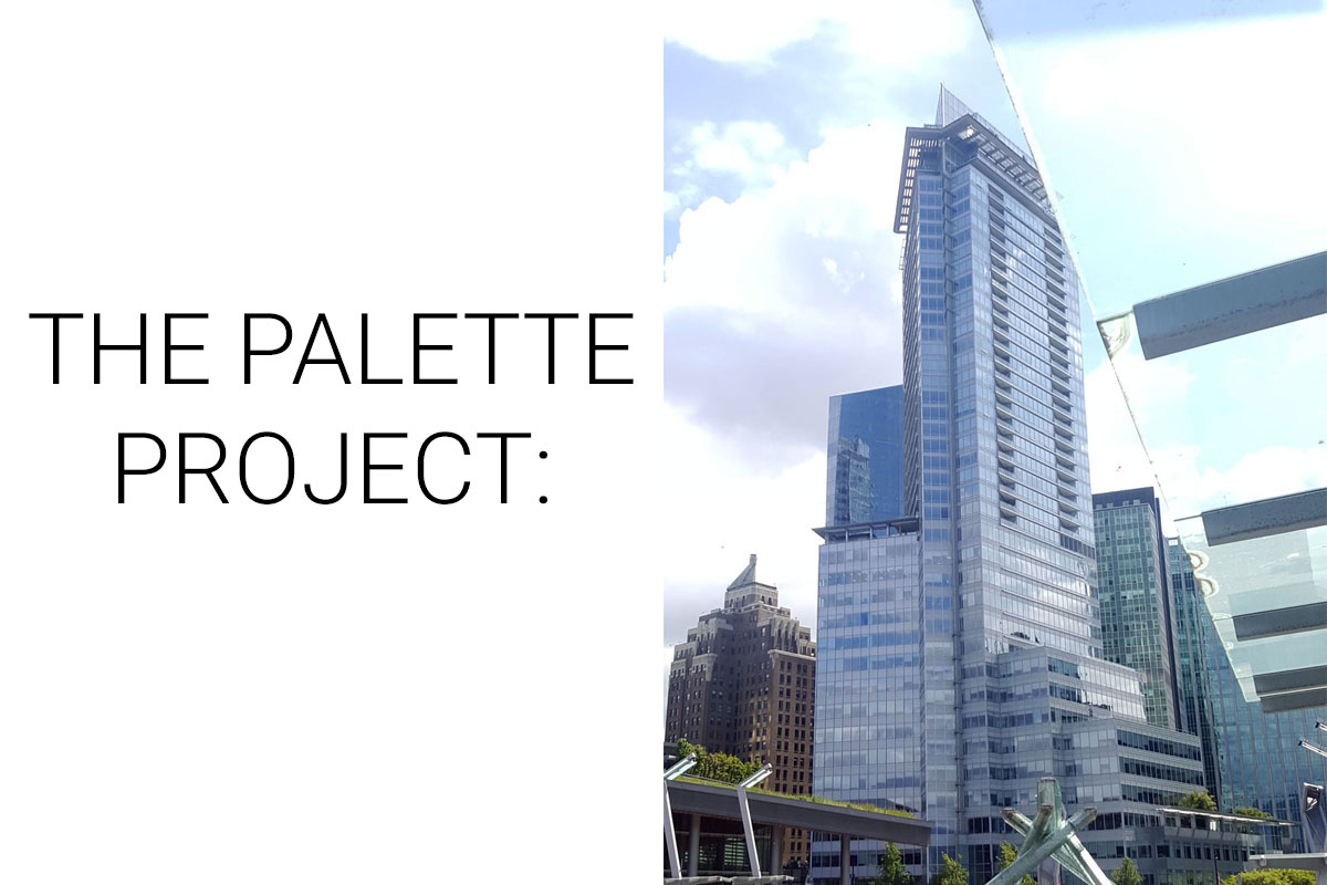
For our first palette we’ll be looking at our hometown, wandering down to where the waterfront meets the city. Jack Poole Plaza connects the seawall, convention center, and downtown Vancouver. It is the current site of the Olympic cauldron from the 2010 Olympic Winter Games… and also serves as the perfect sunny day spot to have to gelato or watch the seaplanes take off and land. Looking towards downtown, you can see why Vancouver is called the ‘city of glass’; rows of glass towers dwarf Vancouver’s original stone skyscrapers. On the left hand side of our photo you can see the c. 1930’s Marine Building coming mid-way up the glassy 3 Harbour Green Building. Art deco meets ultra-modern.
The Inspiration:
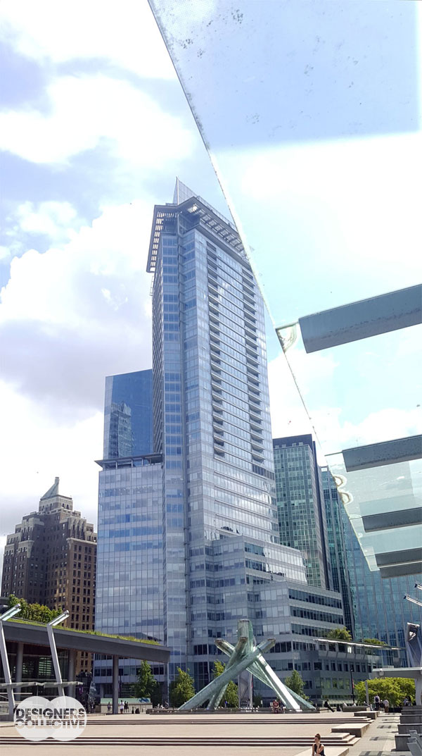
Jack Poole Plaza: Photo by Designers Collective
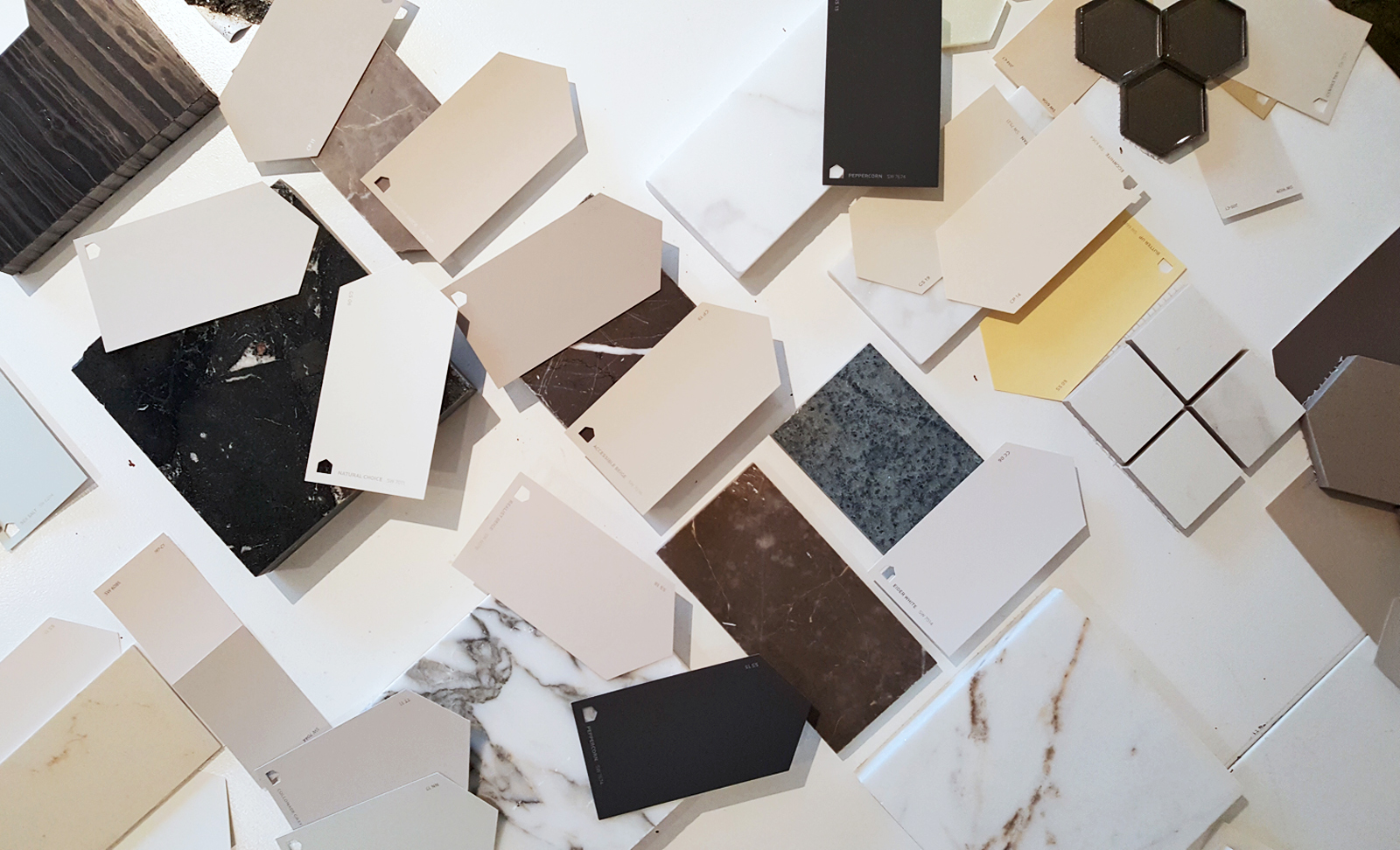
The Palette:
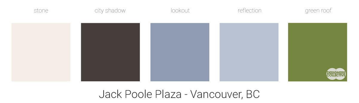
We built this palette out of blues, greens, and neutrals that share similar cloudy undertones. A majority of our downtown core is made of glittering blue glass, mixed with the ocean and blue skies (or rainier days) these watery tones permeate our city. Our urban rainforest is also the perfect spot for green walls, planted boulevards, and public gardens making green an essential colour to include. Our light and dark neutrals can be found in stonework, streets, shadows, and reflective highlights of Vancouver. All of these colours present as neutral, making them good companions for bright accents and bold signature pieces. It’s a cool-toned palette made for Vancouver.
Next Sunday we’ll have new inspiration and new colours to share with you! Each of these palettes is created by Designers Collective and we encourage you to use them for inspiration! If you are interested in purchasing a palette, with paint colour identifications, get in touch with us at our studio: Email studio@designerscollective.ca or visit us at 2885 W 33rd Ave, Vancouver, BC.