


The Palette Project #13: Prince Edward Island
This is another edition of the palette project– we’re exploring inspiring places in Canada and the colours that make them beautiful.
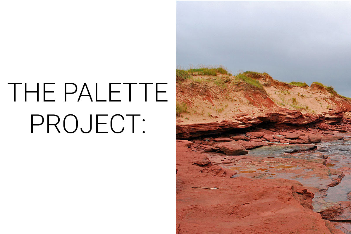
For this week on the Palette Project we’re heading east to PEI. The smallest of the Canadian Provinces, Prince Edward Island is home to rolling hills, charming communities, iconic red beaches, and of course Anne of Green Gables. Our inspiration photo comes from Cavendish Beach in PEI National Park– though it looks gorgeously wild (and it is!) we were lucky to get a shot without tourists scrambling over the iron-rich rocks! We can see why it’s one of the most popular viewpoints in the province… We were lucky enough to see these beaches on a cloudy day as the pewter-coloured sky is reflected in the ocean highlights the rich red of the rocks and the vibrant green of the beach grass. No filter, no problem!
The Inspiration:

The Palette:
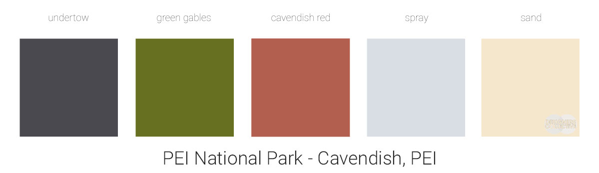
It’s interesting how a photo that evokes the wild east coast of the country can result in such a beautiful, calming palette. This was probably one of the easiest palettes to create as every colour pulled coordinated so well! We had to narrow things down and chose to go with touchstone hues from our inspiration photo: undertow from the grey-blue sky and ocean, green gables from the ocean grass, cavendish red from the iron-rich rocks, spray from the sun-backed clouds, and sand from… well the sand. The shared undertones are a bit muddier and err on the side of neutral. Emphasize the lighter tones and this could be perfect for a bedroom, focus on the richer, darker tones and a living room or library could find itself inspired by the east coast. While the blue hues act like a denim (ie. neutral) a blue-gray or white wouldn’t be misplaced if you’re seeking additional neutral tones. Let your own preferences and instincts be your guide!
Next Sunday we’ll have new inspiration and new colours to share with you! Each of these palettes is created by Designers Collective. We encourage you to use them for inspiration! If you are interested in purchasing a palette, with paint colour identifications, get in touch with us at our studio! Email studio@designerscollective.ca or visit us at 2885 W 33rd Ave, Vancouver, BC.