


The Palette Project #14: Tofino
This is another edition of the palette project– we’re exploring inspiring places in Canada and the colours that make them beautiful.
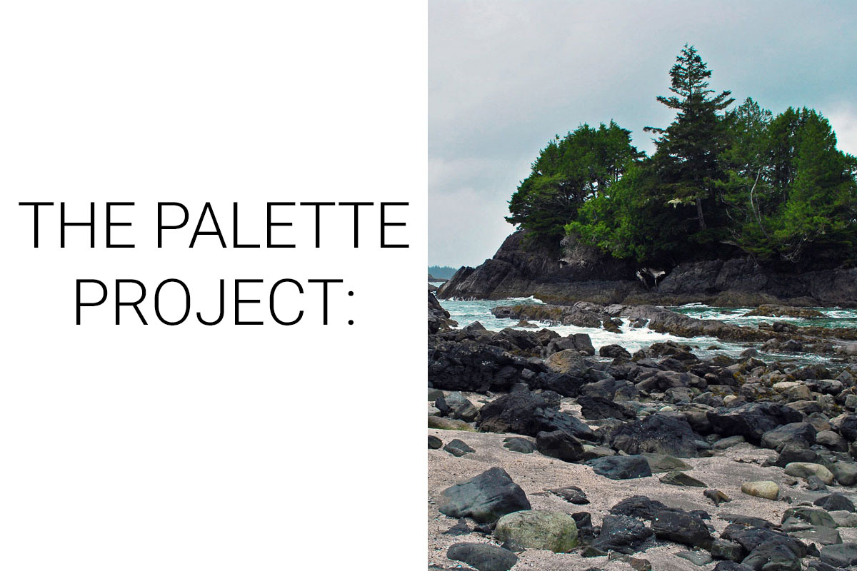
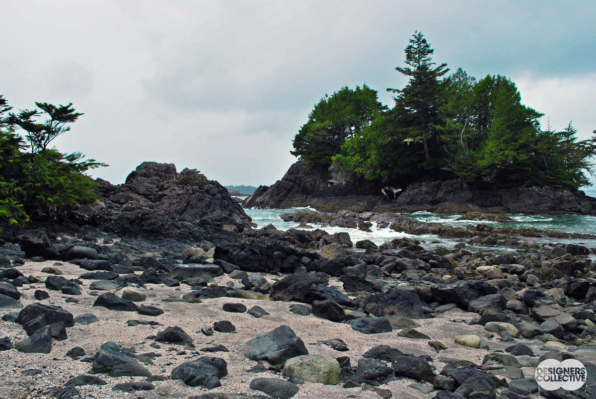
Last week we travelled to Atlantic, so this week we decided to hop across the country and visit the Pacific. Tofino is a dream for everyone from surfers to storm-watchers to seekers of that perfect instagram post. Located on the west coast of Vancouver Island it boasts a rugged coastline, old growth forests, and a picturesque community that make for a million great views… and then some! Our inspiration photo was snapped during a light drizzle in early spring. The stormy skies contrast the rich green of the Canadian rainforest and highlights the craggy coastline. The vistas surrounding Tofino have attracted artists from across the country eager to capture images and impressions of the untamed coast. If you have had your fill of walking along stormy beaches, the community of Tofino offers world class food, an extremely popular local brewery, art galleries, and much more to satisfy all your senses. The colours of Tofino is just one souvenir you can bring home.
The Inspiration:
The Palette:
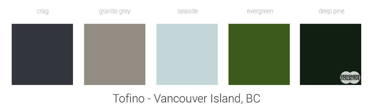
The cool tones of Tofino, once distilled into a palette, create a soothing array of blues, greens, and greys. We just love this combination. When you have a palette as tonal as this one you have a lot of flexibility to play with textiles, patterns and finishes. We decided to focus on the deeper colours from our inspiration photo to highlight the richer tones in a photo dominated by greys and sandy beige. Colours like crag or deep pine have just enough saturation to read as a neutral but not too much as to dominate the palette. Cool tones like this are great to pair with trendy finishes like leather and brass.
Next Sunday we’ll have new inspiration and new colours to share with you! Each of these palettes is created by Designers Collective. We encourage you to use them for inspiration! If you are interested in purchasing a palette, with paint colour identifications, get in touch with us at our studio! Email studio@designerscollective.ca or visit us at 2885 W 33rd Ave, Vancouver, BC.