


The Palette Project #15: West Coast Alpine
This is another edition of the palette project– we’re exploring inspiring places in Canada and the colours that make them beautiful.
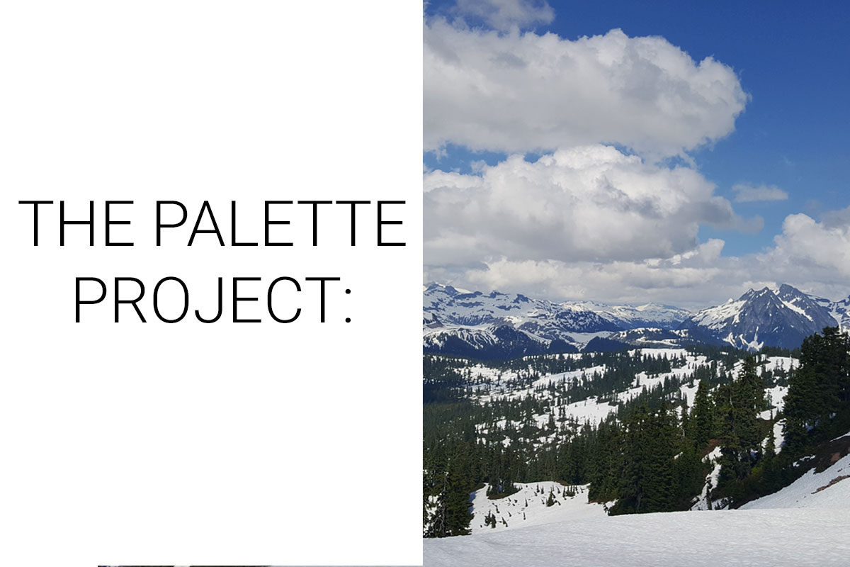
This week on our palette project we’re celebrating winter. Not to get poetic, but the winds of winter have blown through Vancouver—sub zero temperatures and even a little bit of snow came to visit us here on the west coast. However you cope with winter weather, either curled up insider with blankets or eagerly counting down the days until the ski hills open, we all appreciate a classic Canadian winter.
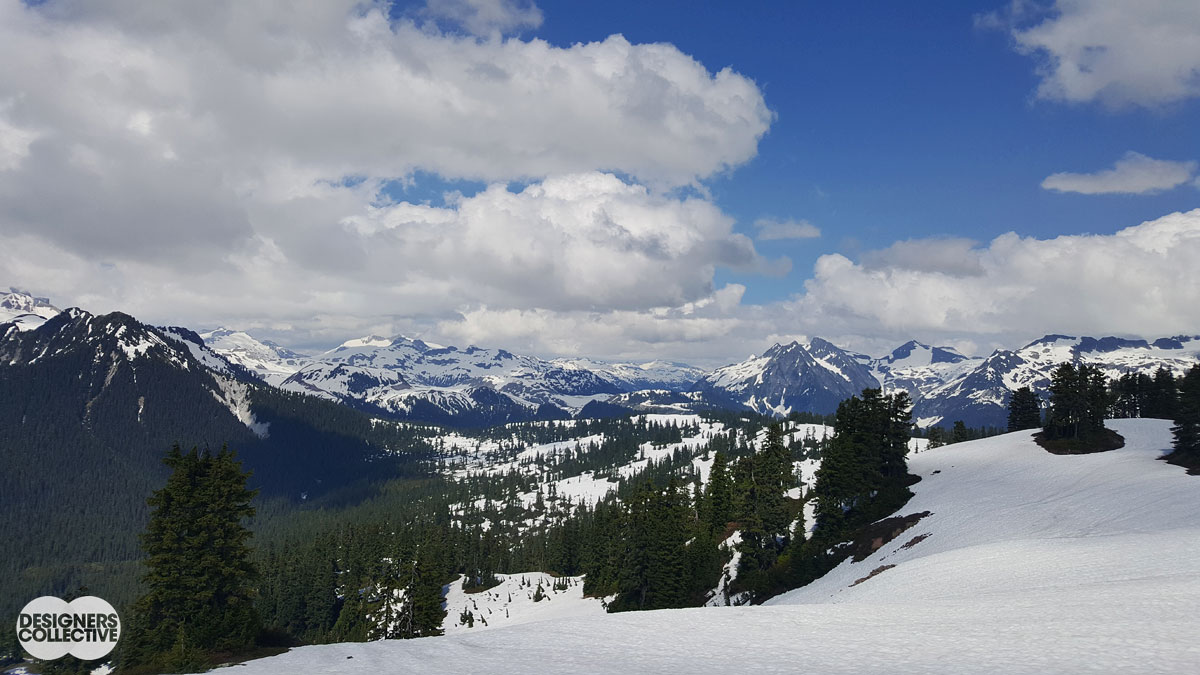
We attempted to distill one version of Canadian winter in a palette inspired by the Sea-to-Sky alpine area, just outside of Vancouver. For those who have driven the namesake highway, you know that from start to finish it is a gorgeous drive: craggy mountains on one side and Howe Sound on the other. In the surrounding mountains there are numerous hiking trails and plenty of back country for the brave (and prepared!) to explore. The only thing that could make these mountains even more majestic is to see them against a bright bluebird sky on a clear day so you can appreciate every snow drift and evergreen for miles. For example:
The Inspiration:
The Palette:
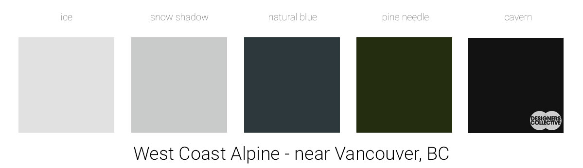
Colour is often surprising… sometimes when creating these palettes you become more and more aware at how our eyes evaluate and judge colours and hues. For example, there is not a single spot of pure white is our inspiration photo… just what seems like a thousand varying shades of greys and off-whites. From this photo we decided to pull from the deeper tones to enhance the greys and off-white. Mountains really come alive with varying degrees of light and shadow, so we made sure to have a balance between the lighter/brighter and the darker/deeper. These tones are all slightly muddy and read as neutral, making this a fantastic starting point for a space that can handle strong accent colours or flashy finishes.
Next Sunday we’ll have new inspiration and new colours to share with you! Each of these palettes is created by Designers Collective. We encourage you to use them for inspiration! If you are interested in purchasing a palette, with paint colour identifications, get in touch with us at our studio! Email studio@designerscollective.ca or visit us at 2885 W 33rd Ave, Vancouver, BC.