


The Palette Project #16: Channel-Port Aux Basque, NL
This is another edition of the palette project– we’re exploring inspiring places in Canada and the colours that make them beautiful.
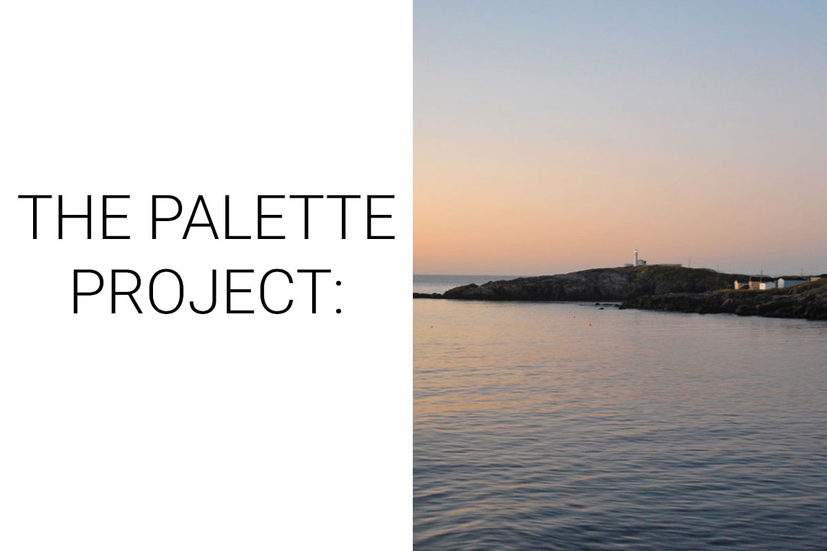
From the mountains of the west coast to the ocean-side vistas of the east we go… This week we are looking at the dreamy calm of sunrise on the coast of Newfoundland. Approaching this island province from the water is nothing short of beautiful. Homes (and of course, a lighthouse) sit impossibly close to the waters’ edge and take on an almost magical look in the early morning light. Channel-Port aux Basque is a quintessential seaside town with fantastic seafood, warm people, and a few friendly neighbourhood pubs. Our inspiration photo was taken from the deck of the ferry that connects Nova Scotia to Newfoundland as it approaches the terminal in the middle of the bay. The soft colours of the sunrise reflect off the water and the landscape, creating a beautiful, quiet moment.
The Inspiration:

The Palette:
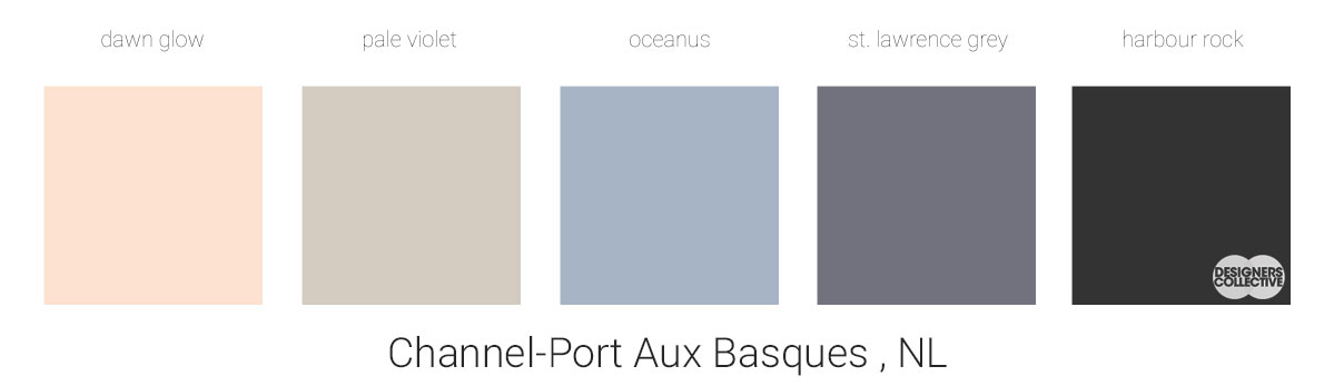
Looking at our inspiration photo, we were immediately drawn towards the beautiful pastels of the sunrise. Using a base of a deep grey, we gradually worked our way through the sunrise to a blush pink we call dawn glow . We didn’t stick with many neutrals for this palette– why would you with all those gorgeous hues? If needed, these colours can easily be mixed with whites, greys, and cool metallic finishes to round out a space. Making this palette was pretty intuitive, we played with a few hues until we struck a balance that felt right and summarizes the atmosphere of our inspiration photo.
Next Sunday we’ll have new inspiration and new colours to share with you! Each of these palettes is created by Designers Collective. We encourage you to use them for inspiration! If you are interested in purchasing a palette, with paint colour identifications, get in touch with us at our studio! Email studio@designerscollective.ca or visit us at 2885 W 33rd Ave, Vancouver, BC.