The Palette Project #18: Montreal Street Art
This is another edition of the palette project– we’re exploring inspiring places in Canada and the colours that make them beautiful.
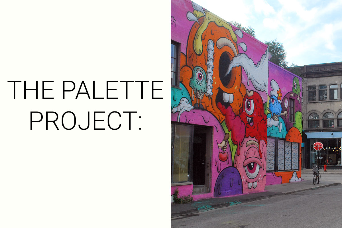
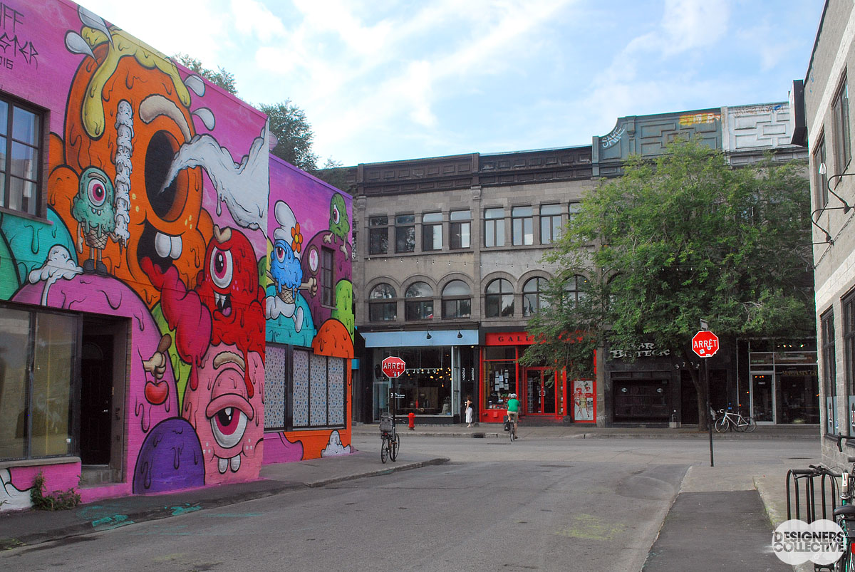
Montreal has long been a hub for the creative, artistic, and change-makers. Just walking about the city you can see the personality of its inhabitants (almost literally) written on the wall. The street art in Montreal ranges from the surreal to the very real, the modest to the ultra-bold. There is a really lovely contrast between the traditional brick and stone European feel of city and the modern urban vibe that permeates the side-streets and main thoroughfares. Our inspiration photo shows this contrast that exists within a living city. While the artistic merit is subjective, you can’t deny the colours are aboslutely magnetic!
The Inspiration:
The Palette:
With this palette we plunge into the jewel tones. We aimed to find a happy medium of hues that resonated equally with the street art and the storefronts. Our sole neutral in this palette (quite the contrast from last week!) is a medium grey we dubbed stone work. Reminiscent of the street, the sidewalk, and the buildings it works as the perfect base for our four bolder hues. The blue, violet, magenta, and red we chose all share cool undertones and a similar saturation. As there are so many colours to choose from in this photo we selected these four as they slide from red to blue, avoiding a palette that jumps around the colour wheel too much! This is a great palette to play with colour and see how using multiple brighter, bolder colours can work harmoniously.
PS. Wouldn’t those colours make a great fabric??
Next Sunday we’ll have new inspiration and new colours to share with you! Each of these palettes is created by Designers Collective. We encourage you to use them for inspiration! If you are interested in purchasing a palette, with paint colour identifications, get in touch with us at our studio! Email studio@designerscollective.ca or visit us at 2885 W 33rd Ave, Vancouver, BC.


Pingback: The Palette Project #23: Parking Lot at Sunrise -
January 29, 2018 at 12:24 am