


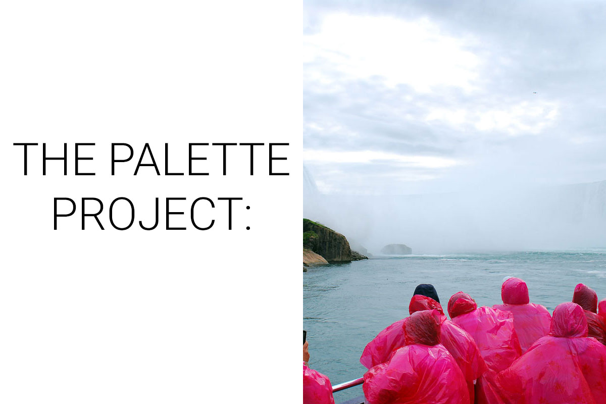
The Palette Project #2: Niagara Falls
This is another edition of our Palette Project– we’re exploring inspiring places in Canada and the colours that make them beautiful.
We’re going cross country this week, looking at the infamous and powerful Niagara Falls. Curving through the Canada/USA boarder, the Horseshoe falls is the largest of the three waterfalls that spill down the end of the Niagara Gorge. It is one of those natural wonders that you hear before you see it– the entire town of Niagara Falls is filled with the subtle sound of crashing water. To get close to the falls you can hop on a ferry tour (the Hornblower from the Canadian side, or the Maid of the Mist from the American side) or take the pedestrian bridge across for a more aerial view– but don’t forget your passport to cross back.
The Inspiration:
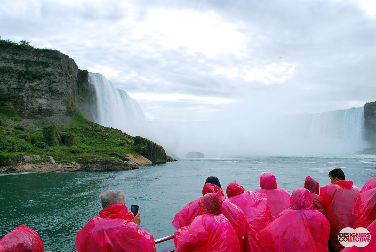
The Horseshoe Falls from the deck of the Hornblower: Photo by Designers Collective
The Palette:
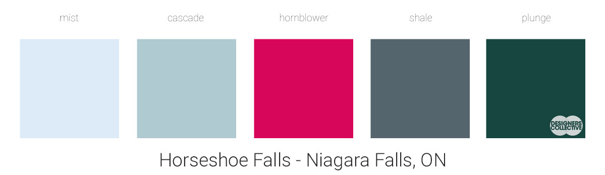
For this palette we had a lot of fun mixing natural, neutral blues with a punch of brightness. The lighter blues are inspired by the water and the sky and evoke a sense of calm. The deep green-blue is from the water directly in front of the boat– it’s deep tones create a sophisticated, dark contrast for the palette. The geology of the falls inspired the deep blue-grey colour. We couldn’t ignore the rain poncho in this photo– the pinky-red colour is the opposite of natural but is seen on nearly every tourist that ventures close to the falls. This bold pop of pink plays well off of the other colours as it shares a cool undertone.
Next Sunday we’ll have new inspiration and new colours to share with you! Each of these palettes is created by Designers Collective. We encourage you to use them for inspiration! If you are interested in purchasing a palette, with paint colour identifications, get in touch with us at our studio! Email studio@designerscollective.ca or visit us at 2885 W 33rd Ave, Vancouver, BC.