


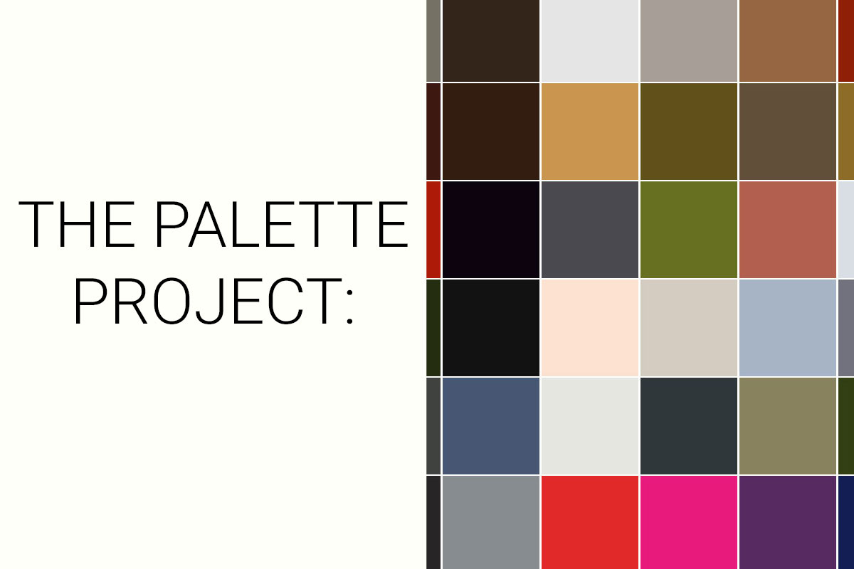
The Palette Project #25: The Finale
For the past few weeks… well 24 weeks… we’ve been exploring the landscapes and colours of Canada. From coast to coast, ocean to alpine, big city to small town, we developed colour palettes expressing this beautiful land that we are so lucky to call home. When we set out with this project, it was intended to be an exercise in creating palettes and challenging ourselves to be inspired by nature’s own palette. The result? A collection of colours that can be used for design projects, but more importantly, a collection of colours that are tied to specific places and moments– something we might carry through to projects in the future! For our final Sunday of the Palette Project, we put together all 125 colours that we’ve shared with you in one big palette:
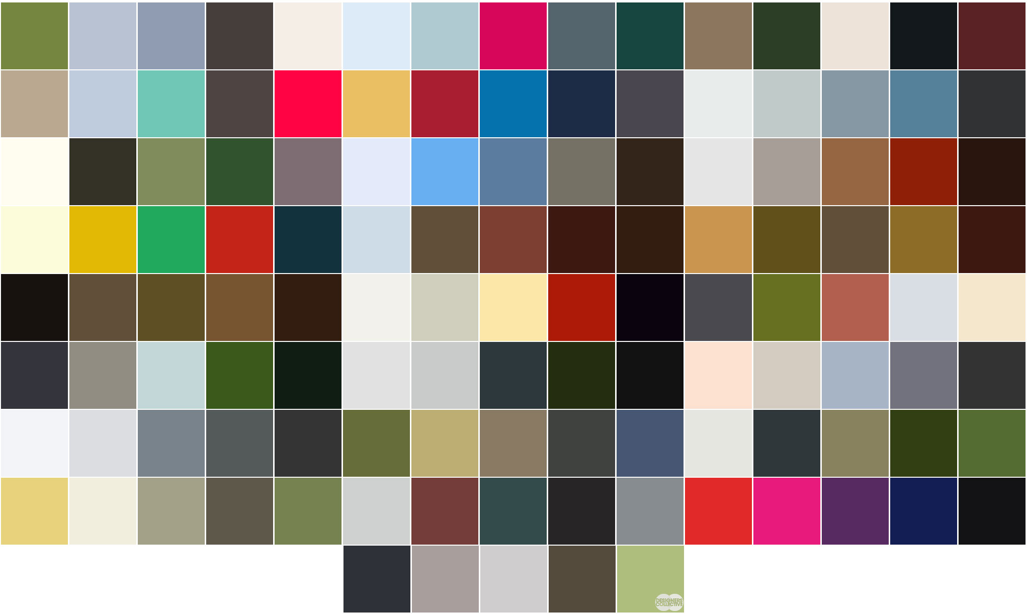
It’s a lot of colour. One could suppose it’s a large country with innumerable views and vistas, so a multitude of colours is to be expected… And these are just ones that were included in our palettes! Just because we can (and as a summary of our entire project) we re-arranged and further broke down our palette into some similar hues:
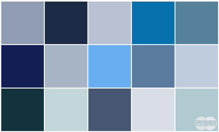
The Blues.
The sky, the ocean, reflections off of glass… from the Halifax Harbour to the Vancouver skyline, blues are everywhere
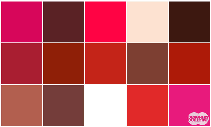
The Reds.
A national colour… we located red hues on parliament hill, in street art, and in autumn leaves (just to name a few!)
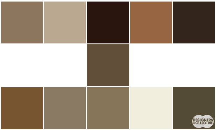
The Browns.
It’s only natural that we pulled these hues from the landscape– the trees, stones, ground, and buildings all include varying degrees of browns and neutrals
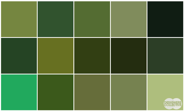
The Greens.
Another uber-natural hue– found from the cedar forests of the pacific northwest to the sea grasses of PEI
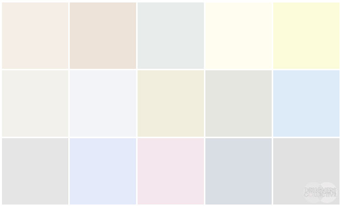
The Lights.
Clouds, skies, snow– these light as a feather hues make a gorgeous 15-colour palette
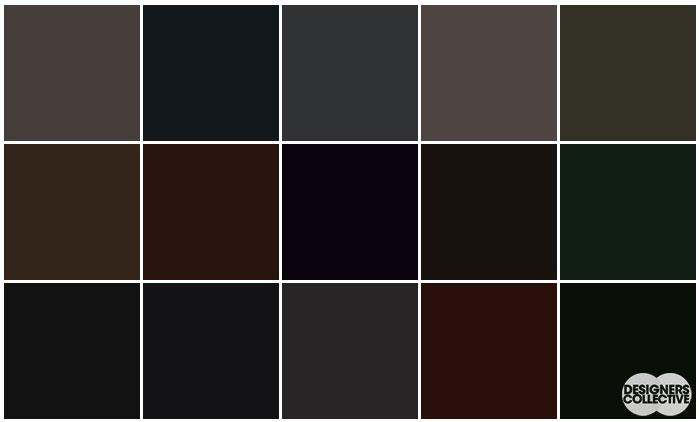
The Darks.
The shadows and dark corners of the landscapes complement more vibrant hues
And that closes our Palette Project! Each of these palettes is created by Designers Collective. We encourage you to use them for inspiration! If you are interested in purchasing a palette, with paint colour identifications, get in touch with us at our studio! Email studio@designerscollective.ca or visit us at 2885 W 33rd Ave, Vancouver, BC.
As always… Stay Colourful!