


The Palette Project #4: Parliament Hill
This is another edition of our Palette Project– we’re exploring inspiring places in Canada and the colours that make them beautiful.
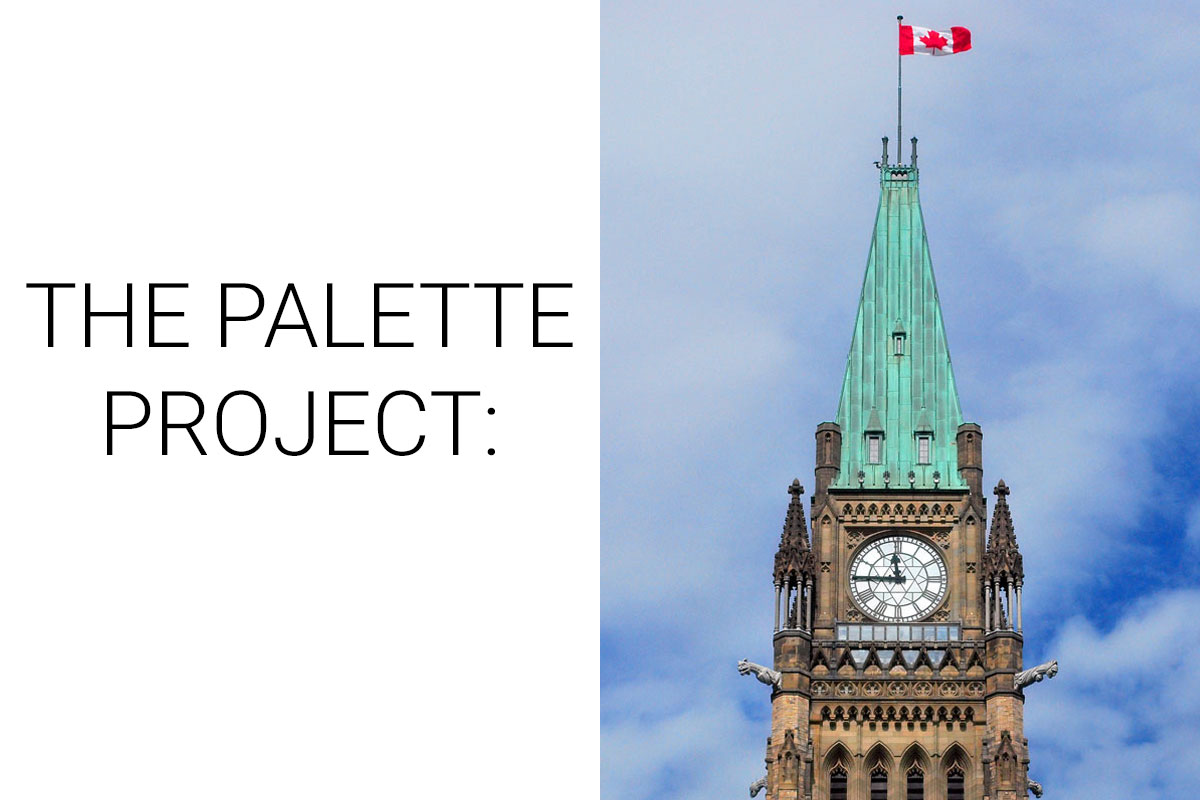
This week we’re headed to the Nation’s capital! Ottawa, ON is an interesting collection of government buildings, embassies, incredible art galleries, a lively public market, and a mix of architectural styles (just to name a few things…). But, the center of it all is Parliament Hill. This complex of buildings sits rather majestically on the hillside just above the Ottawa River, itself, a watery boarder between Ontario and Quebec. Our inspiration for this week focuses on the Peace Tower. Located in the central block of Parliament Hill it rises over 300 feet above the city. A clock tower and flagpole of the country, it is a Canadian icon.
The Inspiration:
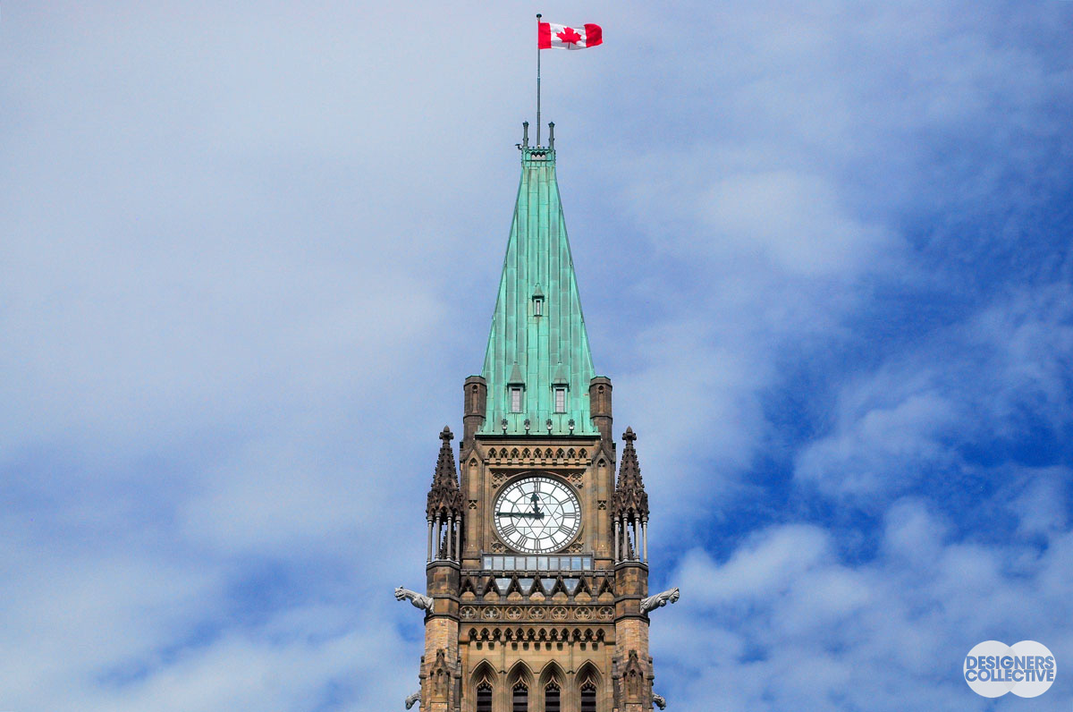
The Peace Tower: Photo by Designers Collective
The Palette:

The trick with developing a successful palette is to find balance. In the tower alone there are so many shades of browns, creams, and shadowy tones, it took some time to narrow it down, but why focus on the neutrals when there are so many other points of interests in this photo? The two goals of this palette was to capture the beautiful green patina of the copper roof and the red of the flag. With two vibrant colours you could match them with more bright and ‘bubblegumy’ hues for some fun, but we decided to play it a bit more safe– complementing the green and red with a pale blue and a couple neutral brows taken out of the stonework.
Next Sunday we’ll have new inspiration and new colours to share with you! Each of these palettes is created by Designers Collective. We encourage you to use them for inspiration! If you are interested in purchasing a palette, with paint colour identifications, get in touch with us at our studio! Email studio@designerscollective.ca or visit us at 2885 W 33rd Ave, Vancouver, BC.