


The Palette Project #9: Maple Candy
This is another edition of the palette project– we’re exploring inspiring places in Canada and the colours that make them beautiful.
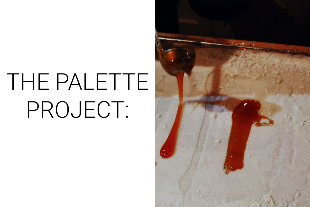
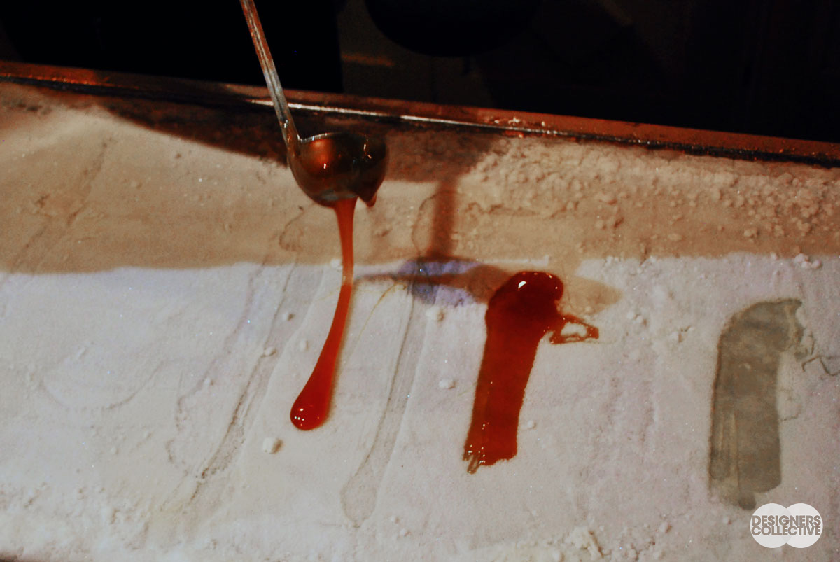
Soft Maple Candy ( or tire d’érable in French) is a classic Canadian treat popular in the wintertime. Boiled maple sap is slowly poured over snow and, when slightly hardened, gathered with a popsicle stick to form a sweet, sappy, and very Canadian dessert. Usually prepared over a pack of fresh snow, to accommodate tourists there are street vendors with very convenient and portable frozen trays of snow. With a silver ladle molten goodness runs over the snow in various hues of deep reds, golds, and toffee browns. After a couple tantalizing minutes, the toffee is ready and you are instantly transported to the Sugar Shacks of Eastern Canada. The evening wind may be howling down the narrow streets of Quebec City, but the rich maple taste is enough to warm our hearts.
The Inspiration:
The Palette:
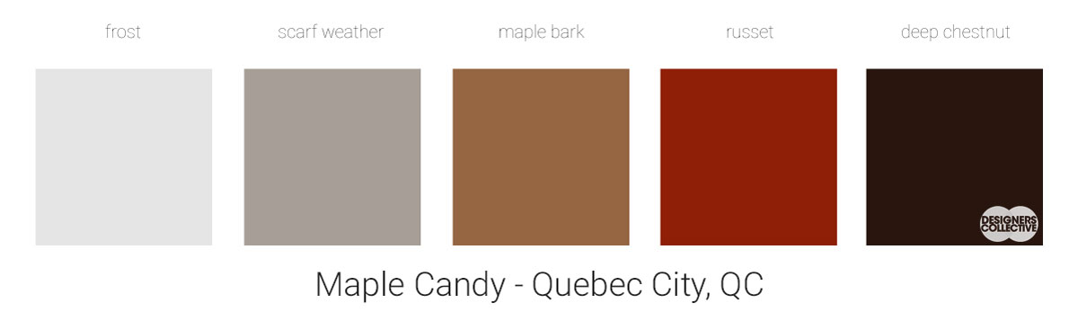
There are no bright bubblegum colours here… Our maple palette is natural all the way. With monochrome and minimal schemes making a noticeable comeback, the browns and greys of our inspiration photo are a great starting point. The warmth of the syrup is contrasted with the coolness of the snow and metal ladle. Mixing warm and cool colours is risky, in this case all our colours have a fairly neutral undertone that links them together. We are also working exclusively with natural tones and they can be more forgiving when it comes to mixing warm and cool. These colours can easily be used as paint colours, stone countertops, wooden finishes, textiles, leathers… the options are inexhaustible!
Next Sunday we’ll have new inspiration and new colours to share with you! Each of these palettes is created by Designers Collective. We encourage you to use them for inspiration! If you are interested in purchasing a palette, with paint colour identifications, get in touch with us at our studio! Email studio@designerscollective.ca or visit us at 2885 W 33rd Ave, Vancouver, BC.