


Renovation Wisdom — Lessons from a Busy Year
2017 was a busy year for us! Our renovation schedule was packed and when we weren’t on site, we were sourcing materials, evaluating drawings, and testing samples… Phew. They say experience is a pretty good teacher, and this year we went to school! Working through our renovations and other projects this past year, we were reminded of a few key aspects of making sure projects run smoothly and that the results exceed expectations.
We did some reflecting and came up with this list of 10 things, with some anecdotes for added fun, that are sooo important to remember when taking on a renovation– big or small.
Shop drawings for millwork are a must.
…Even if you have to pay more. Don’t assume everyone is talking about the same thing, you could find yourself in trouble! Drawings speak a thousand words so really analyze them and read all the notes after every revision. What you have in mind may be different from what the designer and/or millworker understood. Ask questions and get clarification if needed to ensure everyone is on the same page. Make sure everything you discuss is properly drawn in– this gives everyone a common document to refer to. We were reminded of this twice last year… and we were so glad we had shop drawings to refer back to.
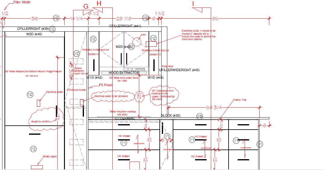
A section of shop drawings from one of our projects.
Always test colours in the space.
Always. Always. Always. We cannot stress this enough! It is imperative to get a tester jar of paint and paint up a poster board and check the colour in the space. Lighting has a huge effect on colour; if the lighting is different than where you first saw the paint (note: it is always different) then you will notice subtle or even blatant differences in a colour. We always pull together our colours, pallets, and fabric etc… in our studio to make sure it flows together. BUT we always take these samples to the site and ensure it still works with the light in the space.
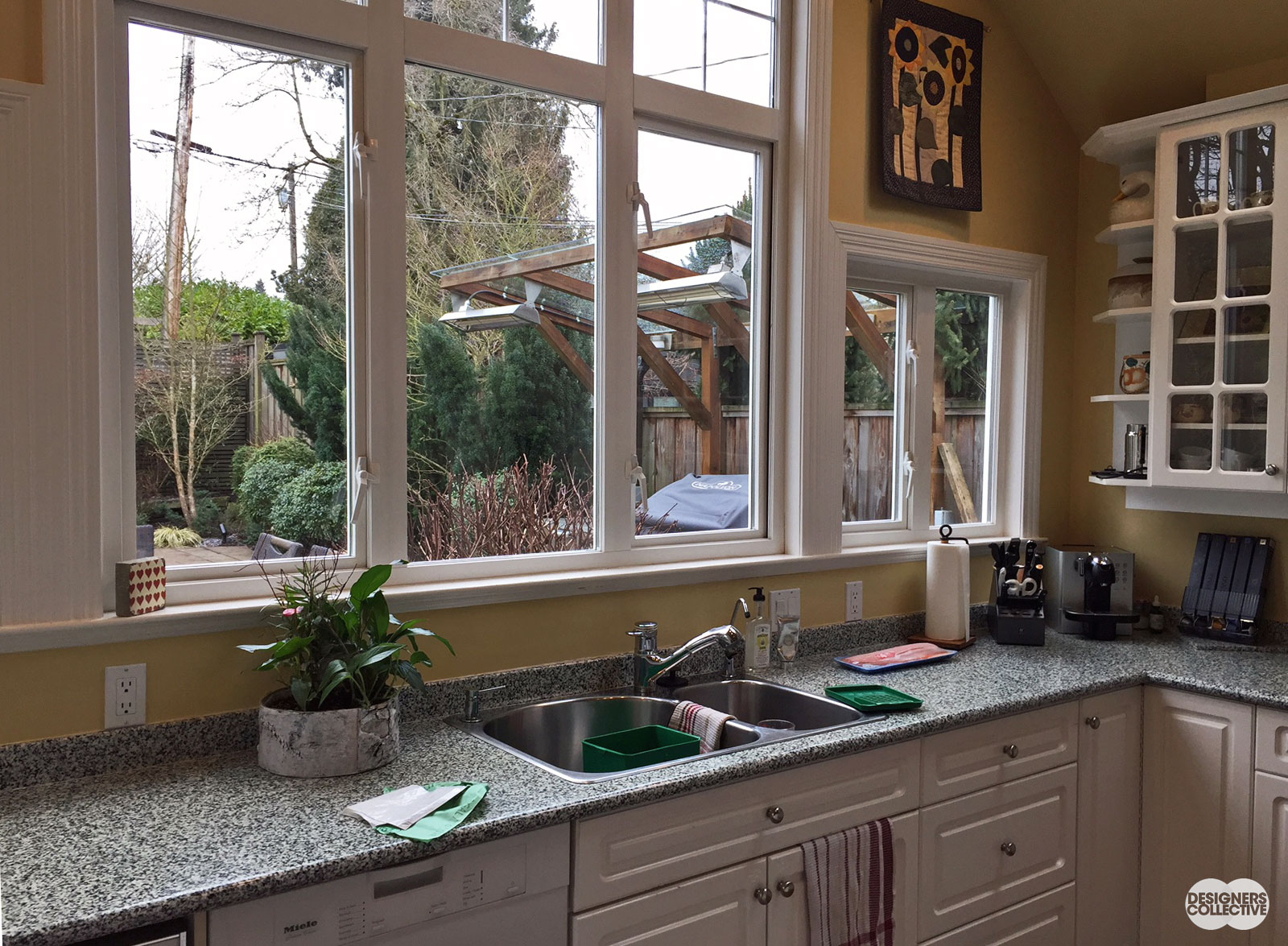
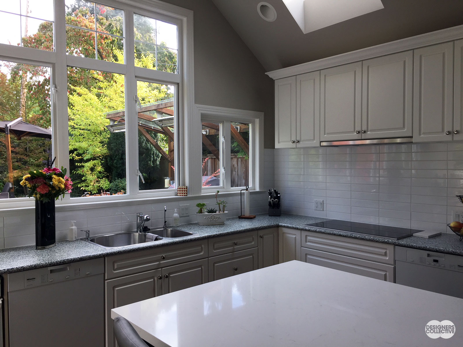
This year we pulled together a scheme for a client we were happy with and once the demolition of the space was done and all the old cabinets etc were taken out of the space, the lighting changed. The colour we selected for the kitchen cabinets suddenly looked much more green than before. We then had to revisit that colour and replaced it with a variation of the original, sans green undertones. The new colour still complemented all our other sample choices, yet this new paint went so much better once in the space. We were VERY glad we had this system of sample testing in the space!
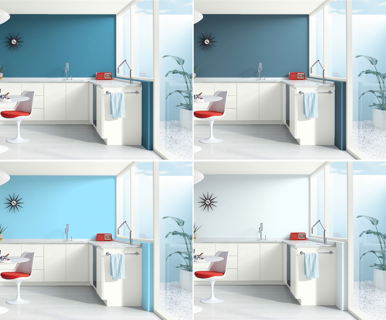
Using Benjamin Moore’s online colour tool, you can see the effect of different colours in the same space.
Once you’ve chosen your colour, make sure you test it out!
Choose fabrics wisely.
Sunlight will fade natural fabrics. We came across this challenge in a couple projects this year where sunlight was in abundance. This meant the fabrics we chose for the living room needed to be sunlight safe. We selected fabrics that had a high content of non-natural fibres which make them more colour fast and therefore ideal for a sunny environment. Even in rainy Vancouver!
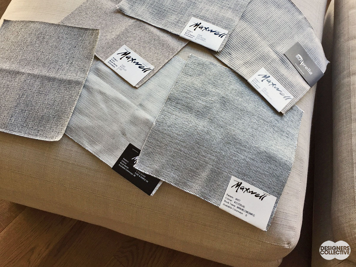
This client has beautiful big windows– and that means a lot of sunlight! We looked at a selection of sun-safe fabrics that coordinated with our overall design scheme
Why not update the backsplash…
…for a quick kitchen refresh? We had a project where there was an old corian counter top with the standard 4″ backsplash that was so beloved in the 90s. Instead of replacing the counter (which was still in great condition!), we removed the 4″ curb and installed a new, contemporary backsplash that completely elevated the kitchen.
BEFORE: The counter was in great condition, just a couple tweaks were needed to update this space…
AFTER: Replacing the 4″ curb with a white tile backsplash makes the space look clean and contemporary
Integrated appliances…
…will make your kitchen appear bigger. Gone are the days when we want all our stainless steel appliances (and corresponding fingerprints) to be on display. Cladding the appliances in paneling to integrate with the millwork is a sure way to achieve a seamless kitchen. Without the visual interruption of bare appliances, the space will look longer and larger to our eye. Although, one time NOT to do this is if you have a spectacular focal point range such as a wolf range that really should be shown.
…we bet you didn’t notice the fridge on the right hand side
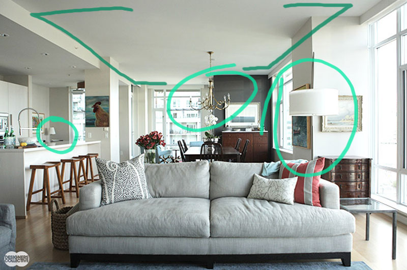
Lighting is everything.
Always, always, always look at the existing lighting and see if you can augment it. In the old condos of yesteryear good lighting is very sorely missing. The challenge is that the ceilings are all concrete so you can’t just add a few recessed pots to remedy the situation. You can however, add sconces in strategic places or, in some cases, even lower the ceiling height to add more recessed lighting.
In this condo project we didn’t have many options for lighting (but they have such great windows to let in daylight!). We added extra lighting near seating so when the sun goes down, our clients have the light they need.
Colourful milllwork.
There are sooooo many great colours out there it would be impossible not to find one you resonate with. A white kitchen is a classic and clean look, but why not add a coloured island or a vertical pantry of colour? Bathroom vanities look amazing in a deep or light colour. The point is, experiment. See if you can inject your personality in your space with coloured millwork.
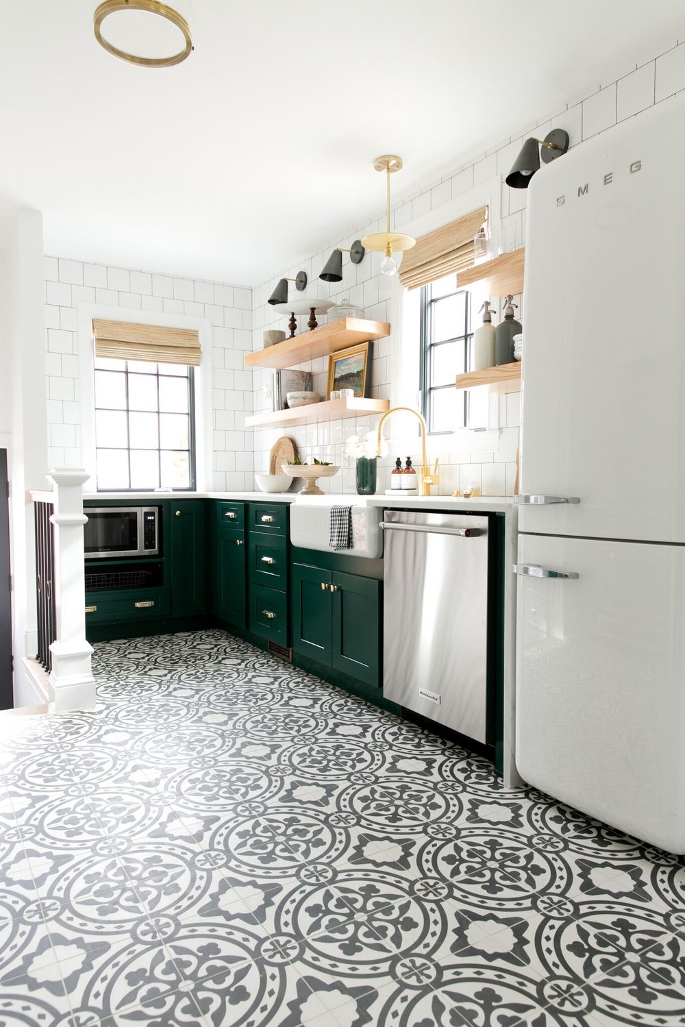
We found this example from Studio McGee. Love the forest green in this space!
Never underestimate art.
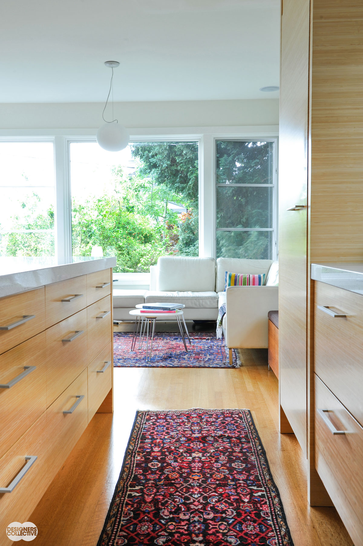
Large scale artwork adds so much to a space. It can provide a focal point, rich visual interest, act as a conversation starter, and may not even be hung on the wall. Why not think of carpets as art? In one of our projects we has the opportunity to select some gorgeous carpets for the client’s space– once we found the right one it tied the entire design together and completely elevated the whole space.
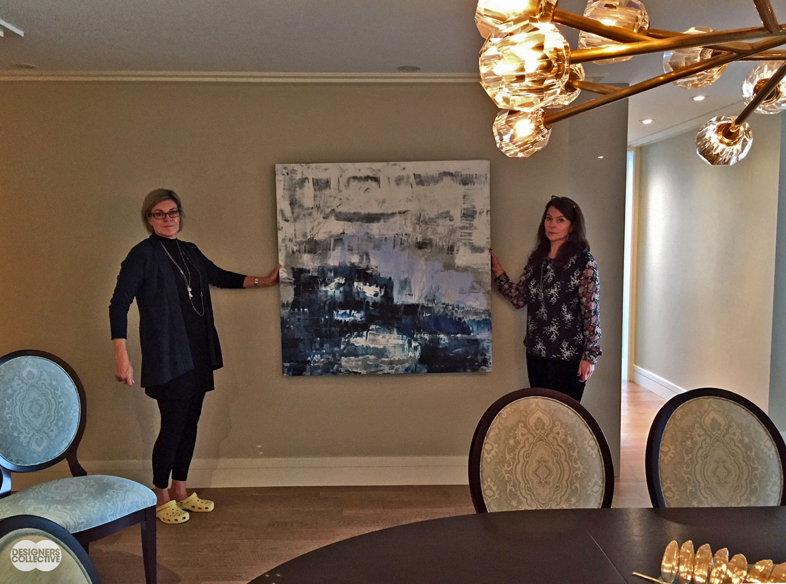
Taking a Miriam Aroeste painting for a test drive in the dining room (See Miriam’s work here)– it’s an instant injection of colour and pattern! Judging by our holders’ faces we took a little too long taking the photo (Sorry Brooke!!)

We work with both galleries and artists themselves when sourcing art for our clients. LEFT: Our clients propped up a Judy Cheng Painting from Ian Tan Gallery to test it on their wall (see more of her work here) RIGHT: Tina worked directly with the Lawrence Paul Yuxweluptun for this incredible drawing

You may not hang your carpet on the wall, but you might want to when they look like this! A carpet with the right colours, pattern, and drama can pull a space together
Keep your personality!
By all means, edit your spaces– but have your personal style reflected in the design. We do not want our space to look like anyone else’s. It is YOUR home and therefore it should reflect YOU in the space. Our job as designers is to make sure that the space is beautiful, well thought out, and most importantly something that you enjoy.
PS. Include your treasured items as well! Make sure they have enough space to be seen and enjoyed.

Personal touches can be large or small. We all have things we’ve collected, purchased, or inherited over the years– why not show them off? This sweet cat figurine adds a bit of colour and mischief on the window ledge
(and finally…) Think “big picture”
… and not “step over a dollar to save a dime”. During a renovation we can sometimes retain items that will work in the new design. In one of our projects we thought we would save our client some money by re-staining the old bedroom flooring to match the new floors being installed in the rest of the space. In the end, we opted to replace the old flooring with new. Although staining the floors was a more economical option, it would not have been the same, seamless, and super beautiful end result. We were glad we stopped and reevaluated this! We explore all options during a project and opt to save money where it makes sense, but sometimes the investment is totally worthwhile. It is also prudent to investigate how the old materials can be re-utilized or recycled in an environmental manner.
And, of course, if you need any help with your space, give us a call!! We love finding design solutions and enjoy taking on your challenging spaces for you. If you are more of a DIY-er, check out our eDesign page here for a range of our services!
Mark Potter
January 16, 2018 at 7:50 amGreat advice!!!
tina
January 19, 2018 at 3:51 pmHi Mark,
Thanks so much for taking the time to read our blogpost and comment! Everyday is a learning opportunity for us. So why not share the knowledge! xo
Mithra Ballesteros
January 16, 2018 at 3:20 pmGreat advice! Especially on point regarding millwork. I remember how costly it was to make changes because I didn’t pay close attention to those important details. Nice round-up, Brooke and Tina!
tina
January 19, 2018 at 3:50 pmHi Mithra, We learn something new everyday! I guess they call that experience! Thanks so much for your lovely feedback and taking the time to comment.