


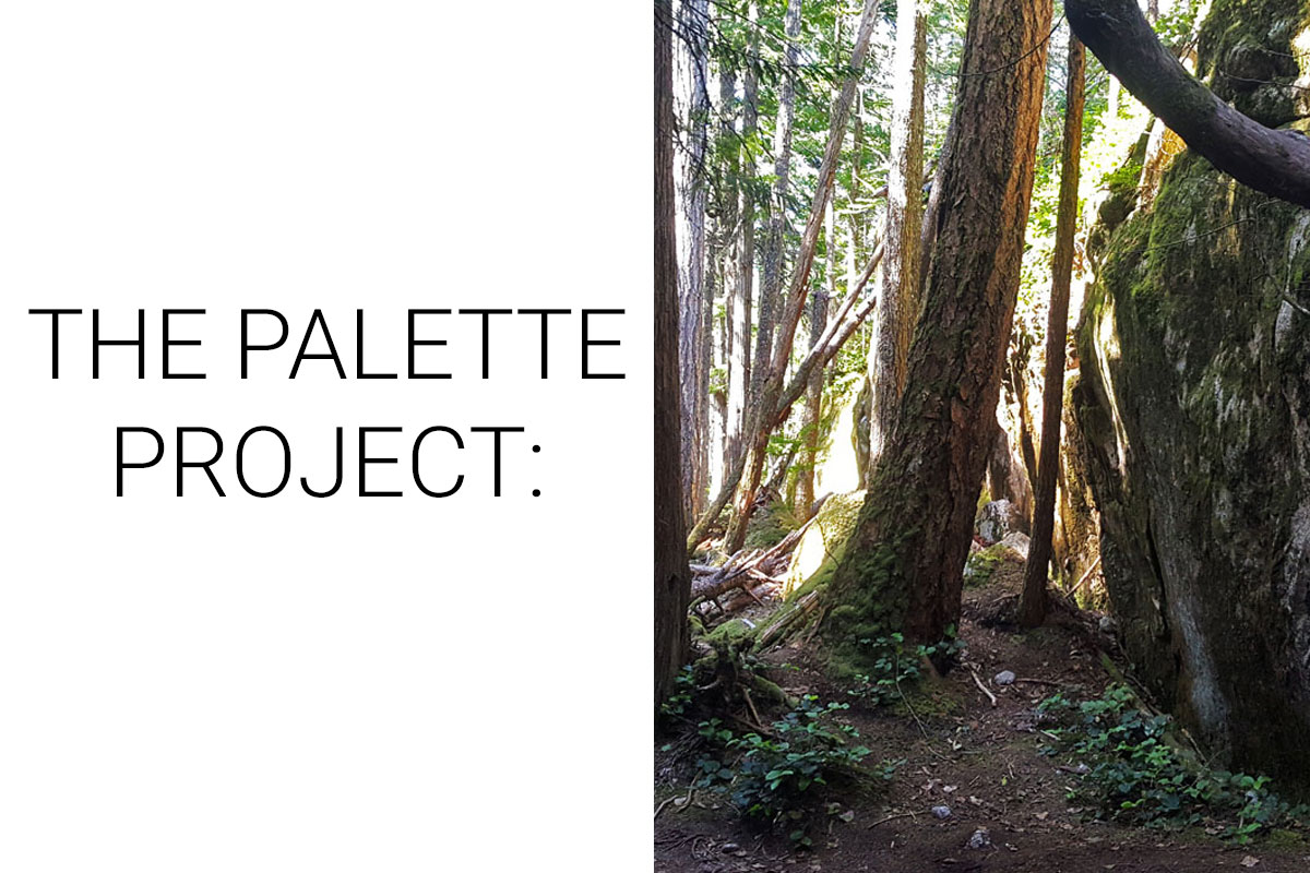
The Palette Project #7: Forest Trail
This is another edition of the palette project– we’re exploring inspiring places in Canada and the colours that make them beautiful.
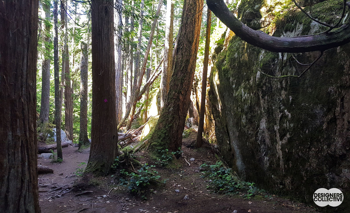
The Sea-to-Sky highway, just outside Vancouver, connects the downtown core of the city with a mountainous playground. Ski hills, hiking trials, and campgrounds are scattered along one of the most scenic roadways in the country. Escaping the buzz of city life, especially on a summer day, will often look like our inspiration photo. This particular spot is on the Sea-to-Sky trail that leads hikers to a gorgeous viewpoint of Howe’s Sound and the surrounding landscape (there is also a gondola for those who prefer a more relaxed ascent!). The trees completely mute the highway noise, and often you can feel like the only ones in the forest. Equal parts tranquil and wild, it is no wonder that the Sea-to-Sky region is a year-round destination for locals and tourists alike.
The Inspiration:
The Palette:
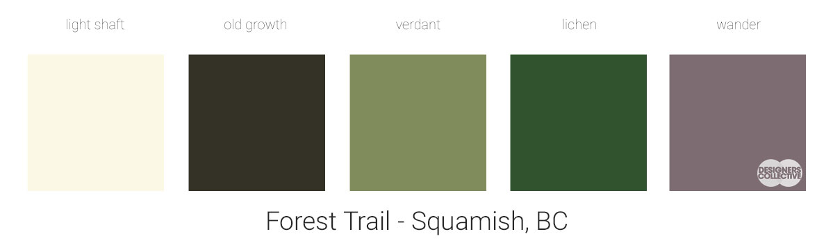
With this palette we wanted to re-create the atmosphere of the forest. The play of natural elements, light, and shadow made for a lot of options when choosing colours– which can be tricky when working exclusively with natural hues! As always, we wanted to balance the light and dark tones but also wanted to avoid making something too monochromatic (that meant limiting how many greens we included…). We coordinated our greens with an off-white and a dark neutral that is equal parts grey, brown, and green. When choosing a colour to stand in for the forest floor/trail we were intrigued that it was not the pale brown we expected, but came up as a muddy mauve! In the end we pulled together a palette that it balanced, modern, and reminds us of some of our favourite peaceful places.
Next Sunday we’ll have new inspiration and new colours to share with you! Each of these palettes is created by Designers Collective. We encourage you to use them for inspiration! If you are interested in purchasing a palette, with paint colour identifications, get in touch with us at our studio! Email studio@designerscollective.ca or visit us at 2885 W 33rd Ave, Vancouver, BC.