What’s Right With This Room?
What’s Right With This Room?
It’s time again for What’s Right With This Room. We’ve done a few blogs now about What’s Wrong With This Room, but have only done one about What’s Right. So, let’s delve into some photos and see if we can see what really works in these images.
I like this image below. The board wall that has been painted out, adds a nice rustic feel but has a contemporary vibe because it has been painted white. The picture above the chair is at a good height and is a good size. If they had just framed the image in a small frame it wouldn’t have the impact it does in the larger frame. The black frame with white matte again, adds a contemporary feel. The wall sconce is situated well for reading in the chair. I love that they still have lighting here even though the space was limited. It was well thought out. The coffee table is in reach of the chair and the couch, which is great. The table is rustic but because the upholstered pieces aren’t too rustic it doesn’t come across as being over done. This is a good example of updated country or cabin living.
This is not a big image but there are a couple of things I want to point out in this image. I like that the cushions don’t match-they coordinate. Sometimes people can get a bit matchy with their cushions and it is way more interesting if they don’t match. They do need to tie together somehow, so make sure there is a common element such as colour. For example, on the sofa there is the patterned cushion but then the chair has a yellow cushion. Because the pattern has yellow in it, it helps tie them together. There are also a few different textures and patterns going on here. The ottoman has a large pattern so the carpet has a small pattern. There is enough texture and pattern going on to make it interesting but not at all overwhelming. It’s worth mentioning that the there is not one colour of blue, taupe and yellow, but a variety of hues and saturation that all work together beautifully because they are in the same family group .
The big thing I want to point out in the picture above is that the carpet is big enough!! So often in our What’s Wrong With this Room, we point out that carpets are too small. It is good to point out how well it works when the carpet is big enough. This room is quite spare but all the elements that are here do work nicely together.
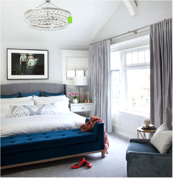 What’s right in this room? There are two different window treatments that are different but cohesive. This adds an element of interest. The palette is soft yet has a one strong colour (navy) that makes it more interesting. The cushions are layered without going overboard-so often I find there are just too many cushions on the bed and although it can look nice it is not very practical. There is a place to sit to put on shoes, which is always nice in a bedroom. The bedside lamp is a good scale and will give adequate light when reading in bed. The textures and patterns are varied yet still soft and inviting. A lot of thought has gone into this room to create a quiet, sophisticated, traditional yet current bedroom.
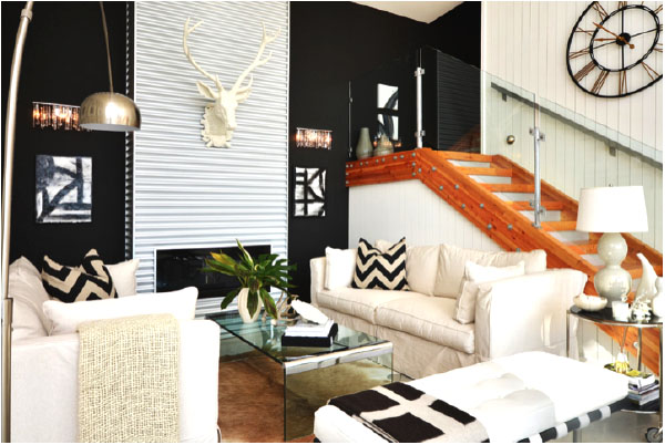
There is quite a lot going on in this room but each element seems to have been carefully thought out. There is a lot of detail but it is so interesting without being too busy. First of all, the “envelope” of the room is interesting. It is a contemporary space but has warm elements such as the bead board stair wall and the warm wood stairs. It is dynamic because it has high contrast between the white and black walls. There is also an element of the unexpected by using the metal siding on the fireplace wall. They have tied it all together with light furniture and accessories with just a few black and white accents. It shows restraint-knowing when to stop with all the different materials-to get just the right hit of interest.
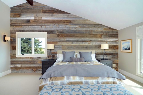
In the bedroom below, the back wall is the focus of the room. Everything else going on supports the main event. The bedding picks up the grey in the wall, and the wall colour is pulled form the wood also. The fabrics are well chosen to coordinate but not compete with the wood and they are in varying scale so work well together. The bedside lights are a good height for reading in bed and the sconce on the wall ties in with the bedside lamps as it is in oil rubbed bronze. The dark of the lamps goes well with the dark bedside tables. The blinds on the windows are quiet fabric so as not to compete with the wood. This room works well as an example of a contemporary take on country.
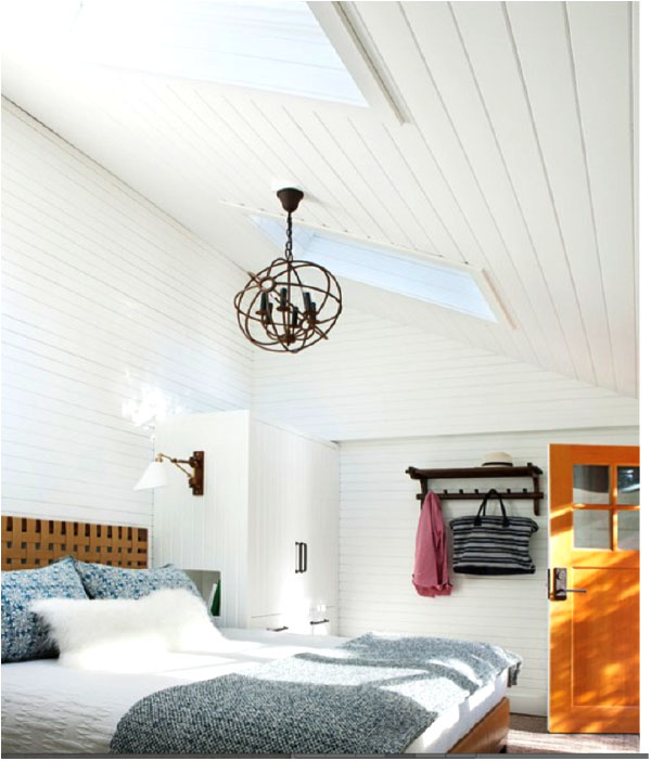
Finally, let’s look at the image below. I like this image a lot. I love all the white paneled walls and the the simple decorating here. The textiles work well with minimal pattern but it’s not at all boring as there are textures to keep the interest. The lights are well placed for night time reading. The headboard and the wood door add a natural element which works just so well juxtaposing the white. (Can you tell I love this room?)
 I hope this post helps you to be able to look at images on line or in a magazine with a more critical eye. There are a lot of great images out there, but have a closer look and see what it is that is drawing you in. It might just give you a glimpse into your own personal style. And if you need more help you could always take one of our design workshops. They can really help you hone in on your own personal style.
Check it out!!


