What’s Wrong With This Room?
Welcome to another episode of What’s Wrong with This Room? When we are look through magazines or online we see images that draw us in and some that don’t seem quite right. I think it is important to know that some images are styled just for the photo and may not necessarily work in real life. Sometimes there are too many cushions on the couch because it looks great for the photo but in real life they would be thrown on the floor if anyone wanted to sit there. Or a light looks great in the picture but in real life wouldn’t give off enough light for the task at hand. So when I look at a photo I like to look with a discerning eye. What works in real life and what doesn’t?
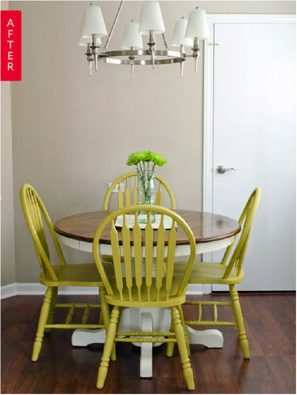
This photo below is fine. There is nothing blatantly wrong with it. You may like the esthetic or you may not but putting that aside what I notice in this image is that the light feels a bit high for me. I like lights over tables or counters to be around 30-32” above the table. It makes the setting more intimate and disperses good light to the surface below.
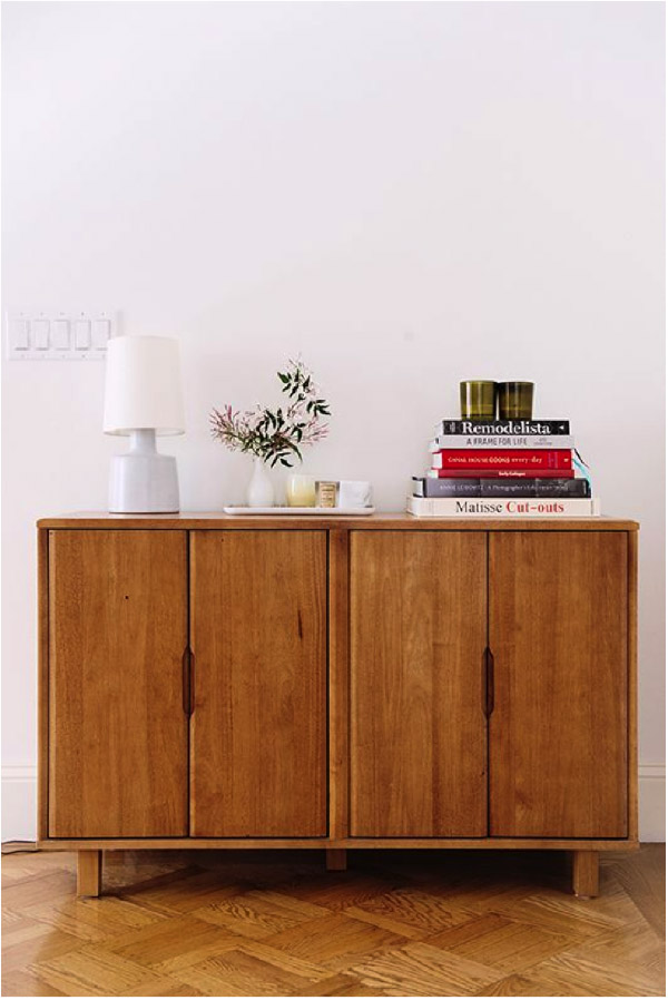
When I look at this photo I really love the sideboard. I love the wood tone and graining and I like the styling with the books and candles etc. but what is not working for me is the lamp. I find the scale of it too small for this piece of furniture. I like the shape of the lamp and the colour but it is just too small. When you look at a picture you want to not only look at the individual items but how they relate to one another.
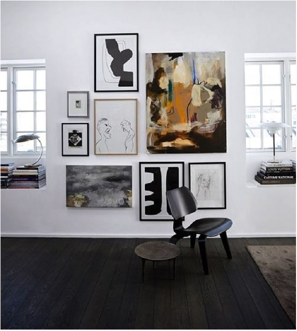
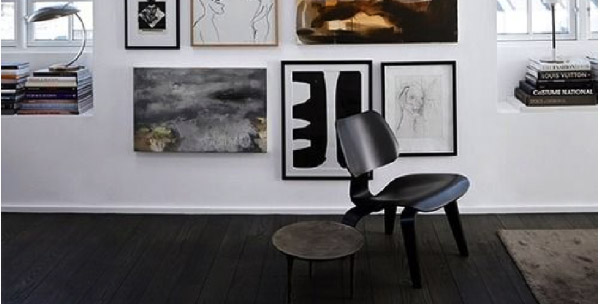
This image really appeals to me. I like the contrast between the black and white. I like the art wall and think it works well between the two windows. But there is something that doesn’t work. Now that we have discussed scale, can you see that something is wrong with the scale here? For the photo, the chair works because you can then see the artwork behind it but I find the scale of the chair too small. I’d like to see a larger chair here that also has at least its front legs on the carpet, which would make for a more eye pleasing vignette.
These are just a few snapshots of ideas of what to look for when you are looking at images and then this will transfer over to when you are putting a room together. Do you have any photos you can send in to us for us to analyze?
Do you have any photos you can send to us for us to analyze?


