What’s Wrong With This Room?
What’s Wrong With This Room?
It is time for another episode of What’s Wrong With This Room? It’s good to look at photographs of home décor or design so you can notice what appeals to you but also so you can train your eye to really analyze a photo and see what works and what doesn’t.
Here we go!!
What do you think of this first image? Can you see something that could look a bit better?
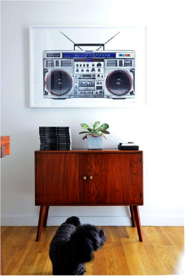
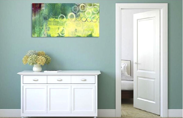 Here the painting doesn’t quite relate to the cabinet below. The size is good but it is kind of floating on the wall. It looks like they tried to line up the art piece with the top of the door, which has no relationship to the furniture that the art work is above. When you hang artwork it is good to have it relate to what’s BELOW if possible. In this case, I would lower the piece until it is about 6-10” above the cabinet. It will then become a vignette with the cabinet, which is more appealing to the eye.
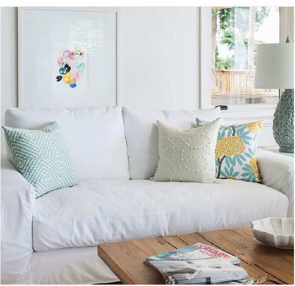
What about this one? Surprisingly, we find this artwork too low. I think the rule of thumb of artwork hanging 6-10” above a piece of furniture works here too. The back cushion of this sofa hides this piece.
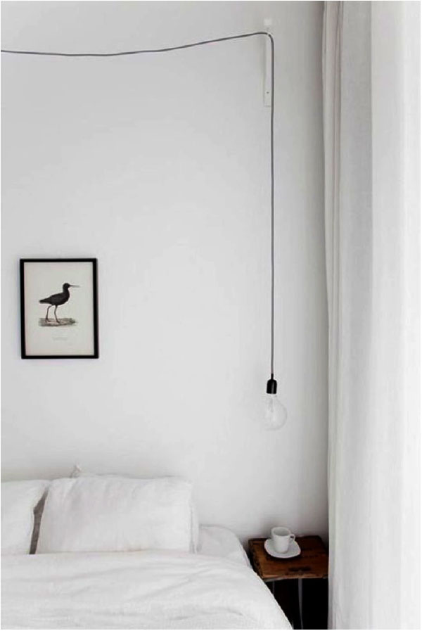 I love minimalism, but sometimes in the search for a perfect minimal look it can fall just a bit short. I think I would want to see the artwork lowered on that wall. I’m not sure the same rule of 6-10” above would work here though, as you could knock into it while sleeping. I think the best thing here is to eyeball it. Have someone else hold up the artwork so you can see how it will look. Just remember it needs to relate to the bed (which is BELOW) to make sense on that wall.
The other thing here is, I think this piece is too small. If you only have one piece of art then it should be about 2/3 of the length of the object below. If you have smaller pieces then hanging them together may make sense. You can hang them about 2-5” apart to ensure they also relate to each other. ( I know- all this relating!)
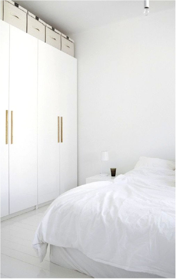 Here is another minimalist look. This is a very spare look-no embellishment at all, BUT I do think the lamp is too small. When reading in bed this lamp would not give you enough light to read by. This image would still make sense if they used a larger white lamp-the look would still be minimal but it would be more functional. Ideally, the bottom of a bedside lampshade should sit at around chin height when sitting up in bed. Because beds and bedside tables now come in so many varying heights there is not an exact recommended height.
Here is an instance where I actually think the artwork is too big. Artwork looks best when it does not go past the edges of the item below-2/3 of the width is ideal. Again this artwork is too high. It should be 6″-10″ above the furniture it is to relate to.
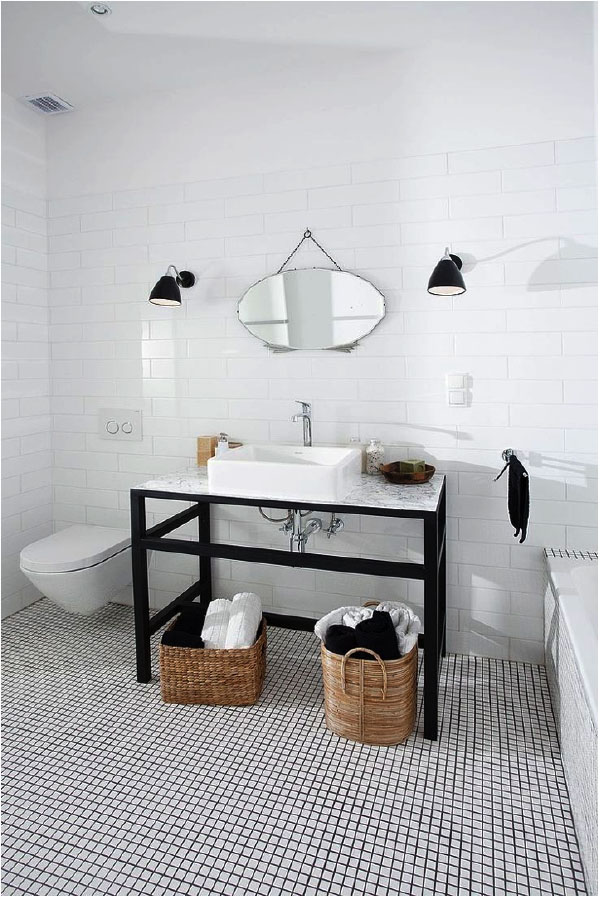 I love the look of this bathroom, and I love the vintage mirror but I think it is too small. I’d like to see a mirror that allows for a much better inspection while applying makeup! A larger mirror balances out the weight of the sink and console as well. The mirror could easily be 2/3 the width of the vanity.
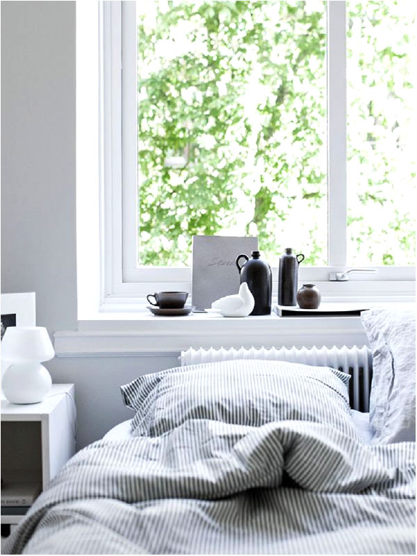 I think this photo is styled well. It evokes a calm and relaxed mood BUT the head of the bed is right up against a radiator-not a great idea. If this is the only wall that the bed can go then I would suggest covering the rad with a cover and pulling the bed away from it so it is not too hot.
The other problem here is the lamp is too small. Apply the same ideas as above. I don’t actually have a problem with the bed being in front of the window as long as the window coverings are adequate. Most often beds are not on a window wall but sometimes it does make sense to do that.
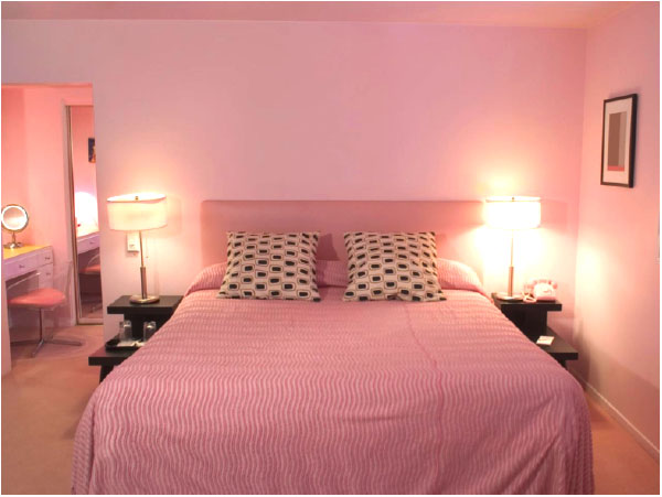
Here, everything is just too matchy. Not everything in a room should match or it loses it appeal. If you like the pink duvet cover then do a different shade or colour on the walls and don’t accessorize with all pink. It will be a way more interesting space if you coordinate but don’t match. Use colour, texture, and pattern to achieve this.
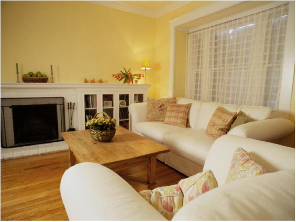 In this image the furniture is pushed up against the walls like a centrifuge. Pull the seating away from the walls to create intimacy as having all the furniture against all the walls can look boxy and unappealing. It can also make the seating too far apart for comfortable conversation.

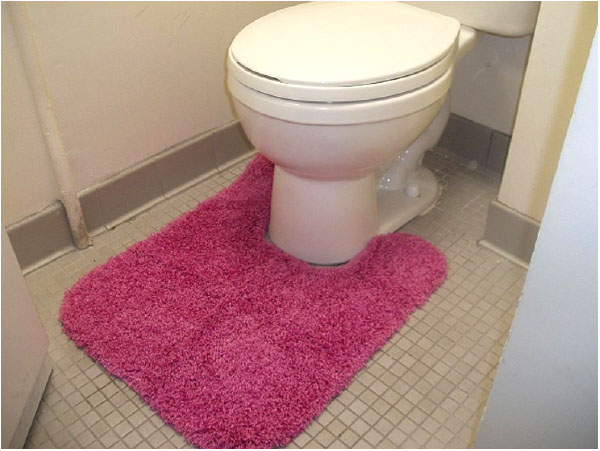
Finally, here is one I am sure everyone will get….right???
If you have some great photos or questions on design do’s and don’ts, send them our way and we will answer them.


Sass
October 13, 2015 at 12:46 pmI love these, thanks for bringing them back!
The toilet rug is too big, isn’t it? :-))
Brooke
October 13, 2015 at 1:12 pmVery clever!
Thanks for reading and posting!! More to come.