


Why Do These Rooms Work?
Why Do These Rooms Work?
Rather than point out why a room is not working, this time around we thought we would do a little photo analysis to determine what actually makes a room work? If you can look at an image closely and imagine yourself in the space then you can find out what will work for you. Pictures can be used for more than just eye candy-we can use them to help us understand how a space works in function and design. So whether or not you like the images we are going to show you, sit back and have a good look. They all “work” for some reason or another.

In this first image of a girl’s bedroom you can see that it just is visually appealing but why? Well first of all, the palette is neutral but has pops of colour. To make the neutral envelope of the room more interesting they have clad the walls in horizontal paneling then painted it out. This adds visual texture and interest without it being overwhelming. If they had left the paneling as wood it would have given the room a heavier look and may not have looked so cohesive. This paneling becomes a detail that is subtle but really does add dimension.
The pink colour in this room is bold which also adds a lot of interest. If the pink had been a pale pink it would have lost the punch that this bright pink is bringing to this room.
The fact that they have used green wallpaper in the closet is a great detail! It adds so much-an unexpected little gem. The wallpaper has pink as well which helps it tie in with the room.

This is a very traditional bedroom. I like the way they have used the accent neutral colour in this room. They have brought the colour of the headboard over to the other side of the room to tie it together. The blinds, headboard, chair cushions, and throw on the end of the bed are all brown based so work together even though they all have different patterns and textures.
It is the colour that is making it feel cohesive. The rest of the room is white or off white which makes it feel very calm and inviting. When working with white you do have to make sure you layer textures to make sure it doesn’t feel too sterile. I think this bedroom combines the textures well to make it feel inviting and not cold.

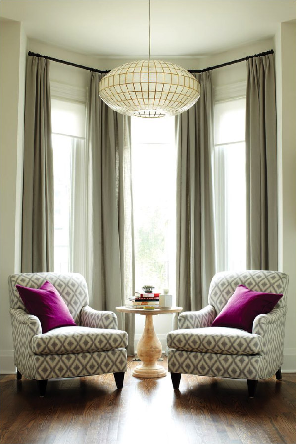
This room is such a great example of how pattern and colour can work together. There are many patterns in this room but they work because they are all different scale. If they were all the same scale they would be competing.
We hope these examples have inspired you to examine some room images of your own to understand why the rooms are successful or not for you.
Lynne Streeter Childress
July 10, 2015 at 12:28 pmI want to live in that pink room. How beautiful. I love that you pointed out the good stuff. It gives you something to aspire to.
tina
July 13, 2015 at 7:01 pmHi Lynne, I totally agree! Love the pink room! I’m glad the blog theme works. We are always looking for ways to help others transform their homes like a professional! Tina